案例媒体
案例说明
这个页面把案例媒体、完整 Prompt 和出处放在一起,方便你先看结果,再判断这条 Prompt 是否值得复制、收藏或加入对比。
案例解读
为了方便搜索、引用和后续复用,这里会把案例的适用场景、画面重点和 Prompt 结构拆成更容易浏览的说明。
这类案例适合用在什么场景
- 把它当作 UI 与社交媒体截图 的基准案例最合适,先看成片方向,再决定自己的 Prompt 要往哪边改。
- 如果你的目标也落在 霓虹、电影感、插画 这些方向,这条案例特别适合先看图判断风格,再回头微调描述。
- 做 Prompt 对比时,也很适合作为控制组,只改一个变量去看结果变化。
画面重点与风格信号
- 这条案例最明显的风格信号集中在 霓虹、电影感、插画,所以第一次改写时最好先保留这些关键词。
- 这类案例更值得先看界面密度、卡片层级,以及屏幕内容有没有先于文字讲清故事。
- 当前只有一张主图,所以第一张结果图就是最核心的参考基准。
Prompt 结构可以怎么理解
- 这条 Prompt 整体属于一条比较长、约束条件很多的 Prompt,很适合拿来判断这类方向到底需要写到多细。
- 关键词簇主要围绕 霓虹、电影感、插画 展开,所以复用时可以先保留这组风格词,再替换主体、镜头、环境或文案信息。
- 最稳的改写方式通常是先保留结果方向和最强风格信号,只替换主体设定与场景块。
如果你是带着问题来的,可以先看这些角度
- 如果保留 霓虹、电影感、插画,只换主体题材,结果最先变化的会是哪一部分?
- 这条结果里,哪些特征更像是 UI 与社交媒体截图 的结构特征,哪些又是标签风格本身带来的?
- 同分类的相关案例里,哪几条能给你更克制或更极致的相邻变体?
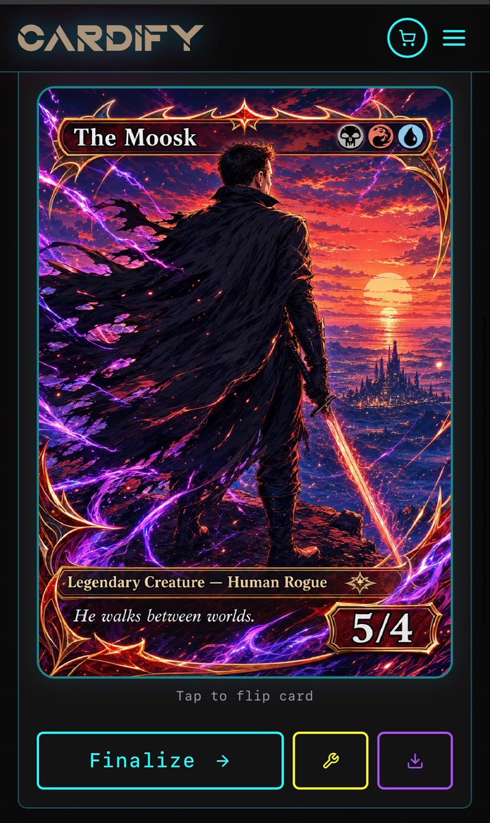
完整 Prompt
Goal: Create a dark futuristic mobile web app screen for a custom trading card generator called {argument name="app name" default="CARDIFY"}, showing one completed fantasy TCG card ready to finalize. Canvas: Vertical smartphone screenshot, 720×1200 style aspect ratio, black and charcoal background with thin neon cyan divider lines and rounded borders. Overall look is premium cyberpunk UI mixed with high-detail fantasy card art. Layout: Top navigation bar contains exactly 3 visible elements: a large stylized CARDIFY logo on the left, a circular neon cyan shopping cart icon near the upper right, and a neon cyan three-line hamburger menu icon at the far right. Below it is a centered card preview inside a thin cyan rounded rectangle panel. Under the card preview, show small gray monospace text reading “Tap to flip card”. At the bottom, place exactly 3 action buttons: a large cyan-outlined rectangular button labeled “Finalize →”, a smaller yellow-outlined square button with a wrench icon, and a smaller purple-outlined square button with a download icon. Trading card design: The card is a vertical fantasy collectible card with rounded corners, ornate red-gold metallic frame, glowing crimson highlights, and electric purple energy curling around the border. The card title bar at the top reads {argument name="card title" default="The Moosk"} in large white serif type. On the right side of the title bar are exactly 3 circular mana/type icons: a skull icon, a red dragon/swirl icon, and a blue water droplet icon. The lower type bar reads {argument name="type line" default="Legendary Creature — Human Rogue"} in gold serif text, with a small star-like rarity emblem to its right. The flavor text box below reads {argument name="flavor text" default="He walks between worlds."} in italic white serif type. The bottom-right power/toughness badge reads {argument name="power toughness" default="5/4"} in large bold white numerals. Main card artwork: A dramatic anime-fantasy illustration of a lone male rogue viewed from behind, standing on a rocky cliff at sunset. He has short dark hair, dark armor, and a huge tattered black cloak streaming leftward in the wind. He holds a glowing orange-red sword pointed downward in his right hand. In the distance is a luminous ocean horizon with a large setting sun, red and purple clouds, and a dark spired fantasy city near the water. Purple lightning arcs and magical energy ribbons surround the character and frame, with red sparks scattered through the cloak and foreground. Use extremely detailed painterly digital art, high contrast, cinematic lighting, saturated magenta, violet, crimson, orange, and gold. Constraints: Keep the screen as a mobile app mockup, not a standalone card. Use exactly 1 trading card preview, exactly 3 top navigation elements, exactly 3 mana/type icons, and exactly 3 bottom action buttons. Preserve all visible UI text clearly. Do not add extra cards, popups, watermarks, or unrelated interface panels.