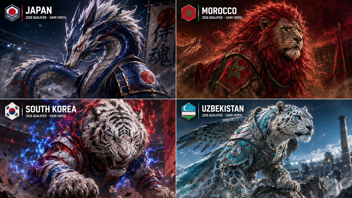
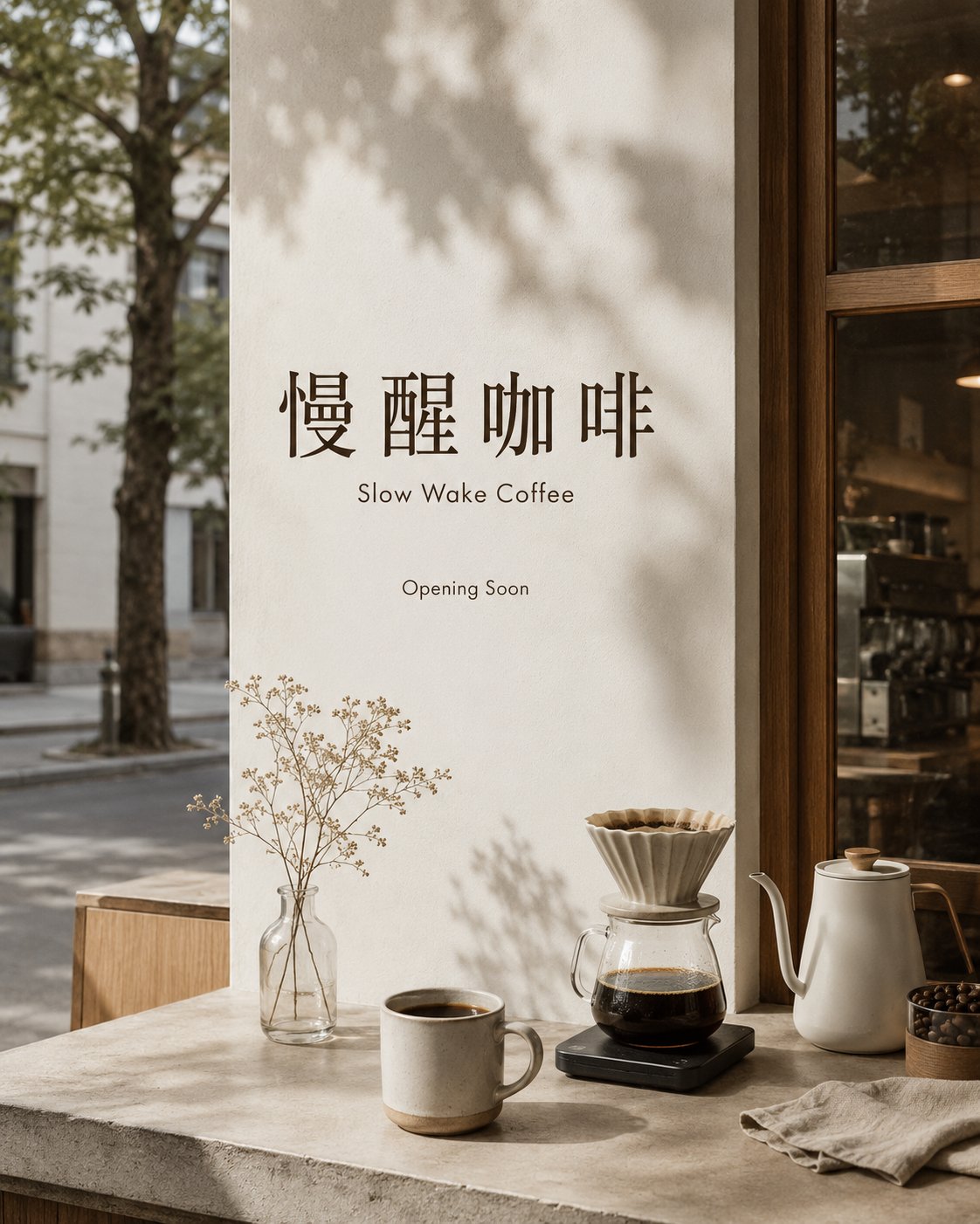
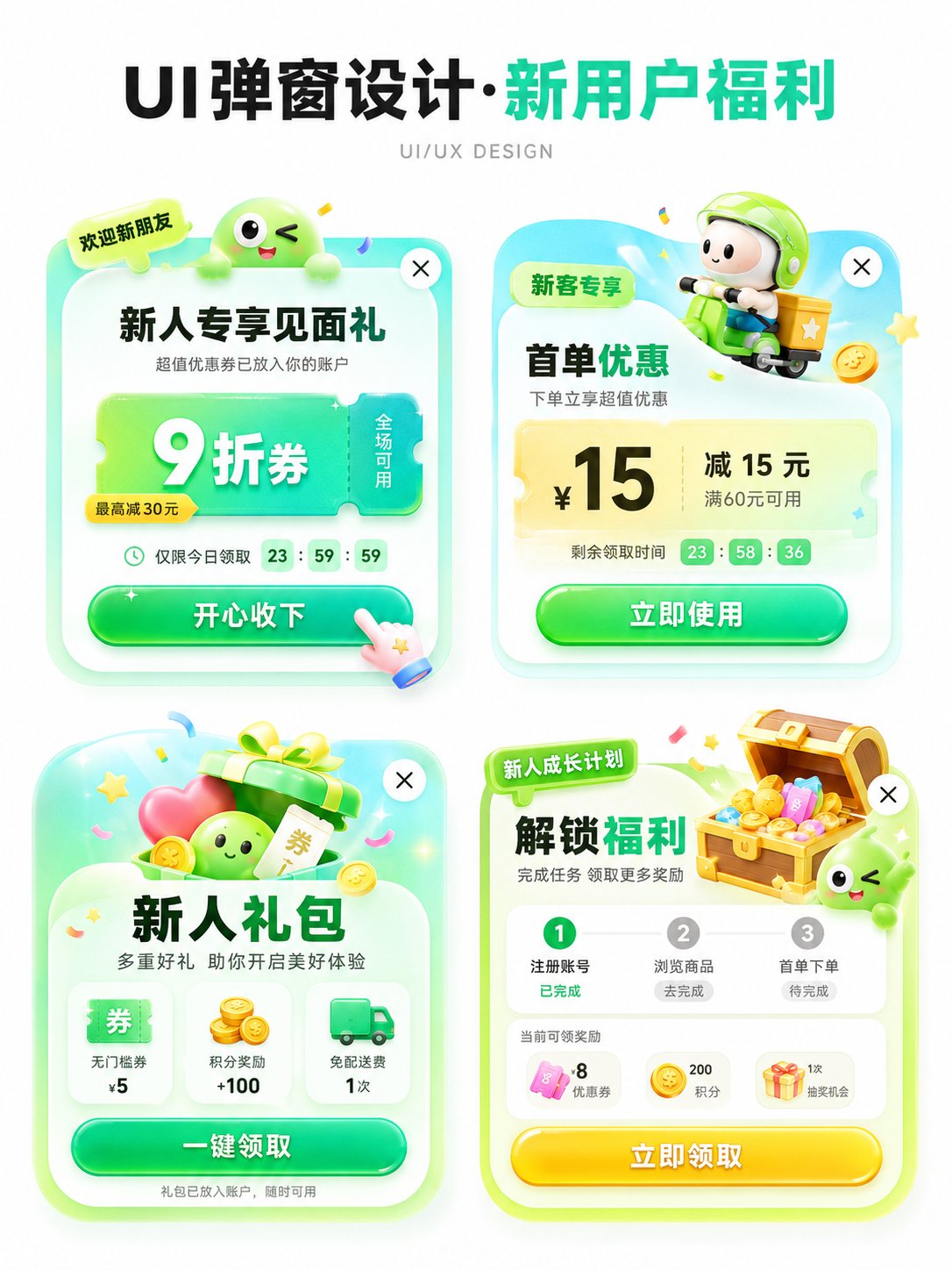
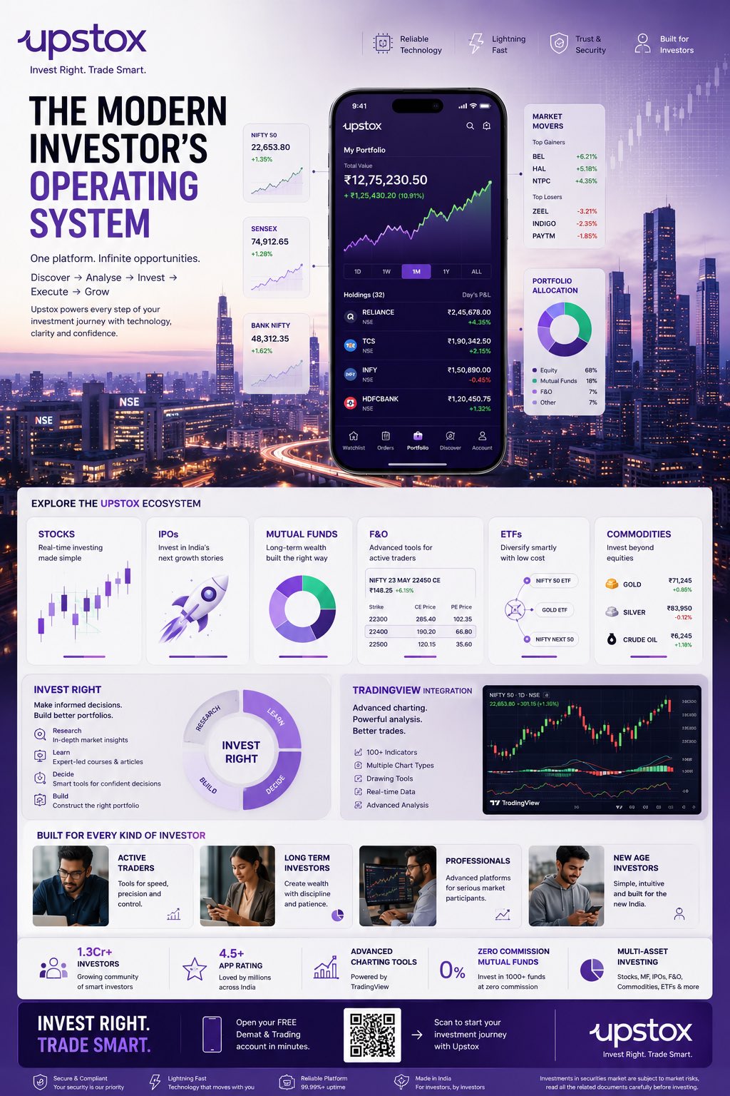
案例媒体
案例说明
这个页面把案例媒体、完整 Prompt 和出处放在一起,方便你先看结果,再判断这条 Prompt 是否值得复制、收藏或加入对比。
案例解读
为了方便搜索、引用和后续复用,这里会把案例的适用场景、画面重点和 Prompt 结构拆成更容易浏览的说明。
这类案例适合用在什么场景
- 把它当作 UI 与社交媒体截图 的基准案例最合适,先看成片方向,再决定自己的 Prompt 要往哪边改。
- 如果你的目标也落在 海报、UI、截图 这些方向,这条案例特别适合先看图判断风格,再回头微调描述。
- 做 Prompt 对比时,也很适合作为控制组,只改一个变量去看结果变化。
画面重点与风格信号
- 这条案例最明显的风格信号集中在 海报、UI、截图,所以第一次改写时最好先保留这些关键词。
- 这类案例更值得先看界面密度、卡片层级,以及屏幕内容有没有先于文字讲清故事。
- 当前保留了 2 份媒体输出,适合顺手观察同一方向在多张结果里的稳定性。
Prompt 结构可以怎么理解
- 这条 Prompt 整体属于一条比较长、约束条件很多的 Prompt,很适合拿来判断这类方向到底需要写到多细。
- 关键词簇主要围绕 海报、UI、截图 展开,所以复用时可以先保留这组风格词,再替换主体、镜头、环境或文案信息。
- 最稳的改写方式通常是先保留结果方向和最强风格信号,只替换主体设定与场景块。
如果你是带着问题来的,可以先看这些角度
- 如果保留 海报、UI、截图,只换主体题材,结果最先变化的会是哪一部分?
- 这条结果里,哪些特征更像是 UI 与社交媒体截图 的结构特征,哪些又是标签风格本身带来的?
- 同分类的相关案例里,哪几条能给你更克制或更极致的相邻变体?
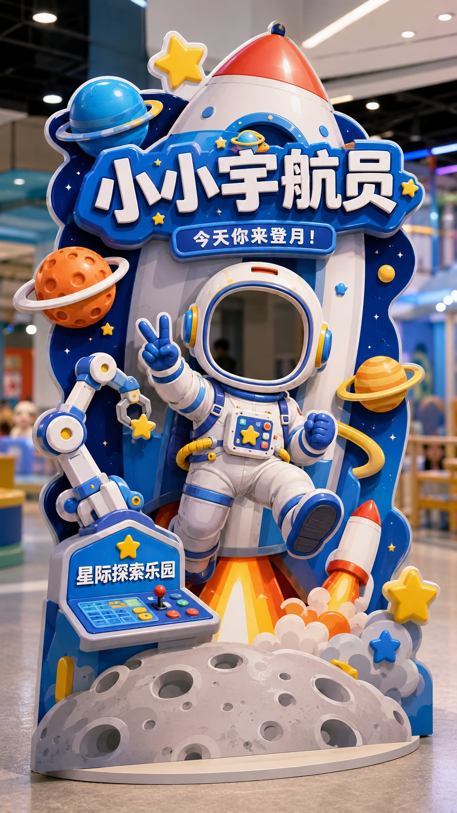
完整 Prompt
Please generate a vertical 9:16 Chinese 'Interactive Check-in Shaped Standee' design mockup, with the theme [Theme] as a head-cover style photo check-in device, suitable for [Usage Scene]. The overall image is a complete interactive installation in a store / theme park / mall activity area, not a regular poster, not a white background graphic design draft, but a shaped standee suitable for customers to stand behind and put their heads in to take photos. Basic Information: Theme: [Little Astronaut / Dessert Magician / Cute Pet Nurse / Dinosaur Archaeology Captain / Other character themes] Usage Scene: [Parent-child Paradise / Science Exploration Museum / Dessert Shop / Parent-child Baking Studio / Pet Shop / Pet Park / Mall Activity Area / Children's Theme Park] Main Title: [Main Title] Subtitle: [An interactive slogan, for example: Today you come to the moon! / Today the sweetness is cast by you / Today you take care of the cuteness / Today you come to discover the ancient world!] Brand Name: [Brand Name / Venue Name] Overall Style: [Cute / Dreamy / Adventure / Adorable / Healing / Dramatic / Parent-child feel] Main Color: [Main Color] Visual Requirements: 1. Image aspect ratio must be vertical 9:16, fully displaying a landable interactive check-in shaped standee. 2. There must be a clear 'head cover opening / face cutout area' in the upper-middle part of the standee, suitable for real people to put their heads in for photos. 3. The head cover opening must naturally blend into the structure of the character itself, such as helmets, hats, arches, theme frames, or the character's head position, and should not look like a forced hole. 4. A complete character body must be designed below the opening, so that users feel like they have really become this character after putting their heads in. 5. Character movements should have a sense of interaction, such as waving, welcoming, making a V-sign, holding props, carrying things, reaching forward, pointing forward, etc. 6. The overall standee must be a shaped outline, not a regular rectangle, not a regular display stand; the shaped outline should be naturally formed by extending theme elements. 7. Add large-sized decorative elements according to the theme, such as rockets, planets, cream, cakes, candies, pets, bubbles, dinosaur eggs, fossils, rock layers, maps, tools, etc. 8. The image should have foreground, middle ground, and background layers to create a light 3D installation feel, rather than just a flat hole-digging poster. 9. No obvious white edges, no thick white outlines; reflect structural and 3D sense through theme color trimming, partial shadows, layered blocking, foreground extension, and shaped expansion. 10. Chinese characters should be few and large, mainly retaining: Main Title, Subtitle, Brand Name; do not pile up too much explanatory information. 11. Title text should naturally blend into the device structure, such as signboards, wooden boards, cream words, rock words, theme frames, etc., rather than appearing as separately pasted flat text blocks. 12. The standee should have a real material feel, like KT board, Forex board, or a shaped floor-standing photo device, with clear edges, a sense of thickness, and a stable base. 13. The background can be a simple and real indoor store, theme park, or activity area scene, slightly blurred, not overpowering the main subject. 14. The overall image should be bright, clear, good-looking, and fun, suitable for customers to take photos and share on social media. Final Effect: A high-completion Chinese interactive check-in shaped standee, where users can put their heads in to take photos, creating a strong sense of character immersion, with overall shaped extensions, a light 3D installation feel, and strong offline sharing attributes. Avoid: Regular posters, regular display stands, no openings, obvious white edges, too much text, messy background, unrealistic structure, or looking like a direct translation/copy of an English version.