案例媒体
案例说明
这个页面把案例媒体、完整 Prompt 和出处放在一起,方便你先看结果,再判断这条 Prompt 是否值得复制、收藏或加入对比。
案例解读
为了方便搜索、引用和后续复用,这里会把案例的适用场景、画面重点和 Prompt 结构拆成更容易浏览的说明。
这类案例适合用在什么场景
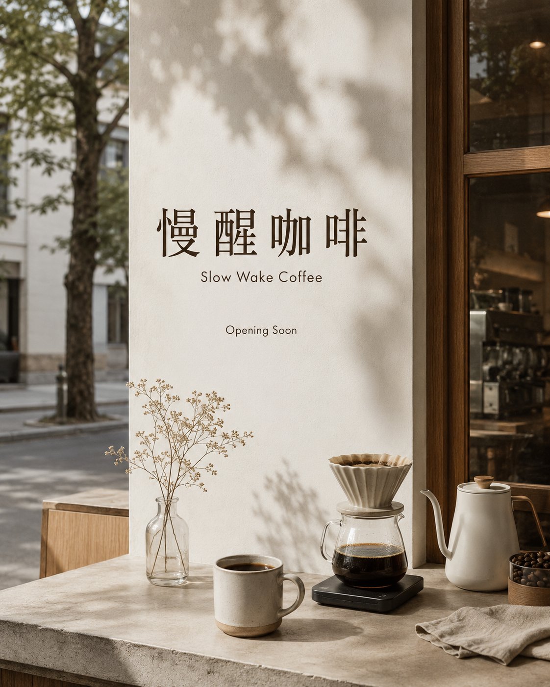
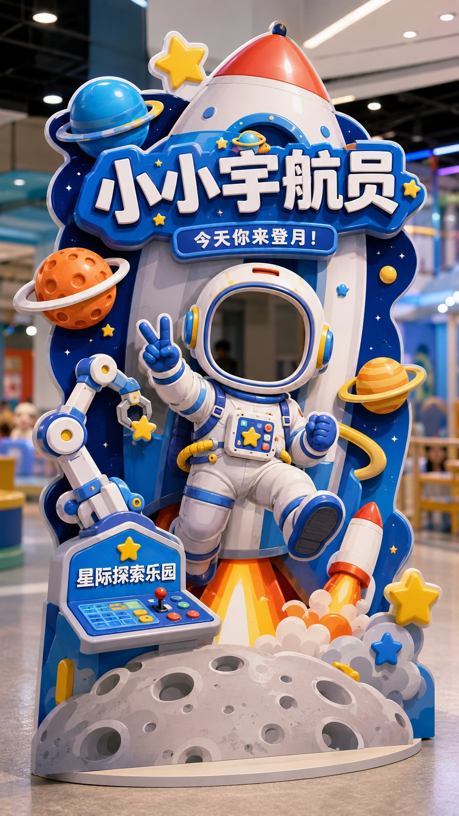
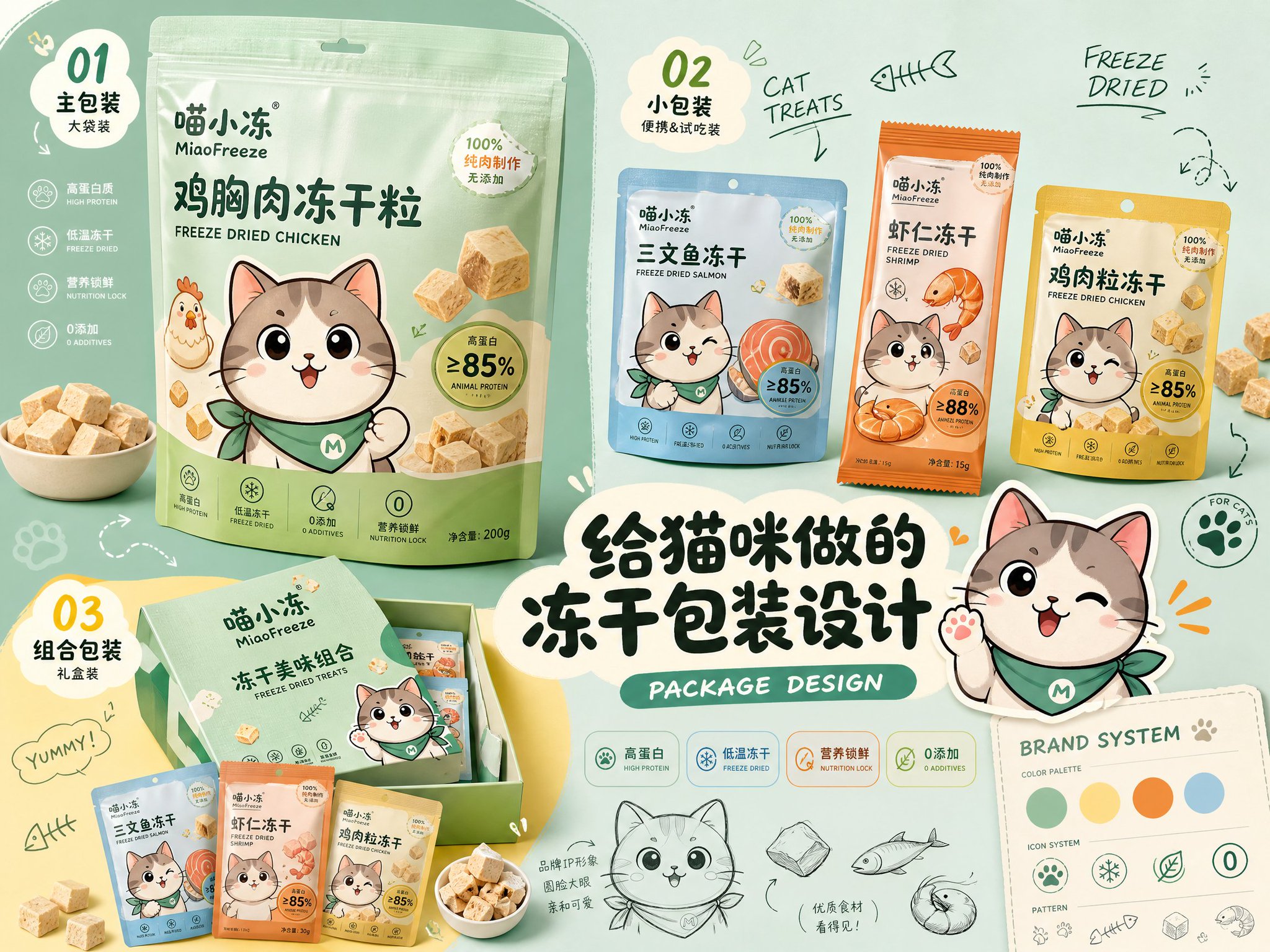
- 把它当作 UI 与社交媒体截图 的基准案例最合适,先看成片方向,再决定自己的 Prompt 要往哪边改。
- 如果你的目标也落在 海报、UI、截图 这些方向,这条案例特别适合先看图判断风格,再回头微调描述。
- 做 Prompt 对比时,也很适合作为控制组,只改一个变量去看结果变化。
画面重点与风格信号
- 这条案例最明显的风格信号集中在 海报、UI、截图,所以第一次改写时最好先保留这些关键词。
- 这类案例更值得先看界面密度、卡片层级,以及屏幕内容有没有先于文字讲清故事。
- 当前保留了 2 份媒体输出,适合顺手观察同一方向在多张结果里的稳定性。
Prompt 结构可以怎么理解
- 这条 Prompt 整体属于一条比较长、约束条件很多的 Prompt,很适合拿来判断这类方向到底需要写到多细。
- 关键词簇主要围绕 海报、UI、截图 展开,所以复用时可以先保留这组风格词,再替换主体、镜头、环境或文案信息。
- 最稳的改写方式通常是先保留结果方向和最强风格信号,只替换主体设定与场景块。
如果你是带着问题来的,可以先看这些角度
- 如果保留 海报、UI、截图,只换主体题材,结果最先变化的会是哪一部分?
- 这条结果里,哪些特征更像是 UI 与社交媒体截图 的结构特征,哪些又是标签风格本身带来的?
- 同分类的相关案例里,哪几条能给你更克制或更极致的相邻变体?
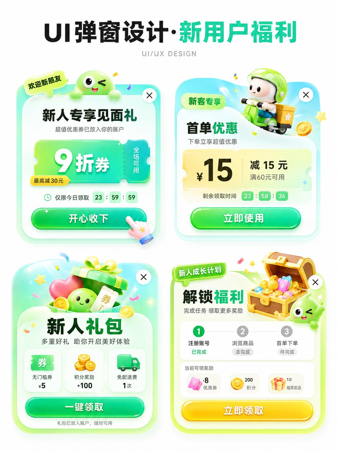
完整 Prompt
Please generate an APP operation pop-up design display image in [Aspect Ratio], with the theme [Theme]. The background should be pure white, with an overall clean and concise design proposal presentation style. The layout is a 2x2 grid, showing 4 different pop-up schemes in one image. All four pop-ups revolve around the same theme, but their entry points, benefit points, icon elements, and information structures are slightly different. Add a clear and eye-catching main title [Main Title] at the top, and the subtitle can be 'UI/UX DESIGN' or similar design display text. [Theme] can be replaced with: New User Benefits / Version Upgrade / 618 Promotion / Membership Opening / Sign-in Reward / Festival Event / Invitation Gift / Limited Time Offer / Growth Task / Points Exchange. [Main Color Tone] can be replaced with: Green series / Blue-purple series / Red-orange-gold series / Black-gold series / Pink-purple series / Fresh candy color. [Style Keywords] can be replaced with: High click desire, Light skeuomorphism, 3D cartoon, Gummy texture, Operational activity pop-up, APP benefit pop-up, Gamified operation visual, Rounded corner card, Soft shadow, Gradient button. [Four sub-scheme directions] can be replaced with: 1. [Scheme 1] 2. [Scheme 2] 3. [Scheme 3] 4. [Scheme 4] Each pop-up card must have the structural sense of a real APP pop-up, including: 1. Top label or scene identifier (such as 'Limited Time Offer', 'Exclusive for New Customers', 'Version Benefits', 'Upgrade Experience', etc.) 2. Core title area, highlighting the activity theme or benefit points. 3. Main equity area, expressed with large numbers, large discounts, and large selling points, such as coupon amounts, discounts, membership prices, upgrade rights, red envelope amounts, task rewards, etc. 4. Auxiliary description information, such as usage conditions, limited-time countdown, scope of application, growth steps, reward content, etc. 5. Obvious CTA button, such as 'Receive Now', 'Accept with Joy', 'Open Now', 'Update Now', 'Go Experience', 'Buy Now', etc. 6. Keep the close button in the top right corner to enhance the sense of a real UI pop-up. The four pop-ups need a unified visual system, but each small card should have its own variations: - Copy structure can be different - Decorative graphics can be different - Icons can be different - Benefit points can be different - Component layout can be slightly different But overall they still belong to 4 design schemes under the same theme. Visually, please strengthen the following characteristics: - White background display, clean page, no complex background - Vertical design display image, suitable for social media publishing - 2x2 layout is clear, with sufficient white space between the four cards - Pop-ups use rounded corner cards, soft shadows, and slight glowing edges - Large buttons should have a strong sense of clickability - Overall colors are bright but not messy - Use an appropriate amount of 3D small elements to enhance vitality, such as gift boxes, gold coins, red envelopes, shopping bags, rockets, crowns, membership cards, treasure chests, bells, megaphones, medals, cards and coupons, small mascots, etc. - Elements should serve the pop-up theme and not overshadow it. Layout requirements: - The top main title is eye-catching, suitable for a 'series cover' - The four pop-ups are centered to form a neat design display board - Information hierarchy is clear: see the title first, then the four pop-ups - Each pop-up should look like a real, implementable APP operational interface reference rather than a common poster - Chinese text should be as concise and clear as possible, reducing excessively small characters and avoiding confusion caused by too much information - Maintain the texture of an 'AI visual proposal map', suitable for UI/UX inspiration reference, operational activity display, and product proposal sharing.