案例媒体
案例说明
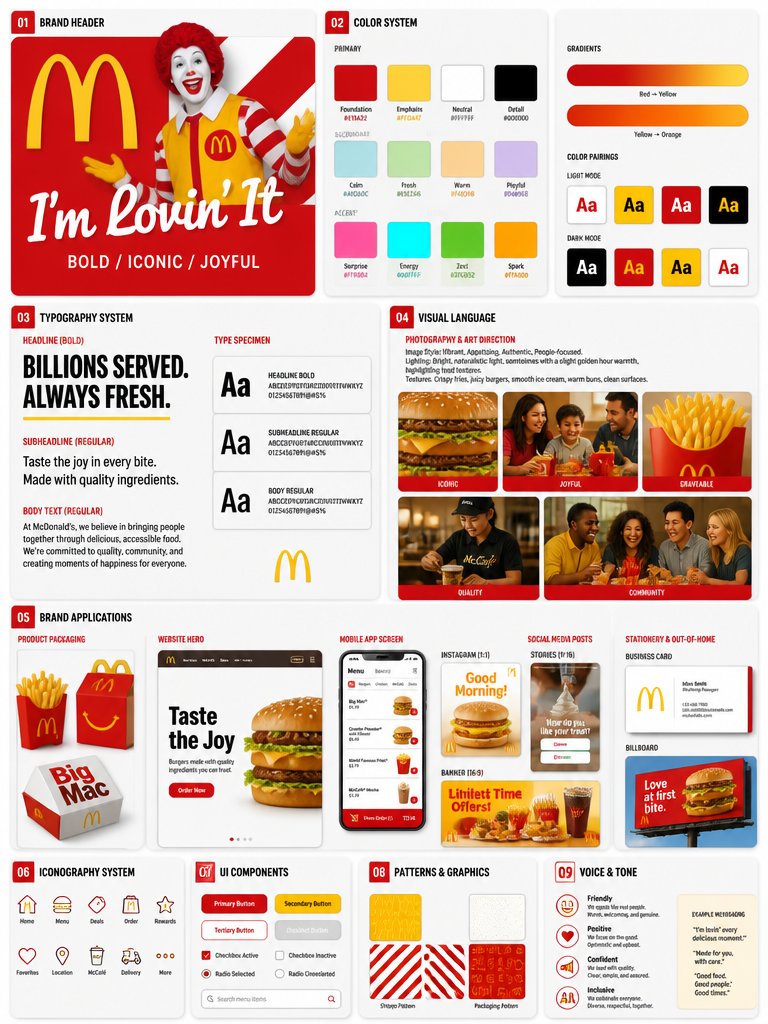
这个页面把案例媒体、完整 Prompt 和出处放在一起,方便你先看结果,再判断这条 Prompt 是否值得复制、收藏或加入对比。
案例解读
为了方便搜索、引用和后续复用,这里会把案例的适用场景、画面重点和 Prompt 结构拆成更容易浏览的说明。
这类案例适合用在什么场景
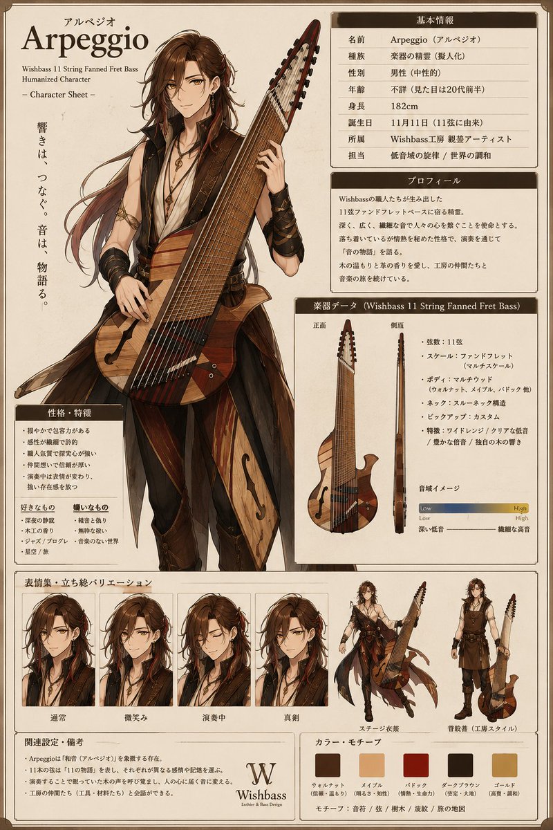
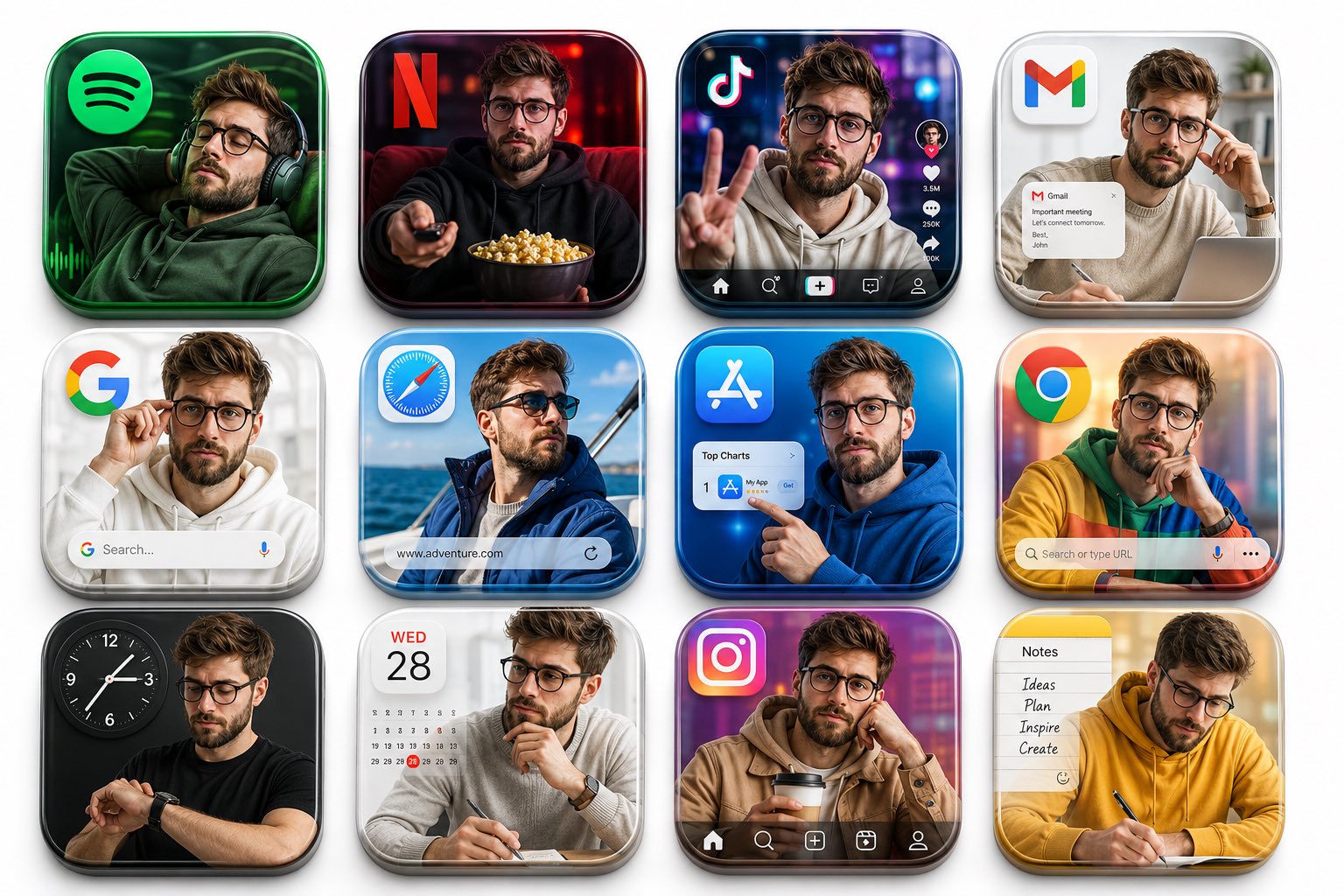
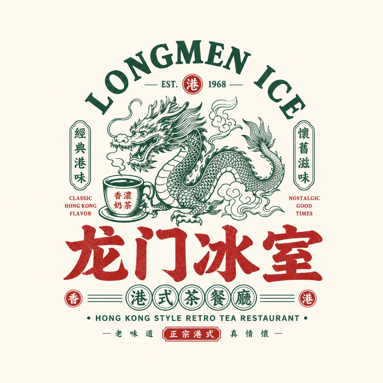
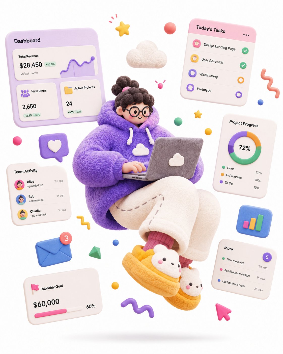
- 把它当作 UI 与社交媒体截图 的基准案例最合适,先看成片方向,再决定自己的 Prompt 要往哪边改。
- 如果你的目标也落在 人像、时尚、插画 这些方向,这条案例特别适合先看图判断风格,再回头微调描述。
- 做 Prompt 对比时,也很适合作为控制组,只改一个变量去看结果变化。
画面重点与风格信号
- 这条案例最明显的风格信号集中在 人像、时尚、插画,所以第一次改写时最好先保留这些关键词。
- 这类案例更值得先看界面密度、卡片层级,以及屏幕内容有没有先于文字讲清故事。
- 当前只有一张主图,所以第一张结果图就是最核心的参考基准。
Prompt 结构可以怎么理解
- 这条 Prompt 整体属于一条比较长、约束条件很多的 Prompt,很适合拿来判断这类方向到底需要写到多细。
- 关键词簇主要围绕 人像、时尚、插画 展开,所以复用时可以先保留这组风格词,再替换主体、镜头、环境或文案信息。
- 最稳的改写方式通常是先保留结果方向和最强风格信号,只替换主体设定与场景块。
如果你是带着问题来的,可以先看这些角度
- 如果保留 人像、时尚、插画,只换主体题材,结果最先变化的会是哪一部分?
- 这条结果里,哪些特征更像是 UI 与社交媒体截图 的结构特征,哪些又是标签风格本身带来的?
- 同分类的相关案例里,哪几条能给你更克制或更极致的相邻变体?
完整 Prompt
Create a comprehensive, 9-part professional brand identity and UI/UX design system style guide sheet for a major fast-food brand. The layout should be structured as a clean, grid-based presentation with distinct, numbered sections (01 to 09). The overall aesthetic must be bold, iconic, and highly structured. ### 01 BRAND HEADER - Include a bold, prominent logo on a striking background (e.g., solid red and white stripes). - Display a recognizable brand mascot or character illustration. - Include a memorable brand slogan (e.g., "it's finger lickin' good") written in a casual, handwritten script font. - List three core brand keywords below the slogan separated by slashes (e.g., BOLD / ICONIC / REAL). ### 02 COLOR SYSTEM - **Primary Palette:** Showcase 4 main colors with hex codes, labeled by their role (e.g., Foundation, Emphasis). - **Secondary Palette:** 4 supporting colors with hex codes, labeled by atmospheric mood. - **Accent Palette:** 4 pop colors with hex codes for specific callouts. - **Gradients:** A visual spectrum displaying brand gradient transitions. - **Color Pairings:** Small contrast blocks demonstrating text/background compatibility (e.g., Red+White, Black+Gold) in both Light Mode and Dark Mode interface previews. ### 03 TYPOGRAPHY SYSTEM - **Headline:** A heavy, tightly lettered, all-caps sans-serif font for maximum impact (e.g., "REAL CHICKEN. REAL GOOD."). - **Subheadline:** A clean, trustworthy sans-serif font in a contrasting color (e.g., "Hand-breaded. Freshly prepared. Every single day."). - **Body Text:** A highly readable, friendly, everyday sans-serif font displaying a short brand philosophy paragraph. - **Specimen Panel:** Display "Aa" font weight examples for Display Bold, Sans Bold, and Sans Regular next to a placeholder logo. ### 04 VISUAL LANGUAGE - **Photography & Art Direction Guidelines:** Detail rules for Image Style (e.g., Bold, Editorial, Craveable), Lighting (e.g., Dramatic directional light with deep shadows), and Textures (e.g., Crispy, tactile food textures, raw wood, metal accents). - **Image Grid:** Include a horizontal sequence of five distinct, high-contrast editorial food and portrait photographs, each tagged with a brand pillar (e.g., Bold, Real, Confident, Craveable, Iconic). ### 05 BRAND APPLICATIONS - Show real-world implementations of the visual identity across multiple media: - **Product Packaging:** 3D mockups of branded food buckets and boxes. - **Website Hero:** A clean desktop landing page layout featuring a strong headline, product shot, and an "Order Now" button. - **Mobile App Screen:** A modern smartphone UI showing a food delivery interface. - **Social Media Posts:** Mockups for Instagram (1:1 square post), Stories (9:16 vertical), and Banners (16:9 widescreen). - **Stationery & Out-of-Home:** A minimalist corporate business card and a dramatic, high-impact nighttime billboard advertisement. ### 06 DESIGN SYSTEM (UI COMPONENTS) - **Buttons:** State variations (Default, Hover, Disabled) for Primary, Secondary, and Text button styles. - **Cards:** UI cards for food menu items featuring high-quality images, titles, pricing, and promotional "Today's Deal" badges. - **Input Fields:** Default, Focused, and Error state text entry boxes. - **Navigation Bar:** Desktop navbar layout with logo, menu links, and an actionable CTA button. - **Spacing Scale:** A visual 8pt grid system scale showing incremental padding blocks (8px, 16px, 24px, up to 96px). ### 07 ICONOGRAPHY - A clean grid of 10 minimalist, uniform line-art icons representing core actions and product categories: Chicken, Bucket, Burger, Fries, Drink, Location, Delivery, Offers, Account, and Favorite. ### 08 PATTERNS & MOTIFS - Five rectangular swatches displaying repeating brand assets: - **Stripe Pattern:** Clean vertical lines. - **Colonel/Mascot Pattern:** A repeating line-art logo motif on a solid background. - **Texture Pattern:** A subtle, raw material texture (like wood or paper grains). - **Shape Motifs:** Geometric chevron/ribbon design elements. - **Dividers:** Thin, functional line breaks and UI indicators. ### 09 MATERIAL & DEPTH - Four visual examples demonstrating physical spatial rendering: - **Real Shadows:** Product packaging casting natural, directional ambient shadows. - **Textured Surfaces:** Close-ups of tactile materials like paper, cardboard, and wood. - **Reflections:** Subtle gloss and polished finishes on plastic or glass drink cups. - **Layer Depth:** A layered mobile application UI showing depth hierarchy and overlapping elements. ### FOOTER QUOTE - Conclude the sheet with a solid red accent block featuring a large white blockquote from the company founder alongside a clean vector line illustration of the brand mascot.