案例媒体
案例说明
这个页面把案例媒体、完整 Prompt 和出处放在一起,方便你先看结果,再判断这条 Prompt 是否值得复制、收藏或加入对比。
案例解读
为了方便搜索、引用和后续复用,这里会把案例的适用场景、画面重点和 Prompt 结构拆成更容易浏览的说明。
这类案例适合用在什么场景
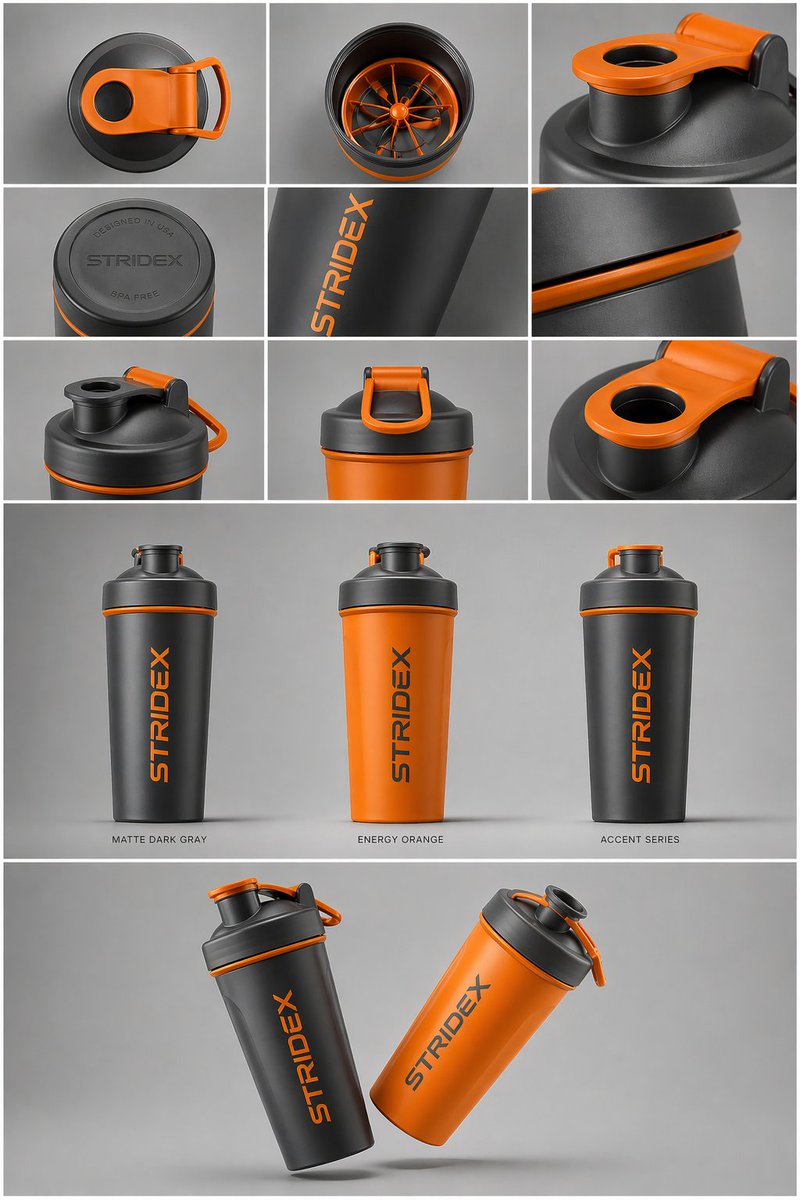
- 把它当作 UI 与社交媒体截图 的基准案例最合适,先看成片方向,再决定自己的 Prompt 要往哪边改。
- 如果你的目标也落在 UI、截图、极简 这些方向,这条案例特别适合先看图判断风格,再回头微调描述。
- 做 Prompt 对比时,也很适合作为控制组,只改一个变量去看结果变化。
画面重点与风格信号
- 这条案例最明显的风格信号集中在 UI、截图、极简,所以第一次改写时最好先保留这些关键词。
- 这类案例更值得先看界面密度、卡片层级,以及屏幕内容有没有先于文字讲清故事。
- 当前只有一张主图,所以第一张结果图就是最核心的参考基准。
Prompt 结构可以怎么理解
- 这条 Prompt 整体属于一条比较长、约束条件很多的 Prompt,很适合拿来判断这类方向到底需要写到多细。
- 关键词簇主要围绕 UI、截图、极简 展开,所以复用时可以先保留这组风格词,再替换主体、镜头、环境或文案信息。
- 最稳的改写方式通常是先保留结果方向和最强风格信号,只替换主体设定与场景块。
如果你是带着问题来的,可以先看这些角度
- 如果保留 UI、截图、极简,只换主体题材,结果最先变化的会是哪一部分?
- 这条结果里,哪些特征更像是 UI 与社交媒体截图 的结构特征,哪些又是标签风格本身带来的?
- 同分类的相关案例里,哪几条能给你更克制或更极致的相邻变体?
完整 Prompt
Create a Nature Biomedical Engineering / NeurIPS medical-AI method figure, landscape 3:2 (1536×1024), soft literature-science colors and minimal academic layout. Figure title: "Multimodal foundation model for clinical decision support". Layout: a left-to-right method pipeline with three horizontal bands and panel labels A–C. A. Inputs on the left: small clean icons and labeled cards "Radiology image", "Pathology tile", "EHR sequence", "Lab values", "Genomics". Use subtle rounded rectangles. B. Middle architecture: five modality encoders feeding into a central pale-teal block "Shared clinical representation"; include small modules "contrastive alignment", "missing-modality mask", "temporal attention". Add thin arrows and skip connections. C. Outputs on the right: three task heads "diagnosis", "risk score", "treatment response" with small calibrated probability bars. Add a lower inset "external validation" showing two hospital icons and an arrow labeled "site transfer". Style requirements: soft Nature/Science palette (muted teal, dusty blue, sage green, warm sand, coral accents), white background, precise vector-like arrows, modest shadows only, readable labels, lots of whitespace, no futuristic HUD, no clinical gore, no real hospital logos, no watermark.