案例媒体

案例说明
这个页面把案例媒体、完整 Prompt 和出处放在一起,方便你先看结果,再判断这条 Prompt 是否值得复制、收藏或加入对比。
案例解读
为了方便搜索、引用和后续复用,这里会把案例的适用场景、画面重点和 Prompt 结构拆成更容易浏览的说明。
这类案例适合用在什么场景
- 把它当作 模型对比与社区 的基准案例最合适,先看成片方向,再决定自己的 Prompt 要往哪边改。
- 如果你的目标也落在 海报、插画、UI 这些方向,这条案例特别适合先看图判断风格,再回头微调描述。
- 做 Prompt 对比时,也很适合作为控制组,只改一个变量去看结果变化。
画面重点与风格信号
- 这条案例最明显的风格信号集中在 海报、插画、UI,所以第一次改写时最好先保留这些关键词。
- 这类案例最有价值的地方通常是看差异:到底改了什么、哪里崩了、是哪段 Prompt 造成的变化。
- 当前保留了 2 份媒体输出,适合顺手观察同一方向在多张结果里的稳定性。
Prompt 结构可以怎么理解
- 这条 Prompt 整体属于一条比较长、约束条件很多的 Prompt,很适合拿来判断这类方向到底需要写到多细。
- 关键词簇主要围绕 海报、插画、UI 展开,所以复用时可以先保留这组风格词,再替换主体、镜头、环境或文案信息。
- 最稳的改写方式通常是先保留结果方向和最强风格信号,只替换主体设定与场景块。
如果你是带着问题来的,可以先看这些角度
- 如果保留 海报、插画、UI,只换主体题材,结果最先变化的会是哪一部分?
- 这条结果里,哪些特征更像是 模型对比与社区 的结构特征,哪些又是标签风格本身带来的?
- 同分类的相关案例里,哪几条能给你更克制或更极致的相邻变体?
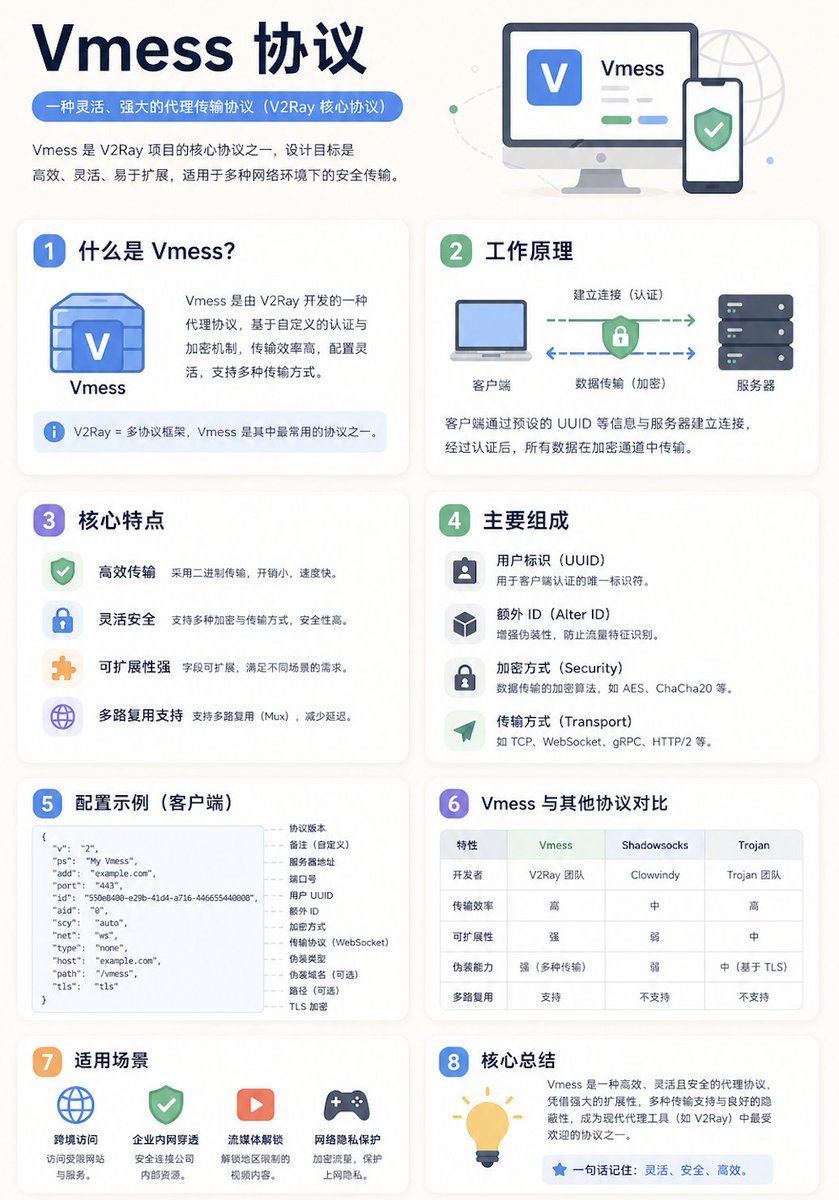
完整 Prompt
A clean educational infographic poster explaining "{argument name="topic" default="Topic"}". [Overall Style] Modern minimalist UI style, background in soft light colors (e.g., cream #FAF7F2 / light gray-blue), restrained and comfortable color palette suitable for long reading sessions. [Core Requirements (Key)] Naturally organize content modules based on the information structure of the "topic". Do not force a fixed number or order of modules; prioritize clear logical information over formal symmetry. [Layout (Adaptive)] - Use grid layout (auto-select 2 columns / 3 columns / irregular distribution) - Card count adjusts based on content (usually 5–9) - High information density modules can be enlarged (higher visual weight) - Simple modules can be shrunk or merged [Card Design] - White cards (#FFFFFF) - Rounded corners + subtle shadows (soft layering) - Maintain uniform spacing and alignment [Each Information Module Includes] - Simple illustrations (unified style) - Clear headings (strong hierarchy) - 1–3 core explanatory sentences (avoid wordiness) - Examples / comparisons / summaries provided where necessary [Content Organization Principles (Emphasis)] Auto-select appropriate structure based on theme, e.g.: - Concept type → definition + principle + characteristics + example - Contrast type → A vs B (comparative structure) - Process type → steps / flowcharts - System type → components + relationships - Skill type → methods + tips + common mistakes [Visual Hierarchy] - Title > Module Title > Main Text > Supporting Information - Important info can be highlighted with color or icons [Color Suggestions] - Primary color: Choose based on theme (Tech=Blue, Learning=Green, Warning=Orange) - Secondary colors: 1–2 types suffice - Avoid high saturation and flashiness [Style Requirements] - Generous negative space, strong sense of "breathability" - Unified icons (linear or flat) - High readability as priority - Clear educational orientation [Extra Optimization (Optional)] - Can include: comparison blocks / process arrows / structure diagrams - Can have a "Core Summary" module as a visual finale.