案例媒体
案例说明
这个页面把案例媒体、完整 Prompt 和出处放在一起,方便你先看结果,再判断这条 Prompt 是否值得复制、收藏或加入对比。
案例解读
为了方便搜索、引用和后续复用,这里会把案例的适用场景、画面重点和 Prompt 结构拆成更容易浏览的说明。
这类案例适合用在什么场景
- 把它当作 模型对比与社区 的基准案例最合适,先看成片方向,再决定自己的 Prompt 要往哪边改。
- 如果你的目标也落在 时尚、海报、角色 这些方向,这条案例特别适合先看图判断风格,再回头微调描述。
- 做 Prompt 对比时,也很适合作为控制组,只改一个变量去看结果变化。
画面重点与风格信号
- 这条案例最明显的风格信号集中在 时尚、海报、角色,所以第一次改写时最好先保留这些关键词。
- 这类案例最有价值的地方通常是看差异:到底改了什么、哪里崩了、是哪段 Prompt 造成的变化。
- 当前只有一张主图,所以第一张结果图就是最核心的参考基准。
Prompt 结构可以怎么理解
- 这条 Prompt 整体属于一条比较长、约束条件很多的 Prompt,很适合拿来判断这类方向到底需要写到多细。
- 关键词簇主要围绕 时尚、海报、角色 展开,所以复用时可以先保留这组风格词,再替换主体、镜头、环境或文案信息。
- 最稳的改写方式通常是先保留结果方向和最强风格信号,只替换主体设定与场景块。
如果你是带着问题来的,可以先看这些角度
- 如果保留 时尚、海报、角色,只换主体题材,结果最先变化的会是哪一部分?
- 这条结果里,哪些特征更像是 模型对比与社区 的结构特征,哪些又是标签风格本身带来的?
- 同分类的相关案例里,哪几条能给你更克制或更极致的相邻变体?
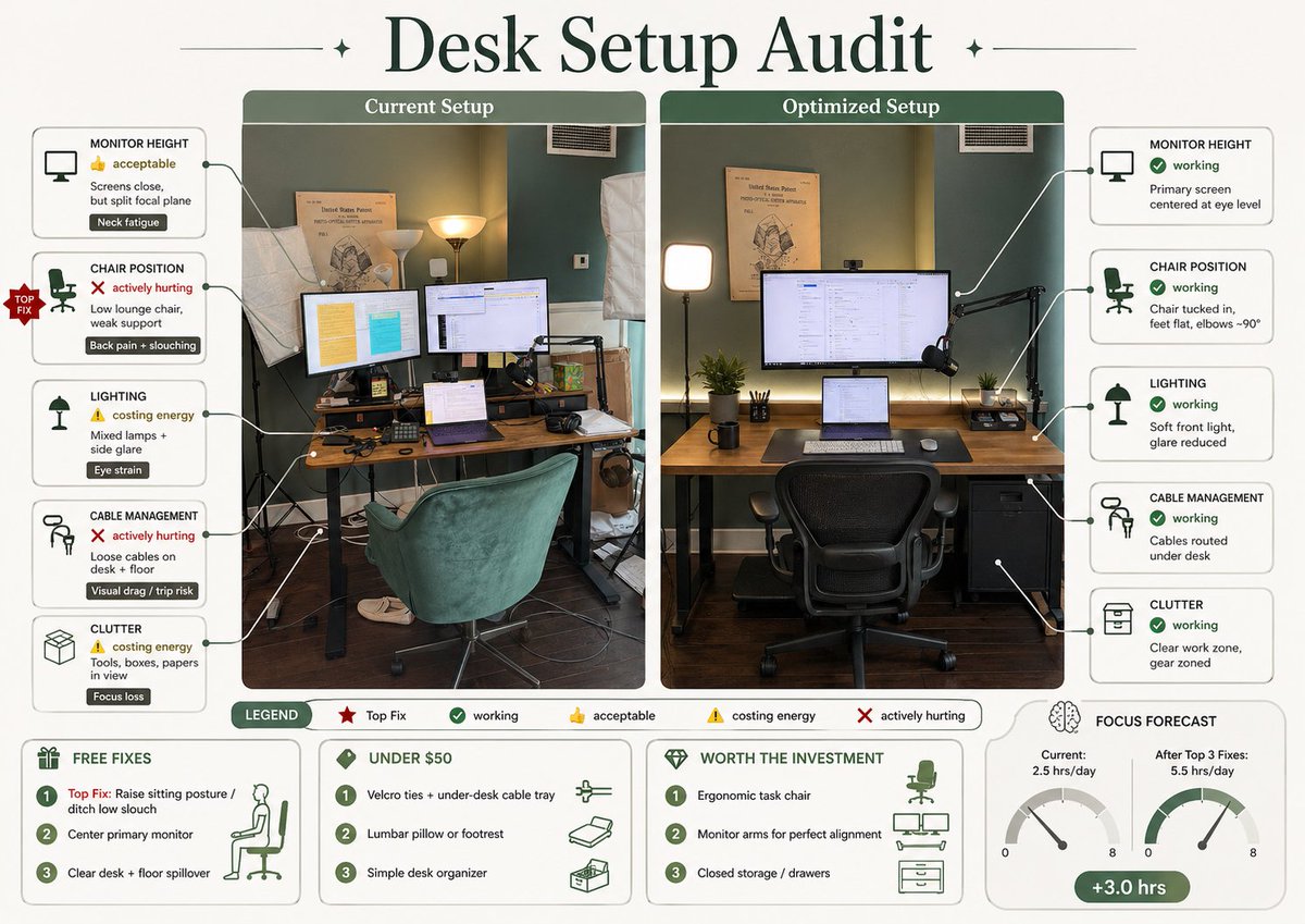
完整 Prompt
Using REFERENCE_0, turn the attached desk photo and its written brief into a clean editorial-style infographic poster. Create a side-by-side comparison with exactly 2 labeled photo panels: “Current Setup” on the left using the original scene, and “Optimized Setup” on the right showing a plausible improved version of the same room and desk from a matching angle. Add a large serif headline at the top reading {argument name="headline text" default="Desk Setup Audit"}. Around the left panel, add exactly 5 issue callout cards connected by leader lines: 1) MONITOR HEIGHT — 👍 acceptable — “Screens close, but split focal plane” — tag “Neck fatigue”; 2) CHAIR POSITION — ❌ actively hurting — “Low lounge chair, weak support” — tag “Back pain + slouching”; 3) LIGHTING — ⚠️ costing energy — “Mixed lamps + side glare” — tag “Eye strain”; 4) CABLE MANAGEMENT — ❌ actively hurting — “Loose cables on desk + floor” — tag “Visual drag / trip risk”; 5) CLUTTER — ⚠️ costing energy — “Tools, boxes, papers in view” — tag “Focus loss”. Add a small red “TOP FIX” badge pointing to the chair position issue. Around the right panel, add exactly 5 improved callout cards: 1) MONITOR HEIGHT — ✅ working — “Primary screen centered at eye level”; 2) CHAIR POSITION — ✅ working — “Chair tucked in, feet flat, elbows ~90°”; 3) LIGHTING — ✅ working — “Soft front light, glare reduced”; 4) CABLE MANAGEMENT — ✅ working — “Cables routed under desk”; 5) CLUTTER — ✅ working — “Clear work zone, gear zoned”. In the optimized panel, visibly show the improvements: one main monitor centered, laptop centered below it, ergonomic office chair, cleaner desktop, cable routing hidden under the desk, softer balanced lighting, and a small drawer cabinet on the right while keeping the same room recognizable. Add a bottom legend with exactly 5 items: “LEGEND”, “Top Fix”, “working”, “acceptable”, “costing energy”, “actively hurting”. Along the bottom, add exactly 4 boxed sections: 1) “FREE FIXES” with 3 numbered items — “Top Fix: Raise sitting posture / ditch low slouch”, “Center primary monitor”, “Clear desk + floor spillover”; 2) “UNDER $50” with 3 numbered items — “Velcro ties + under-desk cable tray”, “Lumbar pillow or footrest”, “Simple desk organizer”; 3) “WORTH THE INVESTMENT” with 3 numbered items — “Ergonomic task chair”, “Monitor arms for perfect alignment”, “Closed storage / drawers”; 4) “FOCUS FORECAST” showing 2 gauges labeled “Current: 2.5 hrs/day” and “After Top 3 Fixes: 5.5 hrs/day”, plus a green pill reading “+3.0 hrs”. Use a refined magazine infographic aesthetic, muted green and cream palette, rounded boxes, minimal text, crisp icons, thin connector lines, and polished layout suitable for sharing on social media.