案例媒体
案例说明
这个页面把案例媒体、完整 Prompt 和出处放在一起,方便你先看结果,再判断这条 Prompt 是否值得复制、收藏或加入对比。
案例解读
为了方便搜索、引用和后续复用,这里会把案例的适用场景、画面重点和 Prompt 结构拆成更容易浏览的说明。
这类案例适合用在什么场景
- 把它当作 模型对比与社区 的基准案例最合适,先看成片方向,再决定自己的 Prompt 要往哪边改。
- 如果你的目标也落在 35mm、海报、排版 这些方向,这条案例特别适合先看图判断风格,再回头微调描述。
- 做 Prompt 对比时,也很适合作为控制组,只改一个变量去看结果变化。
画面重点与风格信号
- 这条案例最明显的风格信号集中在 35mm、海报、排版,所以第一次改写时最好先保留这些关键词。
- 这类案例最有价值的地方通常是看差异:到底改了什么、哪里崩了、是哪段 Prompt 造成的变化。
- 当前保留了 2 份媒体输出,适合顺手观察同一方向在多张结果里的稳定性。
Prompt 结构可以怎么理解
- 这条 Prompt 整体属于一条比较长、约束条件很多的 Prompt,很适合拿来判断这类方向到底需要写到多细。
- 关键词簇主要围绕 35mm、海报、排版 展开,所以复用时可以先保留这组风格词,再替换主体、镜头、环境或文案信息。
- 最稳的改写方式通常是先保留结果方向和最强风格信号,只替换主体设定与场景块。
如果你是带着问题来的,可以先看这些角度
- 如果保留 35mm、海报、排版,只换主体题材,结果最先变化的会是哪一部分?
- 这条结果里,哪些特征更像是 模型对比与社区 的结构特征,哪些又是标签风格本身带来的?
- 同分类的相关案例里,哪几条能给你更克制或更极致的相邻变体?
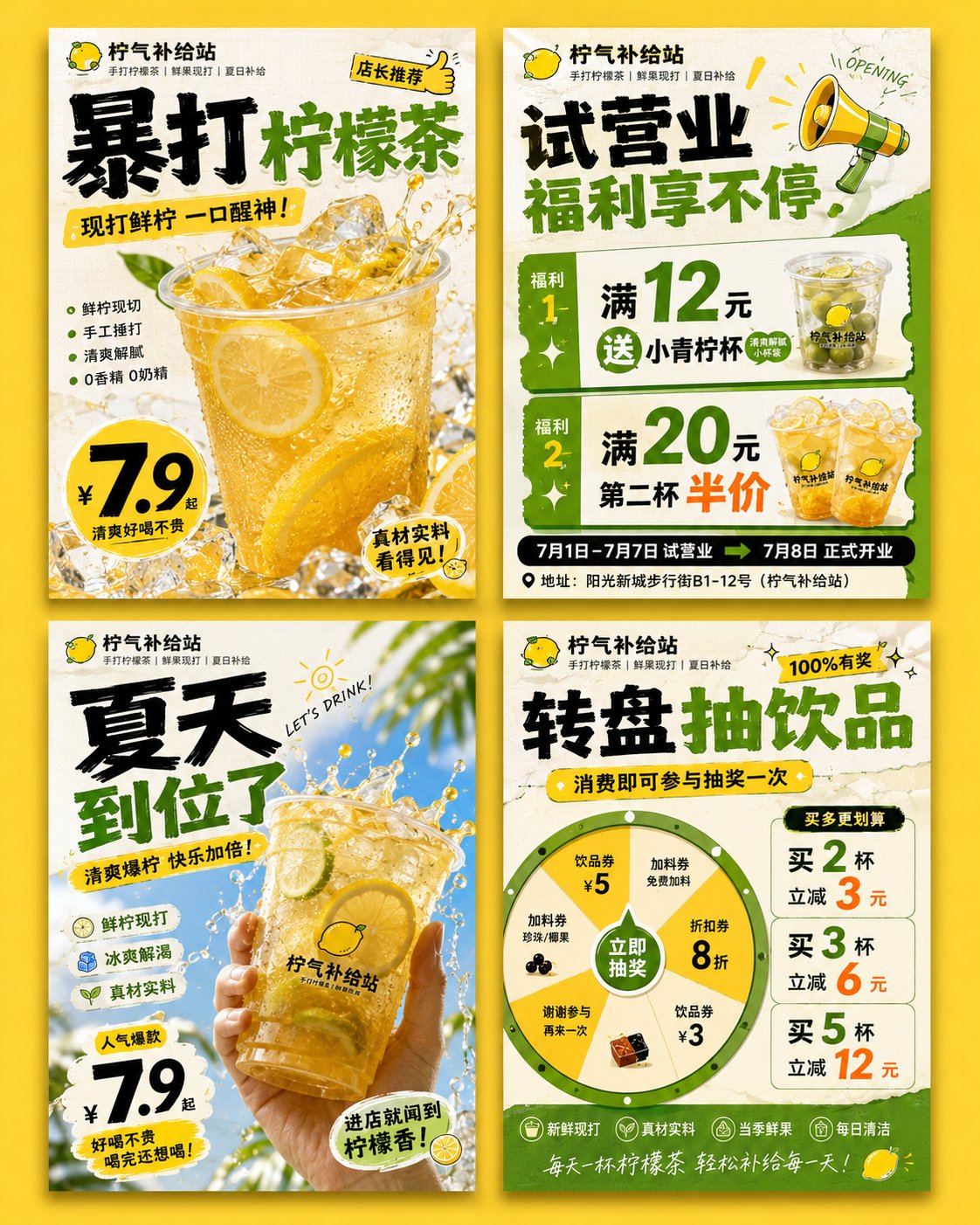
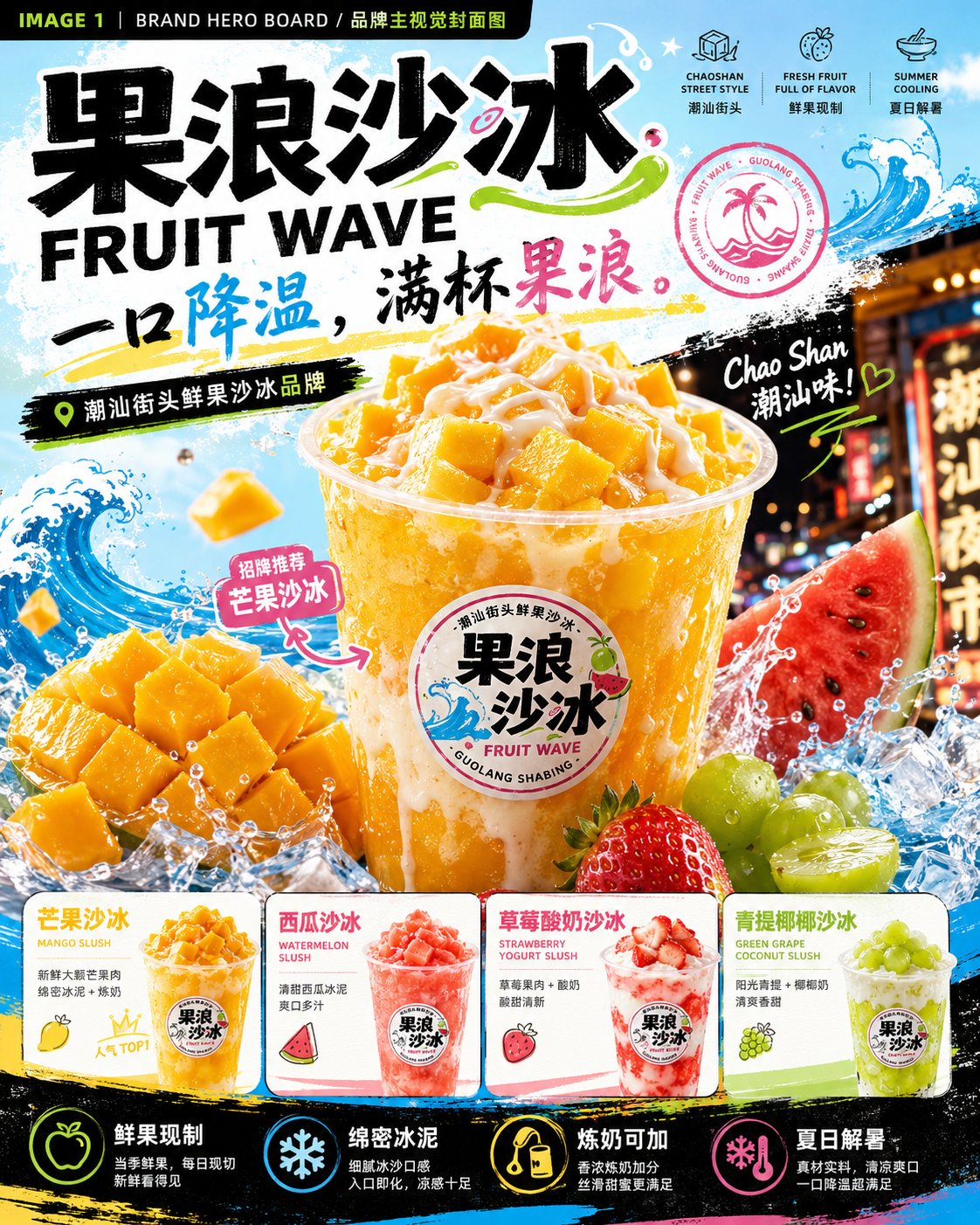
完整 Prompt
Please generate a set of "FRUIT WAVE 果浪沙冰" summer fresh fruit slushy brand visual proposal images. Note: This is a continuous set of 4 brand visual proposal images, but each one must be generated independently. Do not merge them; do not use a four-grid layout. The 4 images must maintain the same brand system: brand name, font, color palette, cup stickers, wave graphics, fruit elements, and street summer vibe must all be unified. Brand Name: 果浪沙冰 English Name: FRUIT WAVE Brand Type: Chaoshan street fresh fruit slushy brand / Young people's summer fresh-made dessert brand Brand Positioning: Turning Chaoshan street fresh fruit slushies into higher aesthetic, more branded summer fresh-made desserts. Slogan: One sip to cool down, a full cup of fruit wave. Core Keywords: Fresh fruit made on the spot, dense slush, condensed milk adds points, summer heat relief, young and trendy, street night market, bright and colorful, cool and delicious, real ingredients. Visual Style: High-saturation fruit colors, summer refreshing feel, street trendy feel, Chaoshan night market check-in vibe, fresh fruit realism. The visuals should be fresh, cool, sweet, bright, freshly made, photogenic, and appetizing. Primary Colors: Mango yellow, watermelon pink, lime green, condensed milk white, icy light blue, deep charcoal gray. Auxiliary Graphics: Blue ocean waves, ice crystals, water droplets, splash graphics, fruit slices, condensed milk dripping lines, handwritten graffiti, circular brand seal. Core Products: Mango Slush / MANGO SLUSH Watermelon Slush / WATERMELON SLUSH Strawberry Yogurt Slush / STRAWBERRY YOGURT SLUSH Green Grape Coconut Slush / GREEN GRAPE COCONUT SLUSH Double Fruit Slush / DOUBLE FRUIT SLUSH Condensed Milk Peanut Slush / CONDENSED MILK PEANUT SLUSH Product Requirements: Transparent cups as the core visual carrier, with a "FRUIT WAVE 果浪沙冰" circular sticker on the cup body. Inside the cup, one should see dense slush, fruit granules, real fruit pieces, condensed milk topping, and a cool icy feel. Do not make it look like ordinary milk tea; highlight fresh fruit slushy, slush, condensed milk, and summer heat relief. Aspect Ratio: Vertical 4:5. Overall Requirements: Sufficient information, sense of design, brand proposal feel, not empty, not crude. Chinese and English titles should be clear, and typography must be professional. The overall look should be like a complete brand visual proposal rather than ordinary posters. IMAGE 1 | BRAND HERO BOARD / Brand Visual Hero Cover Image Generate a brand visual hero cover image. The visual should immediately convey "youth, fresh fruit, summer, heat relief, Chaoshan street slushy." Layout: Top displays large title "果浪沙冰 / FRUIT WAVE" and slogan "一口降温,满杯果浪。" Center features a huge Mango Slush as the main visual, transparent cup, brand sticker, mango slush, mango chunks, condensed milk topping, ice cube splashes, blue waves, fruit splashes. Bottom displays 4 main flavor small cards: Mango Slush, Watermelon Slush, Strawberry Yogurt Slush, Green Grape Coconut Slush. Add selling point icons: Freshly made with real fruit, dense slush, condensed milk available, summer heat relief. Visuals should be high-saturation, cool, strong fresh fruit feel, with street summer impact. IMAGE 2 | IDENTITY SYSTEM BOARD / Brand Identity System Board Generate a brand identity system board. Show the Logo, colors, fonts, icons, stickers, auxiliary graphics, and flavor system for "FRUIT WAVE 果浪沙冰." Layout: Top displays brand name, English name, slogan, and small product visuals. Middle displays in modular style: 01 Brand Identity: Chinese logo, English logo, circular brand seal. 02 Color System: Mango yellow, watermelon pink, lime green, condensed milk white, icy light blue, deep charcoal gray. 03 Typography System: Chinese title font, body text font, English font. 04 Icon System: Mango, watermelon, strawberry, green grape, condensed milk, ice cubes, waves, double-mix. 05 Sticker Labels: Freshly made with real fruit, dense slush, condensed milk adds points, double-mix recommendation, summer limited, real ingredients. 06 Auxiliary Graphics: Blue ocean waves, ice crystals, water droplets, splashes, condensed milk dripping, colorful graffiti. Bottom displays 6 flavor cards: Mango, Watermelon, Strawberry Yogurt, Green Grape Coconut, Double Fruit Slush, Condensed Milk Peanut Slush. Visuals should be like a brand system proposal board, information-rich but clear and organized. IMAGE 3 | PRODUCT & PACKAGING BOARD / Product and Packaging Application Board Generate a product and packaging application board. Show how this brand translates into a real, sellable product system. Layout: Top displays 4 main slushy products: Mango Slush, Watermelon Slush, Strawberry Yogurt Slush, Green Grape Coconut Slush. Each cup is transparent, has a unified brand sticker, contains slush, fruit granules, fruit pieces, condensed milk, and a cool icy feel. Middle displays packaging applications: Cup stickers, sealing film, packaging bags, paper bags, menu boards, ordering stickers, brand cards. Bottom displays product matrix: Mango Slush, Watermelon Slush, Strawberry Yogurt Slush, Green Grape Coconut Slush, Double Fruit Slush, Condensed Milk Peanut Slush. Add core selling points: Freshly made with real fruit, dense with no ice crystals, condensed milk available, double-mix as you like, summer late-night snack recommendation. Bottom-most displays topping recommendations: Condensed milk, peanut bits, coconut jelly, raisins. Visuals should feel like real sellable products, with a sense of packaging and strong product appeal, making people want to buy at a glance. IMAGE 4 | CAMPAIGN & SPACE BOARD / Communication and Space Application Board Generate a communication and space application board. Show the effect of "FRUIT WAVE 果浪沙冰" entering real streets, night markets, pop-ups, social media, and brand materials. Layout: Top displays brand name, English name, slogan, and small brand icons. Left large scene: Chaoshan night market slushy stall / roadside shop / flagship store. Signboard says "FRUIT WAVE 果浪沙冰," featuring an ordering window, fresh fruit display, transparent cup slushies, night market lighting, young customers or staff, embodying the street life of summer nights. Top right: Summer pop-up stall with awning, menu, lightboxes, fresh fruit, and product display. Middle right: Two advertising posters, copy can be "Real fresh fruit, real icy cool," "Summer calls for a slushy," "One sip to cool down, a full cup of fruit wave." Bottom left: 3-4 social media vertical posters, including new arrivals, popular TOPs, double fruit CP recommendations, summer night heat relief buddies. Bottom right: Brand touchpoints including paper bags, napkins, coasters, stickers, ordering cards, takeout bags. Bottom displays application scene icons: Chaoshan night market, street shop, fresh fruit stall, summer pop-up, youth community. Visuals should have a sense of space, communication, and storytelling, highlighting summer nights, streets, fruit stalls, young people, and a sense of cooling down.