案例媒体

案例说明
这个页面把案例媒体、完整 Prompt 和出处放在一起,方便你先看结果,再判断这条 Prompt 是否值得复制、收藏或加入对比。
案例解读
为了方便搜索、引用和后续复用,这里会把案例的适用场景、画面重点和 Prompt 结构拆成更容易浏览的说明。
这类案例适合用在什么场景
- 把它当作 模型对比与社区 的基准案例最合适,先看成片方向,再决定自己的 Prompt 要往哪边改。
- 如果你的目标也落在 截图、角色、排版 这些方向,这条案例特别适合先看图判断风格,再回头微调描述。
- 做 Prompt 对比时,也很适合作为控制组,只改一个变量去看结果变化。
画面重点与风格信号
- 这条案例最明显的风格信号集中在 截图、角色、排版,所以第一次改写时最好先保留这些关键词。
- 这类案例最有价值的地方通常是看差异:到底改了什么、哪里崩了、是哪段 Prompt 造成的变化。
- 当前只有一张主图,所以第一张结果图就是最核心的参考基准。
Prompt 结构可以怎么理解
- 这条 Prompt 整体属于一条比较长、约束条件很多的 Prompt,很适合拿来判断这类方向到底需要写到多细。
- 关键词簇主要围绕 截图、角色、排版 展开,所以复用时可以先保留这组风格词,再替换主体、镜头、环境或文案信息。
- 最稳的改写方式通常是先保留结果方向和最强风格信号,只替换主体设定与场景块。
如果你是带着问题来的,可以先看这些角度
- 如果保留 截图、角色、排版,只换主体题材,结果最先变化的会是哪一部分?
- 这条结果里,哪些特征更像是 模型对比与社区 的结构特征,哪些又是标签风格本身带来的?
- 同分类的相关案例里,哪几条能给你更克制或更极致的相邻变体?
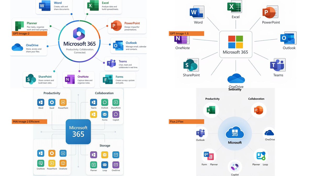
完整 Prompt
Using the provided reference image as a rough inspiration for an official explanatory slide/infographic, create a clean comparison image showing the same Microsoft 365 ecosystem concept generated in four different model styles. Canvas and layout: 16:9 white slide, divided into exactly 4 quadrants in a 2×2 grid with generous whitespace and no hard divider lines. Subject: Each quadrant should show a Microsoft 365 hub-and-spoke or app ecosystem diagram centered on {argument name="main product name" default="Microsoft 365"}, with surrounding Microsoft app icons and short English labels. Quadrants and visible orange model tags: Include exactly 4 orange labels, one per quadrant: 1. Top-left: {argument name="first model label" default="GPT-Image-2"} — polished circular Microsoft 365 hub diagram with multiple app cards around it. 2. Top-right: {argument name="second model label" default="GPT-Image-1.5"} — simpler radial hub diagram with icons around a central Microsoft 365 box. 3. Bottom-left: {argument name="third model label" default="MAI Image 2 Efficient"} — structured dashboard-like diagram with grouped sections such as Productivity, Collaboration, and Storage. 4. Bottom-right: {argument name="fourth model label" default="Flux.2 Flex"} — soft circular diagram with icons orbiting a central Microsoft cloud-style mark. Apps to include across the diagrams: Word, Excel, PowerPoint, Outlook, Teams, OneDrive, SharePoint, OneNote, Planner, Forms, Loop, and Copilot where appropriate. Use recognizable Microsoft-style colored app icons, but keep everything as a generated infographic rather than a screenshot. Style: Modern corporate PowerPoint infographic style, crisp readable English text, flat vector icons, subtle shadows, light gray connector lines, mostly white background, Microsoft blue/green/orange/purple palette. Keep the overall image clean and presentation-ready.