案例媒体
案例说明
这个页面把案例媒体、完整 Prompt 和出处放在一起,方便你先看结果,再判断这条 Prompt 是否值得复制、收藏或加入对比。
案例解读
为了方便搜索、引用和后续复用,这里会把案例的适用场景、画面重点和 Prompt 结构拆成更容易浏览的说明。
这类案例适合用在什么场景
- 把它当作 模型对比与社区 的基准案例最合适,先看成片方向,再决定自己的 Prompt 要往哪边改。
- 如果你的目标也落在 截图、极简、排版 这些方向,这条案例特别适合先看图判断风格,再回头微调描述。
- 做 Prompt 对比时,也很适合作为控制组,只改一个变量去看结果变化。
画面重点与风格信号
- 这条案例最明显的风格信号集中在 截图、极简、排版,所以第一次改写时最好先保留这些关键词。
- 这类案例最有价值的地方通常是看差异:到底改了什么、哪里崩了、是哪段 Prompt 造成的变化。
- 当前只有一张主图,所以第一张结果图就是最核心的参考基准。
Prompt 结构可以怎么理解
- 这条 Prompt 整体属于一条比较长、约束条件很多的 Prompt,很适合拿来判断这类方向到底需要写到多细。
- 关键词簇主要围绕 截图、极简、排版 展开,所以复用时可以先保留这组风格词,再替换主体、镜头、环境或文案信息。
- 最稳的改写方式通常是先保留结果方向和最强风格信号,只替换主体设定与场景块。
如果你是带着问题来的,可以先看这些角度
- 如果保留 截图、极简、排版,只换主体题材,结果最先变化的会是哪一部分?
- 这条结果里,哪些特征更像是 模型对比与社区 的结构特征,哪些又是标签风格本身带来的?
- 同分类的相关案例里,哪几条能给你更克制或更极致的相邻变体?
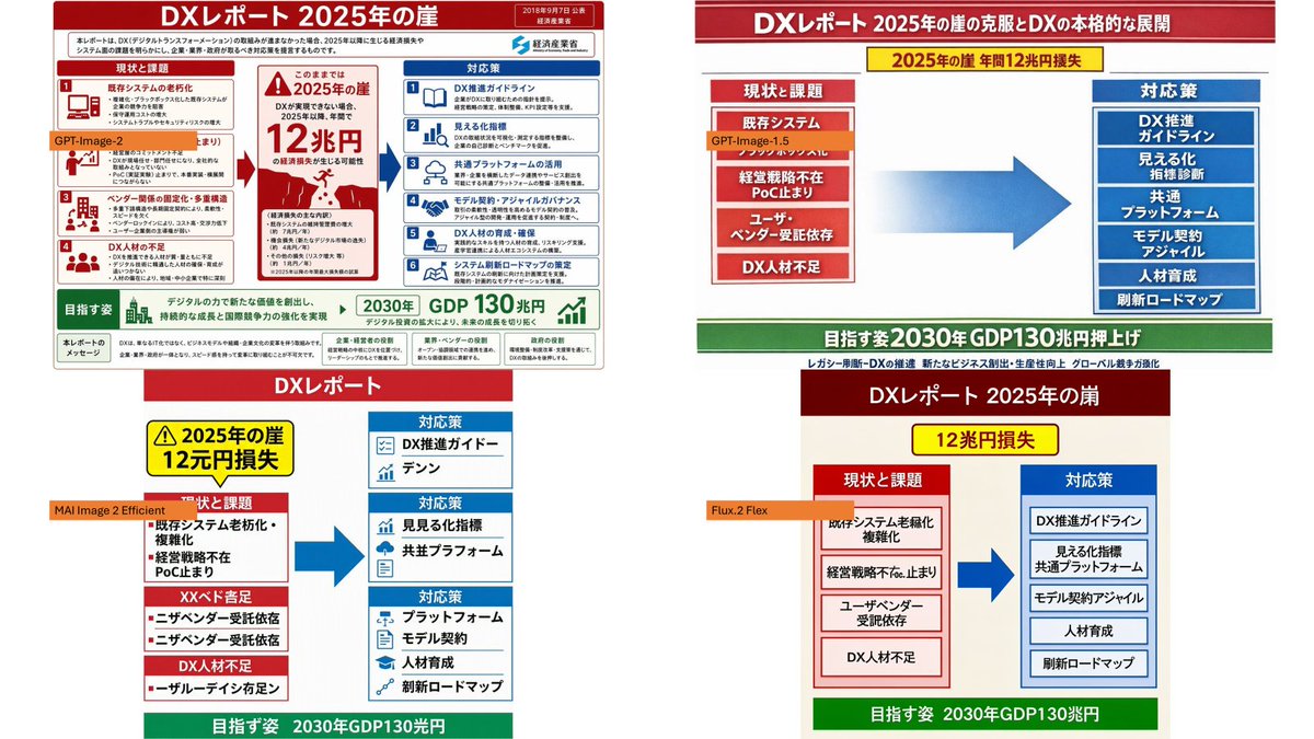
完整 Prompt
Using the provided reference image as the source slide, create a 16:9 white comparison canvas showing four different regenerated versions of the same Japanese government-style DX report slide. Layout: Arrange exactly 4 panels in a 2×2 grid with generous white margins. The top-left panel should keep the provided reference slide nearly unchanged and scaled down. The other three panels should be simplified reinterpretations of the same content, each with the same overall logic: red header, red “current issues” block on the left, blue “countermeasures” block on the right, a large blue arrow pointing from left to right, and a green goal band at the bottom. Panel labels: Add exactly 4 small orange model labels over the panels: {argument name="top left model label" default="GPT-Image-2"}, {argument name="top right model label" default="GPT-Image-1.5"}, {argument name="bottom left model label" default="MAI Image 2 Efficient"}, and {argument name="bottom right model label" default="Flux.2 Flex"}. Text and content to preserve from the reference: Keep the main theme as {argument name="main headline" default="DXレポート 2025年の崖"}. Preserve readable Japanese key phrases such as “2025年の崖”, “12兆円損失”, “現状と課題”, “対応策”, “既存システム”, “経営戦略不在”, “DX人材不足”, “DX推進ガイドライン”, “見える化指標”, “共通プラットフォーム”, “モデル契約・アジャイル”, “人材育成”, “刷新ロードマップ”, and the green goal message about “2030年 GDP130兆円”. Panel differences: The top-right version should look like a clean, simplified PowerPoint infographic with a long red title bar, a yellow warning banner near the top, stacked red issue boxes on the left, stacked blue solution boxes on the right, and a large gradient blue arrow in the center. The bottom-left version should look more compact and slightly imperfect, with multiple red issue sections on the left and three blue response sections on the right. The bottom-right version should look like a neat minimal slide with a dark red title bar, a yellow loss badge, two bordered columns, and a green bottom goal bar. Style constraints: Make the overall image look like a screenshot of a PowerPoint slide comparing output quality across image models. Keep all four panels legible, flat, and infographic-like. Do not add photo-realistic elements, people, watermarks, or extra panels.