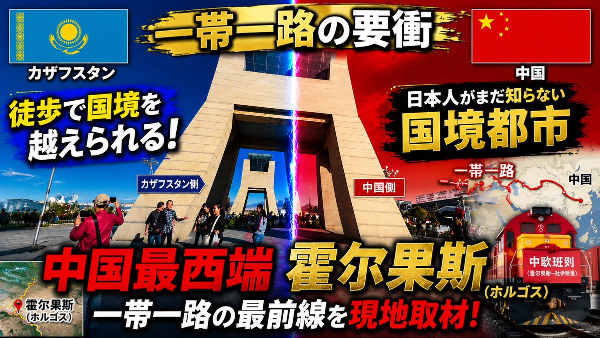
案例媒体
案例说明
这个页面把案例媒体、完整 Prompt 和出处放在一起,方便你先看结果,再判断这条 Prompt 是否值得复制、收藏或加入对比。
案例解读
为了方便搜索、引用和后续复用,这里会把案例的适用场景、画面重点和 Prompt 结构拆成更容易浏览的说明。
这类案例适合用在什么场景
- 把它当作 模型对比与社区 的基准案例最合适,先看成片方向,再决定自己的 Prompt 要往哪边改。
- 如果你的目标也落在 海报、插画、截图 这些方向,这条案例特别适合先看图判断风格,再回头微调描述。
- 做 Prompt 对比时,也很适合作为控制组,只改一个变量去看结果变化。
画面重点与风格信号
- 这条案例最明显的风格信号集中在 海报、插画、截图,所以第一次改写时最好先保留这些关键词。
- 这类案例最有价值的地方通常是看差异:到底改了什么、哪里崩了、是哪段 Prompt 造成的变化。
- 当前只有一张主图,所以第一张结果图就是最核心的参考基准。
Prompt 结构可以怎么理解
- 这条 Prompt 整体属于一条比较长、约束条件很多的 Prompt,很适合拿来判断这类方向到底需要写到多细。
- 关键词簇主要围绕 海报、插画、截图 展开,所以复用时可以先保留这组风格词,再替换主体、镜头、环境或文案信息。
- 最稳的改写方式通常是先保留结果方向和最强风格信号,只替换主体设定与场景块。
如果你是带着问题来的,可以先看这些角度
- 如果保留 海报、插画、截图,只换主体题材,结果最先变化的会是哪一部分?
- 这条结果里,哪些特征更像是 模型对比与社区 的结构特征,哪些又是标签风格本身带来的?
- 同分类的相关案例里,哪几条能给你更克制或更极致的相邻变体?
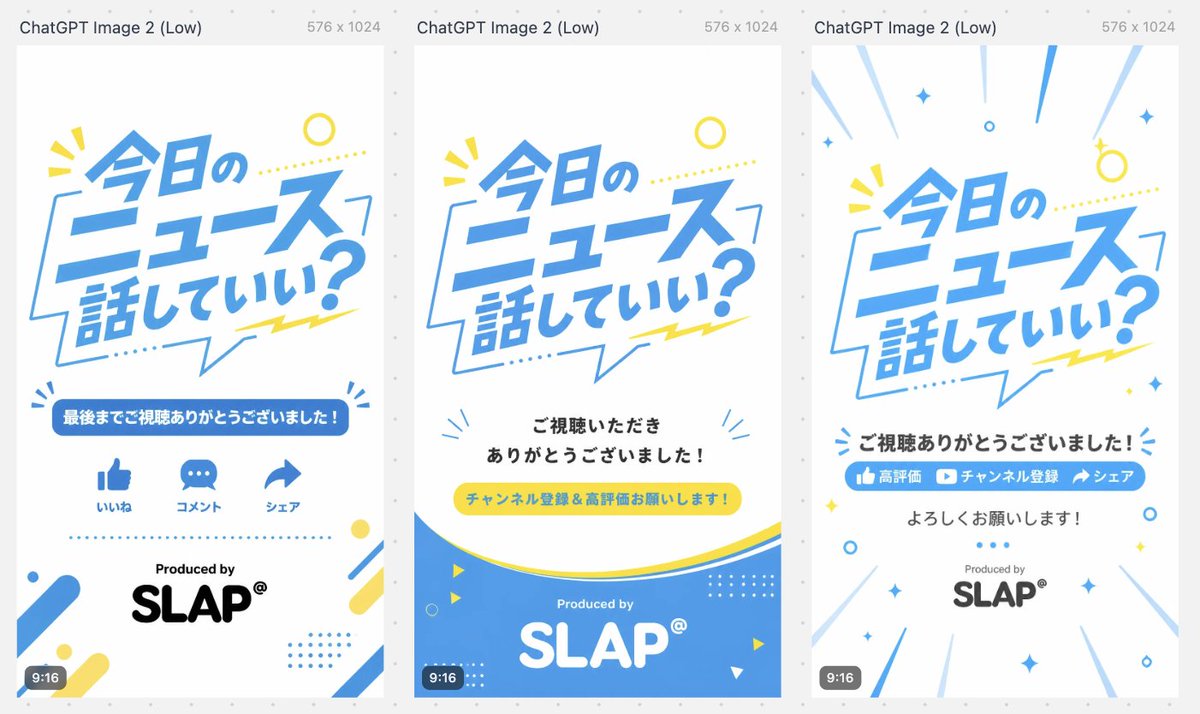
完整 Prompt
{"type":"three-variant vertical short-video outro storyboard / end-card design sheet","canvas":{"overall":"wide comparison image containing three tall smartphone-format cards side by side on a light gray dotted background","each_card_size":"9:16 vertical, 576 x 1024, white background","top_caption":"Each card has a small gray header above it reading ChatGPT Image 2 (Low) and 576 x 1024."},"style":{"visual_style":"clean Japanese pop graphic design for news or commentary shorts, bright and friendly, flat vector typography, lots of white space","palette":"sky blue, white, lemon yellow, black, light gray accents","typography":"large bold slanted Japanese headline lettering in blue, rounded sans-serif supporting text, playful speech-bubble shapes and dotted decorations","branding":"Produced by SLAP® near the bottom of each card"},"shared_main_headline":{"text":"{argument name=\"main headline text\" default=\"今日のニュース話していい?\"}","position":"upper half of every vertical card","appearance":"large dynamic blue Japanese text inside or overlapping a thin blue speech-bubble outline, slightly tilted, with yellow dotted line and small yellow burst marks"},"layout":{"variant_count":3,"variants":[{"title":"Variant 1: engagement icons outro","position":"left card","elements_count":6,"elements":["Large headline in upper center","Blue rounded banner with the text {argument name=\"thank you banner text\" default=\"最後までご視聴ありがとうございました!\"}","Three blue social icons in one row: thumbs-up labeled いいね, speech bubble labeled コメント, share arrow labeled シェア","Dotted blue horizontal divider","Produced by text above large black SLAP® logo","Corner decorations: blue/yellow rounded diagonal bars, dots, small circular accents, and tiny burst marks"],"bottom_badge":"small dark rounded 9:16 label at lower left"},{"title":"Variant 2: subscription request with blue wave footer","position":"center card","elements_count":6,"elements":["Large headline in upper center","Centered black message: {argument name=\"viewer thanks text\" default=\"ご視聴いただきありがとうございました!\"}","Yellow pill-shaped call-to-action button with blue text: {argument name=\"call to action text\" default=\"チャンネル登録&高評価お願いします!\"}","Large curved blue wave footer with thin yellow curve above it","White Produced by and large white SLAP® logo inside the blue footer","Small decorative triangles, circles, dotted grids, and blue radiating marks around the lower area"],"bottom_badge":"small dark rounded 9:16 label at lower left"},{"title":"Variant 3: energetic subscribe/share outro","position":"right card","elements_count":7,"elements":["Large headline in upper center with radiating blue speed lines from the edges","Bold black centered message: {argument name=\"closing thanks text\" default=\"ご視聴ありがとうございました!\"}","Blue horizontal call-to-action bar containing three segments: thumbs-up icon 高評価, play-button icon チャンネル登録, share arrow シェア","Centered black text below: よろしくお願いします!","Produced by above gray/black SLAP® logo","Scattered blue and yellow sparkle, circle, diamond, and dot decorations","Diagonal motion lines around the border creating a celebratory burst effect"],"bottom_badge":"small dark rounded 9:16 label at lower left"}]},"composition_notes":"Generate a single landscape image showing all three 9:16 end-card designs aligned evenly from left to right with narrow gaps, like a design comparison preview. Keep the Japanese text crisp and legible, maintain strong blue/yellow brand consistency, and make the cards look ready for short-form video endings."}