案例媒体
案例说明
这个页面把案例媒体、完整 Prompt 和出处放在一起,方便你先看结果,再判断这条 Prompt 是否值得复制、收藏或加入对比。
案例解读
为了方便搜索、引用和后续复用,这里会把案例的适用场景、画面重点和 Prompt 结构拆成更容易浏览的说明。
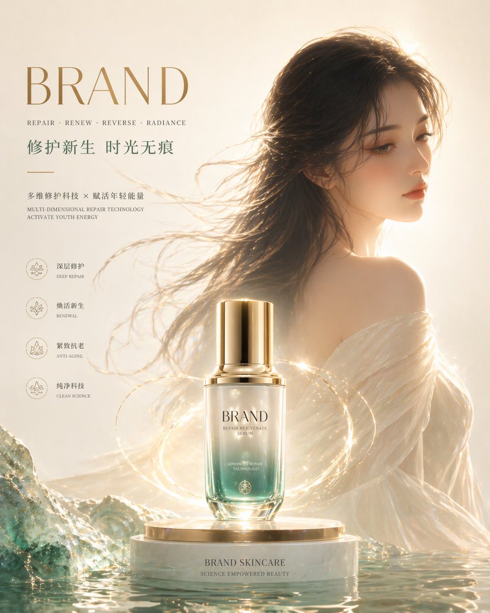
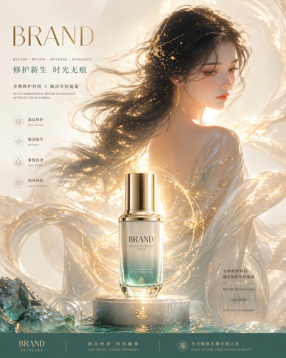
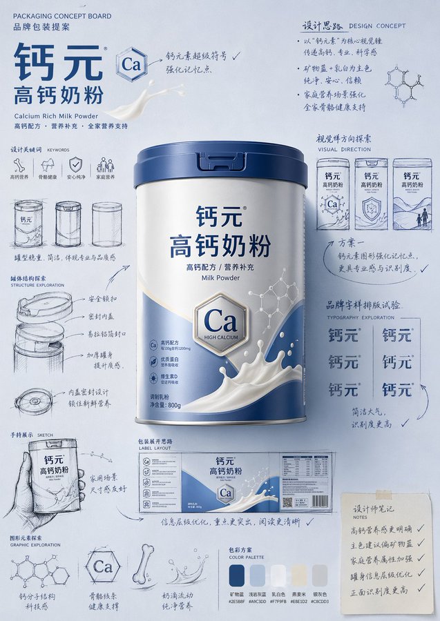
这类案例适合用在什么场景
- 把它当作 角色设计 的基准案例最合适,先看成片方向,再决定自己的 Prompt 要往哪边改。
- 如果你的目标也落在 海报、插画、角色 这些方向,这条案例特别适合先看图判断风格,再回头微调描述。
- 做 Prompt 对比时,也很适合作为控制组,只改一个变量去看结果变化。
画面重点与风格信号
- 这条案例最明显的风格信号集中在 海报、插画、角色,所以第一次改写时最好先保留这些关键词。
- 重点可以先看轮廓、服饰语言、情绪气质,以及角色是否一眼就能立住。
- 当前保留了 2 份媒体输出,适合顺手观察同一方向在多张结果里的稳定性。
Prompt 结构可以怎么理解
- 这条 Prompt 整体属于一条比较长、约束条件很多的 Prompt,很适合拿来判断这类方向到底需要写到多细。
- 关键词簇主要围绕 海报、插画、角色 展开,所以复用时可以先保留这组风格词,再替换主体、镜头、环境或文案信息。
- 最稳的改写方式通常是先保留结果方向和最强风格信号,只替换主体设定与场景块。
如果你是带着问题来的,可以先看这些角度
- 如果保留 海报、插画、角色,只换主体题材,结果最先变化的会是哪一部分?
- 这条结果里,哪些特征更像是 角色设计 的结构特征,哪些又是标签风格本身带来的?
- 同分类的相关案例里,哪几条能给你更克制或更极致的相邻变体?
完整 Prompt
Please generate a product introduction poster in the style of a "hand-drawn packaging proposal board" for [Product Name]. If I provide a product image, please use this image as the main reference, retain the product's core appearance features, packaging form, color, material, brand identity and overall temperament, and prioritize adopting the main color tone and color scheme from the product image for the design. If I do not provide a product image, please automatically generate a product appearance and packaging design that matches the positioning of [Product Name], and automatically match natural and reasonable main color, auxiliary color, and background color based on product attributes, category characteristics, and temperament. Overall poster style requirements: This is not an ordinary e-commerce detail page, nor a simple studio-shot poster, but a creative proposal board that integrates "finished product image + packaging design sketch + brand concept development process". The overall presentation is a highly aesthetic, high-completion brand design display image, like a designer presenting a packaging concept scheme. Image requirements: - Vertical composition - Use a unified and brand-aware main color tone background, the background color is naturally determined by the product itself, not fixed to a certain color - The color scheme should be coordinated with product attributes: if there is a reference image, prioritize inheriting the main color and brand color of the reference image; if there is no reference image, automatically generate a reasonable color scheme based on the product name - Place the most complete and eye-catching product main visual in the center of the image, with realistic texture, three-dimensional light and shadow, and commercial finished product effect - Add multiple auxiliary visual elements around the product: packaging sketches from different angles, structural sketches, partial shape explorations, hand-held display drafts, packaging unfolding ideas, brand typography layout experiments - Add natural and casual black or dark hand-drawn line drafts, arrows, circled marks, symbols, handwritten Chinese annotations, to give the image a strong sense of "design process" and "creative proposal" - The finished product image should be relatively exquisite and realistic, while the sketch part should be relatively casual and dynamic, forming a contrast between "finished product + design sketch" - The layout looks relaxed and free, but the overall should have order, rhythm, and a visual center, reflecting a high-end graphic design sense - Can moderately add small graphics, small symbols or fun elements related to the product to enhance brand memory points - The final effect should have a sense of brand, creativity, process, and visual impact Color scheme principles: - Do not fix a yellow background - Automatically select the main color tone based on product type, material, purpose, consumer feeling, and brand temperament - The background color, product color, text color, and sketch line color should be coordinated with each other - Can use a high-saturation single-color background, or a soft and unified color palette background, as long as the overall has a sense of brand and visual impact - Colors should naturally serve the product, rather than overshadowing it Style keywords: Packaging design proposal board, brand concept development, hand-drawn sketch, design process sense, moodboard, creative review draft, finished product rendering, visual experiment, commercial design poster Please pay special attention: - If there is a reference product image, prioritize following the reference image, do not deviate from the product itself - If there is no reference image, automatically generate a reasonable product appearance, packaging, and color scheme based on the product name, and maintain the overall style unity - The focus of the image is "product introduction + creative design process display" - Do not make it into an ordinary e-commerce detail page, do not make it into a promotional poster, do not make it overly neat and rigid, do not lack sketches and handwritten annotations, do not have a cheap sense, do not have a low-brow cartoon sense