案例媒体
案例说明
这个页面把案例媒体、完整 Prompt 和出处放在一起,方便你先看结果,再判断这条 Prompt 是否值得复制、收藏或加入对比。
案例解读
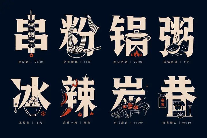
为了方便搜索、引用和后续复用,这里会把案例的适用场景、画面重点和 Prompt 结构拆成更容易浏览的说明。
这类案例适合用在什么场景
- 把它当作 角色设计 的基准案例最合适,先看成片方向,再决定自己的 Prompt 要往哪边改。
- 如果你的目标也落在 插画、角色、城市视觉 这些方向,这条案例特别适合先看图判断风格,再回头微调描述。
- 做 Prompt 对比时,也很适合作为控制组,只改一个变量去看结果变化。
画面重点与风格信号
- 这条案例最明显的风格信号集中在 插画、角色、城市视觉,所以第一次改写时最好先保留这些关键词。
- 重点可以先看轮廓、服饰语言、情绪气质,以及角色是否一眼就能立住。
- 当前保留了 2 份媒体输出,适合顺手观察同一方向在多张结果里的稳定性。
Prompt 结构可以怎么理解
- 这条 Prompt 整体属于一条比较长、约束条件很多的 Prompt,很适合拿来判断这类方向到底需要写到多细。
- 关键词簇主要围绕 插画、角色、城市视觉 展开,所以复用时可以先保留这组风格词,再替换主体、镜头、环境或文案信息。
- 最稳的改写方式通常是先保留结果方向和最强风格信号,只替换主体设定与场景块。
如果你是带着问题来的,可以先看这些角度
- 如果保留 插画、角色、城市视觉,只换主体题材,结果最先变化的会是哪一部分?
- 这条结果里,哪些特征更像是 角色设计 的结构特征,哪些又是标签风格本身带来的?
- 同分类的相关案例里,哪几条能给你更克制或更极致的相邻变体?
完整 Prompt
Generate a set of text-graphic integrated glyph icon systems based on any theme: each unit features a large-scale Chinese core character as the main visual. The glyphs maintain readability, weight, hard edges, with a slight sense of manual cutting. Key shapes derived from the theme are embedded inside strokes, replace partial strokes, or are hidden in negative space gaps, allowing the viewer to read the character first and then discover the object within the character, forming a moment where "character meaning and graphic complement each other." The overall layout uses a neat matrix arrangement with stable spacing between units. Beneath each character, tiny auxiliary text is configured, serving only indexing and rhythmic functions; the font weight is light, spacing is tight, alignment is restrained, and it does not compete with the main character. The graphic language consists of high-contrast silhouettes, simplified line engraving, partial line drawing, and solid block surfaces. Embedded objects must fit the stroke flow, appearing both as illustrations and as part of the character, avoiding an independent sticker feel; the complexity of each unit is similar, but the embedding methods must vary, creating a collection-album style of information density and recognition fun. Colors are extracted from the theme's own materials, emotions, and cultural signals, mapped only as character relationships: a large-area, low-brightness pure background provides support, high-brightness main information colors are responsible for glyph and graphic identification, and a small amount of theme accent colors are used only for key details or rhythmic points; maintain clear color scales, clean boundaries, controlled saturation, and calm, precise emotions. Even if the theme requires dark or vivid colors, maintain optical cleanliness, sharp edges, and background transparency, avoiding dirty grays, aging effects, smoke, or mud-colored overlays. The finished product should look like a systematically designed set of themed typeface specimens, combining text readability, graphic memory points, and a compact, orderly layout rhythm. —————— Target: Vertical 3:4, a "Rainy Day Commute Tips" for property or company groups, main characters can be "伞 (Umbrella), 滑 (Slippery), 迟 (Late), 鞋 (Shoes), 车 (Vehicle), 门 (Door)".