案例媒体
案例说明
这个页面把案例媒体、完整 Prompt 和出处放在一起,方便你先看结果,再判断这条 Prompt 是否值得复制、收藏或加入对比。
案例解读
为了方便搜索、引用和后续复用,这里会把案例的适用场景、画面重点和 Prompt 结构拆成更容易浏览的说明。
这类案例适合用在什么场景
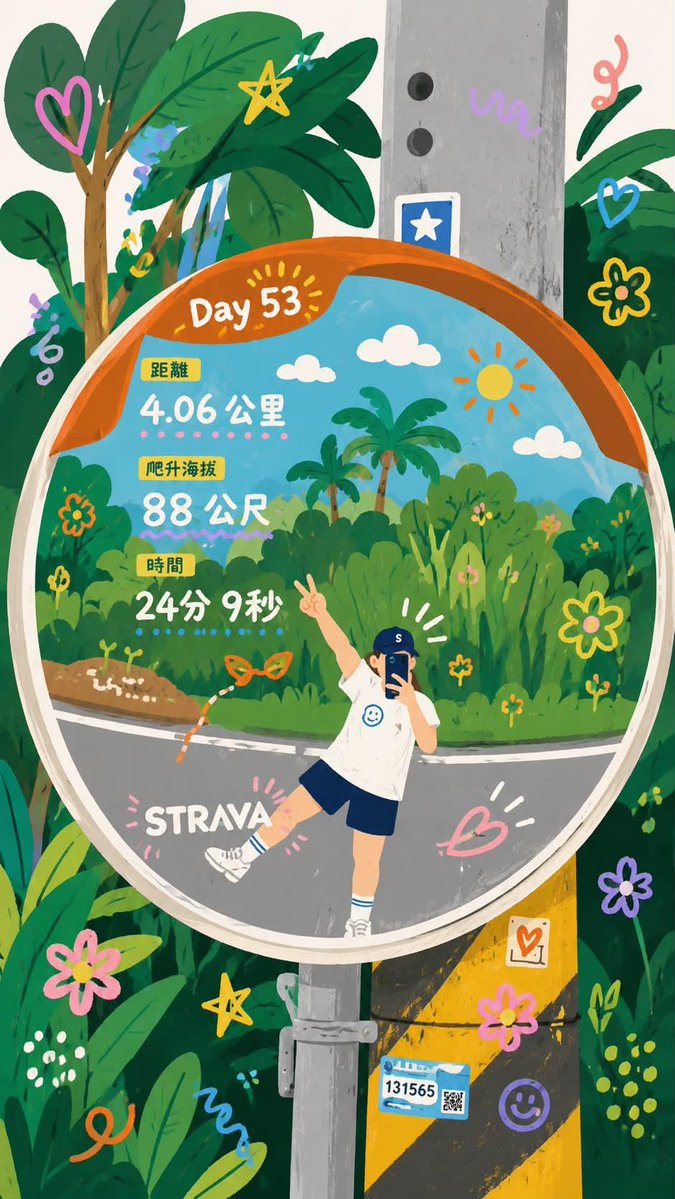
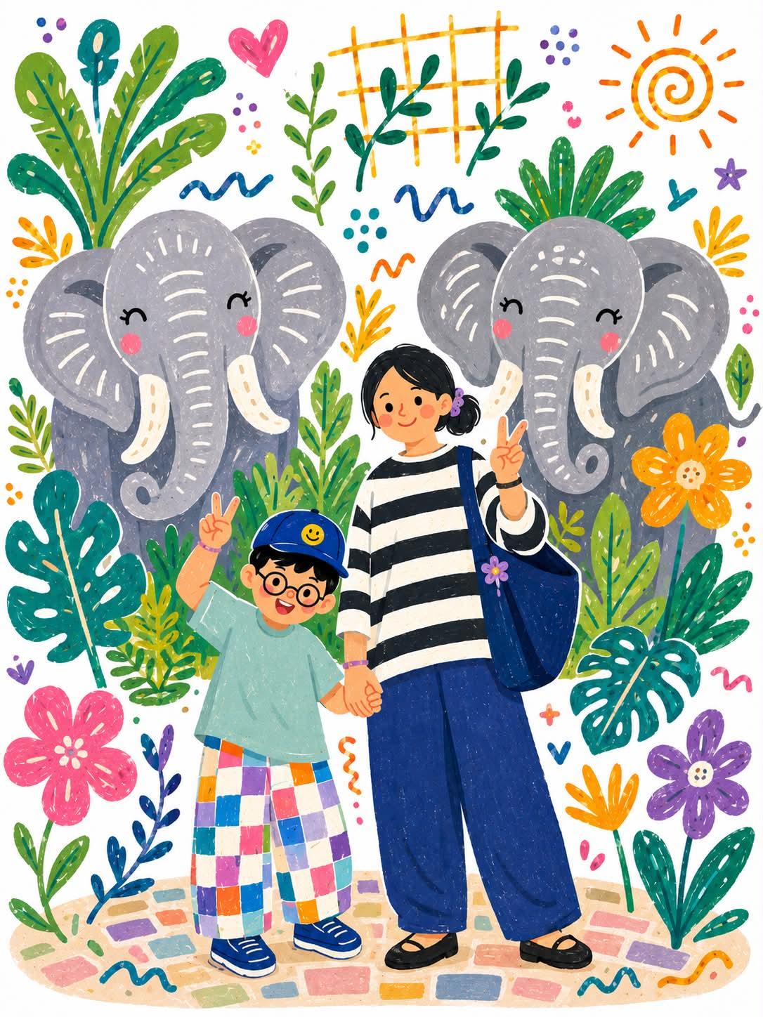
- 把它当作 角色设计 的基准案例最合适,先看成片方向,再决定自己的 Prompt 要往哪边改。
- 如果你的目标也落在 角色、城市视觉、水彩 这些方向,这条案例特别适合先看图判断风格,再回头微调描述。
- 做 Prompt 对比时,也很适合作为控制组,只改一个变量去看结果变化。
画面重点与风格信号
- 这条案例最明显的风格信号集中在 角色、城市视觉、水彩,所以第一次改写时最好先保留这些关键词。
- 重点可以先看轮廓、服饰语言、情绪气质,以及角色是否一眼就能立住。
- 当前保留了 2 份媒体输出,适合顺手观察同一方向在多张结果里的稳定性。
Prompt 结构可以怎么理解
- 这条 Prompt 整体属于一条比较长、约束条件很多的 Prompt,很适合拿来判断这类方向到底需要写到多细。
- 关键词簇主要围绕 角色、城市视觉、水彩 展开,所以复用时可以先保留这组风格词,再替换主体、镜头、环境或文案信息。
- 最稳的改写方式通常是先保留结果方向和最强风格信号,只替换主体设定与场景块。
如果你是带着问题来的,可以先看这些角度
- 如果保留 角色、城市视觉、水彩,只换主体题材,结果最先变化的会是哪一部分?
- 这条结果里,哪些特征更像是 角色设计 的结构特征,哪些又是标签风格本身带来的?
- 同分类的相关案例里,哪几条能给你更克制或更极致的相邻变体?
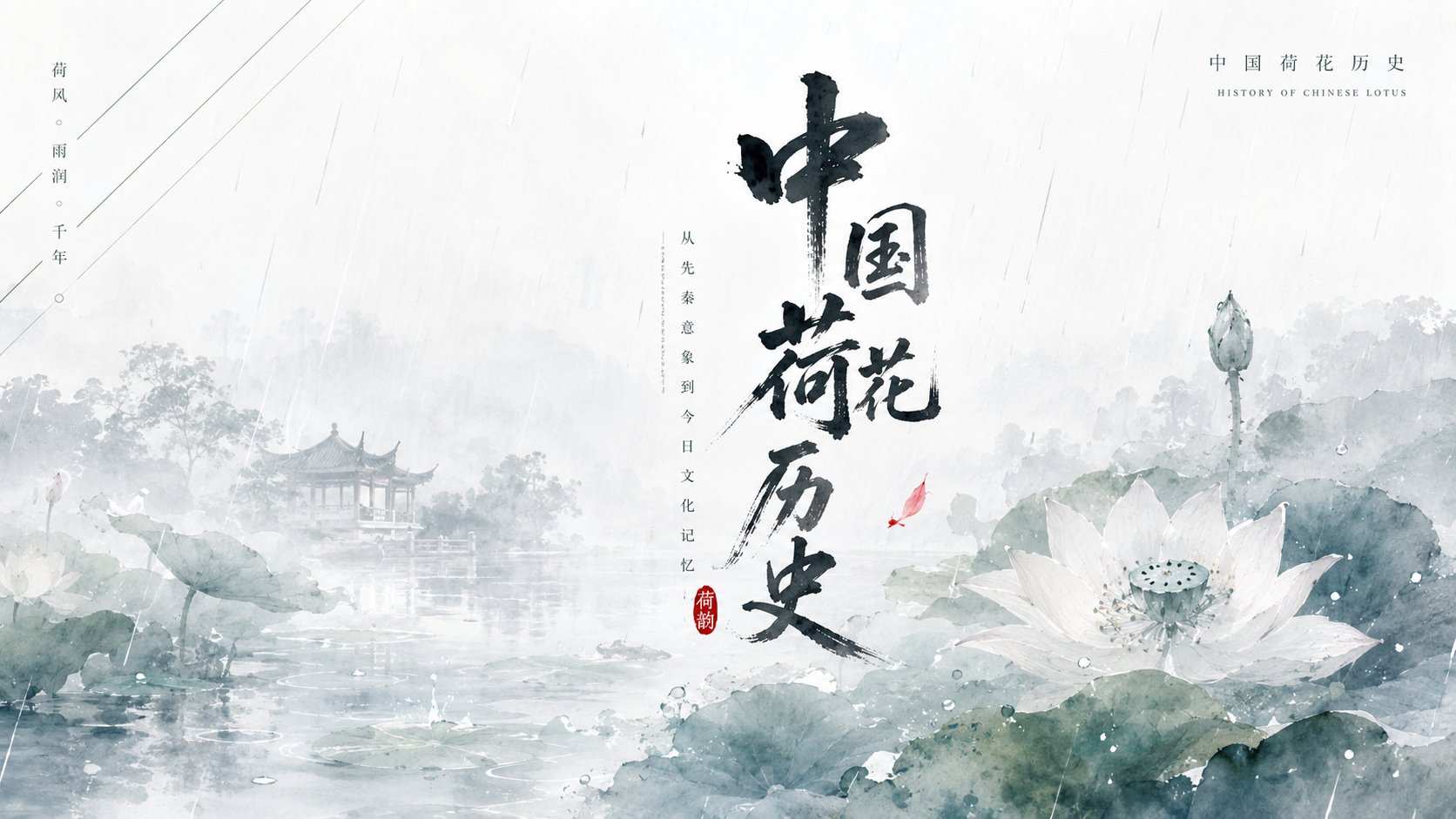
完整 Prompt
Generate a visual work with a clear seasonal feel based on the theme "Lotus" for the purpose of "Knowledge Infographic". Establish a central weight with a large-scale calligraphic main character or theme symbol at first glance. Brushstrokes should have dry and wet ink changes, feibai (flying white) edges, and an outward stretching momentum, appearing as if held up by air rather than filling the screen. The background should maintain a large area of high-brightness negative space and a soft misty light effect. A set of slender diagonal linear elements should be placed from the top left into the interior of the frame as a reading guide; the lines should be light, clean, and rhythmic, forming a dense-sparse contrast with the central main form. Below, use a translucent main form derived from the theme to carry the emotion, employing watercolor smudging, soft-focus edges, thin layering, and local enlargement, allowing the subject to grow out of the light-colored matte surface. Beside it, add an extremely small and clear theme-derived dot-like creature or symbol as a vitality focus, with a very small area but a brighter color. Informational text appears only as hierarchy and rhythm: retain the contrast between a small-sized rational title and light handwritten foreign text at the top, the central main character is the heaviest, and the short phrases at the bottom are quieter with relaxed letter spacing, leaving enough room to breathe. Colors are extracted from the theme's own season, material, emotion, and cultural signals, mapped to a large area of bright and clean base color, soft transparent main support colors, a small amount of clear emphasis color, and informational colors with clear light and dark levels. Maintain an overall bright, light, clear, and clean feel with high brightness, low turbidity, soft contrast, and transparent layers; even if the theme requires deeper colors, use clear deep colors and airy white space. The texture of the image combines light watercolor, soft misty light, clean paper surface, and calligraphic ink, avoiding crowded decoration, allowing the central brushstrokes, diagonal guidance, bottom transparent subject, and small-area vitality points to collectively form a refreshing and ritualistic theme memory. Aspect ratio 16:9.