案例媒体
案例说明
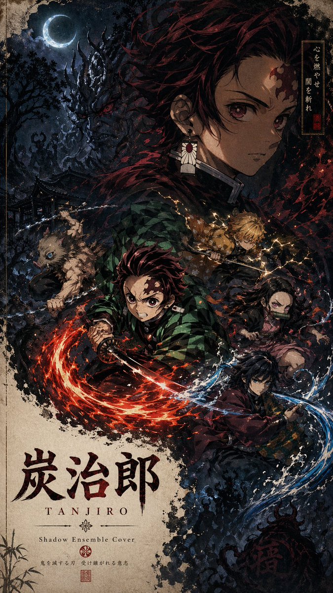
这个页面把案例媒体、完整 Prompt 和出处放在一起,方便你先看结果,再判断这条 Prompt 是否值得复制、收藏或加入对比。
案例解读
为了方便搜索、引用和后续复用,这里会把案例的适用场景、画面重点和 Prompt 结构拆成更容易浏览的说明。
这类案例适合用在什么场景
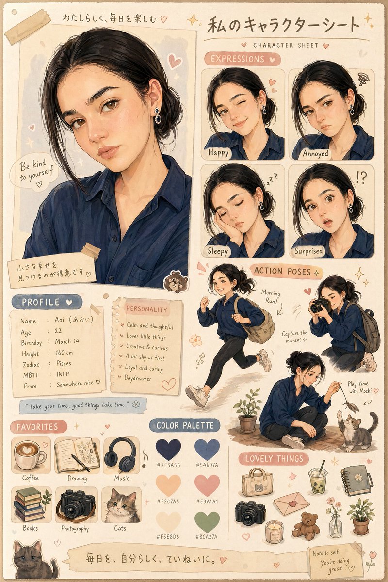
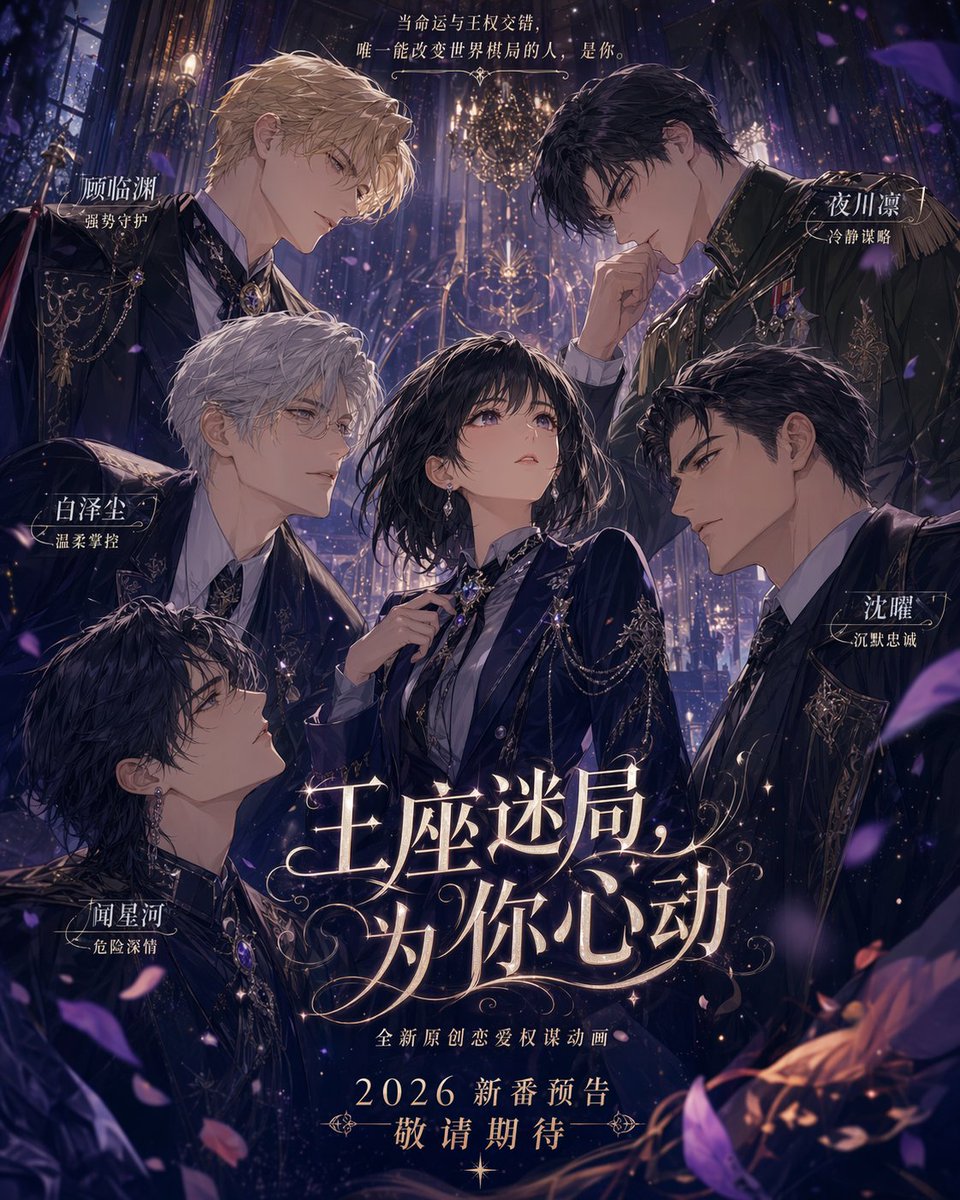
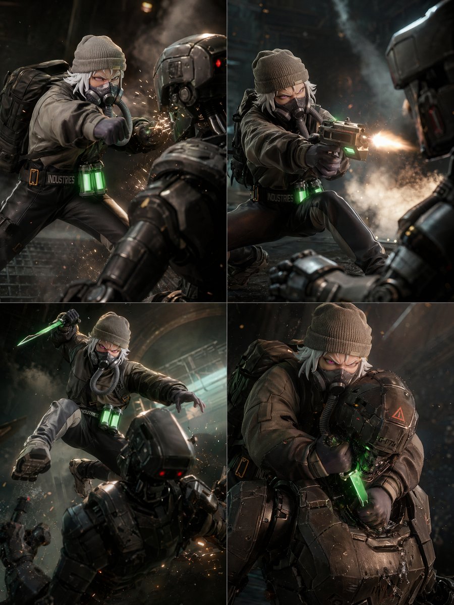
- 把它当作 角色设计 的基准案例最合适,先看成片方向,再决定自己的 Prompt 要往哪边改。
- 如果你的目标也落在 霓虹、人像、海报 这些方向,这条案例特别适合先看图判断风格,再回头微调描述。
- 做 Prompt 对比时,也很适合作为控制组,只改一个变量去看结果变化。
画面重点与风格信号
- 这条案例最明显的风格信号集中在 霓虹、人像、海报,所以第一次改写时最好先保留这些关键词。
- 重点可以先看轮廓、服饰语言、情绪气质,以及角色是否一眼就能立住。
- 当前保留了 2 份媒体输出,适合顺手观察同一方向在多张结果里的稳定性。
Prompt 结构可以怎么理解
- 这条 Prompt 整体属于一条比较长、约束条件很多的 Prompt,很适合拿来判断这类方向到底需要写到多细。
- 关键词簇主要围绕 霓虹、人像、海报 展开,所以复用时可以先保留这组风格词,再替换主体、镜头、环境或文案信息。
- 最稳的改写方式通常是先保留结果方向和最强风格信号,只替换主体设定与场景块。
如果你是带着问题来的,可以先看这些角度
- 如果保留 霓虹、人像、海报,只换主体题材,结果最先变化的会是哪一部分?
- 这条结果里,哪些特征更像是 角色设计 的结构特征,哪些又是标签风格本身带来的?
- 同分类的相关案例里,哪几条能给你更克制或更极致的相邻变体?
完整 Prompt
Please create a high-completion, high-narrative-tension, series-suitable "Shadow Ensemble Cover" based on [Theme: Write Character Name]. This is not an ordinary character illustration, nor a simple battle poster, but a "ensemble action cover" with a sense of novel cover, comic main visual, game promotional, and dark fantasy illustration. The image needs to combine a giant spiritual core character, multiple mid-ground action characters, background threat elements, local energy light effects, and a blank title area to form a complete character faction and worldview cover. 【Basic Settings】 Theme: [Theme, e.g., Jujutsu Battle / Dark Journey to the West / Cyber Hunter / Shanhai Jing Monster Hunting Squad / Doomsday Survivors / Magic Academy Combat Team] Work Name: [Work Name] Series Name / Brand Name: [Brand Name or Series Name] Subtitle: [Subtitle] Style Direction: [Style Direction, e.g., Dark Fantasy, Retro Comic Cover, Hand-painted Impasto, Fantasy Novel Cover, Game Main Visual] Main Color Tone: [Main Color Tone, e.g., Ink Green Black Gray / Deep Blue Neon / Dark Brown Gold Red / Sand Yellow Rust / Deep Purple Gold] Accent Color: [Accent Color, e.g., Blood Red Energy, Cyan-Green Magic Light, Golden Divine Light, Blue Lightning] Aspect Ratio: [Aspect Ratio, e.g., 2:3 Vertical / 3:4 Vertical / 4:5 Vertical / 9:16 Vertical] 【Image Structure】 Adopt a vertical cover composition. There must be a massive main visual character in the image, serving as the spiritual core and atmospheric dominant element of the entire image. This character can be a side face, half-body portrait, back view, front gaze, or giant silhouette, occupying the right side, upper side, or main background area of the image, with a calm, mysterious, and oppressive expression, not necessarily participating in combat, but must dominate the atmosphere of the entire image. Arrange 3 to 6 action characters in the mid-ground to form a combat faction ensemble. There needs to be a clear division of labor and posture differences among the characters, such as charging, holding a knife, casting spells, defending, summoning, jumping, standing guard, ranged attacking, etc. Avoid all characters standing still; a strong action rhythm and visual dynamic line must be formed. Add enemy threats or worldview elements to the background, such as monsters, giant beasts, villain shadows, mechanical legions, demons, ruins, forests, alien spaces, battlefield smoke, or city disasters. The background threat should not overshadow the main subjects, but should wrap around the characters like shadows, enhancing the sense of crisis and narrative depth. The image needs to set 1 to 2 high-saturation energy burst points, such as red flame fists, blue lightning, green curse aura, purple magic, golden divine light, or white blade light. Energy light effects should be concentrated on key characters or key weapons to form visual focal points, do not make the entire image glow evenly. 【Composition Method】 The overall structure adopts "Large Spiritual Core Character + Mid-ground Action Ensemble + Background Threat Shadow + Bottom or Side Blank Title Area". The image can use diagonal dynamic lines to organize characters, allowing the character ensemble to move from upper left to lower right, or rush from the bottom to the center, forming a strong sense of propulsion. Retain an obvious blank title area, recommended to be located at the lower left, bottom, or side of the image. The blank area uses off-white, gray-white, light paper color, or low-saturation background color for placing [Brand Name / Work Name / Subtitle]. The title typography should have a sense of publication cover, using elegant serif fonts, retro title fonts, comic cover titles, or high-end magazine-style layouts. The text area must be clear and not completely obscured by characters and the background. The edges of the illustration should not be a completely filled rectangle; irregular brush edges, ink diffusion, torn paper blank areas, or natural dissipation can be used, making the characters and background seem to grow out of the paper, enhancing the hand-drawn cover feel and artistic texture. 【Visual Style】 The overall style should be a combination of hand-painted impasto and comic covers, with paper texture, brushstroke feel, dark layer depth, and retro publication temperament. Light and shadow should be mainly low-key dark light, with the background darkened, character outlines clear, and local energy light providing high-contrast focal points. The image should not be overly clean, nor like ordinary smooth AI illustrations; it should retain hand-drawn textures, paper grains, edge brushstrokes, and dark fog. Color-wise, adopt mainly low-saturation dark tones, supplemented by a small amount of high-saturation energy colors. The overall atmosphere should have a sense of oppression, mystery, combat, and worldview thickness. 【Image Goal】 The final image should look like a mature fantasy novel cover, comic special edition cover, game character faction main visual, or IP promotional poster. It needs to simultaneously possess: 1. A clear main visual character; 2. A character ensemble with action rhythm; 3. Clear enemy threats or worldview background; 4. Strong but restrained energy light effects; 5. A readable title text area; 6. The overall texture of a retro hand-drawn cover. Please ensure the image information is rich but not chaotic, character hierarchy is clear, visual center of gravity is clear, reading path is natural, and it is suitable for subsequently replacing themes to continue generating works of the same series.