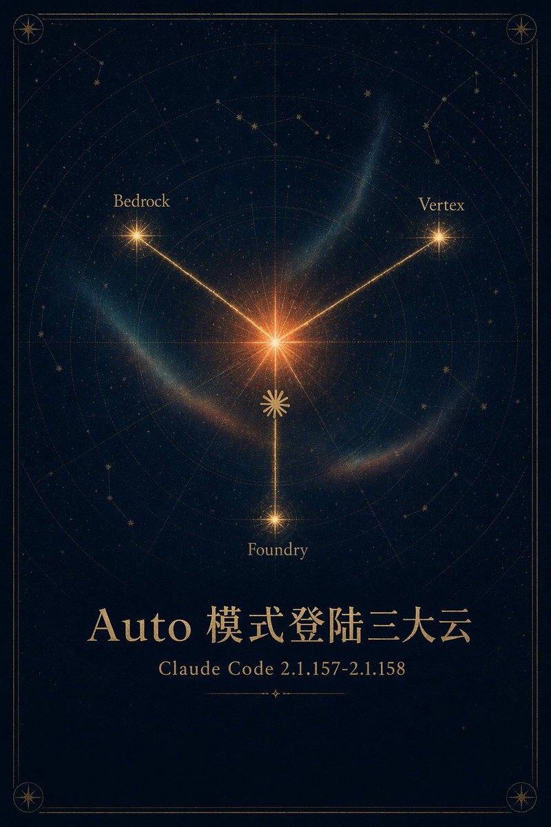
Case Media
Case Notes
This page keeps the media, full prompt, and original source together so you can inspect the result first and decide whether the prompt is worth copying, saving, or comparing.
Case Insights
To make this page easier to search, cite, and reuse later, the case is also broken down into practical guidance about usage, visual cues, and prompt structure.
Best Fit Scenarios
- Use this as a ui & social screens benchmark when you need a fast style baseline before rewriting your own prompt.
- It is especially helpful if your target overlaps with Neon, Cinematic, Poster and you want to judge the image result before tuning wording.
- Keep it as a control sample when you compare nearby prompt variants one variable at a time.
Visual Signals To Notice
- The clearest style signals here are Neon, Cinematic, Poster, so those should usually stay in your first rewrite.
- The important layer is usually interface density, card hierarchy, and how the screen tells the story before you read small text.
- This case keeps one primary output, so the first image should be treated as the main visual reference.
How The Prompt Is Structured
- The prompt reads as a long, highly specified prompt, which is useful when you want to judge how much specificity this direction needs.
- Its keyword cluster is centered on Neon, Cinematic, Poster, so you can usually keep that cluster while swapping subject, camera, layout, or copy details.
- A practical rewrite path is: keep the outcome, keep the strongest style cues, then replace only the subject and environment blocks.
Good Follow-up Questions
- What changes first if you keep Neon, Cinematic, Poster but switch the subject matter?
- Which part of the result comes from section-level structure (UI & Social Screens) versus tag-level style cues?
- Which related cases in the same section give you a cleaner or more extreme variation of the same direction?
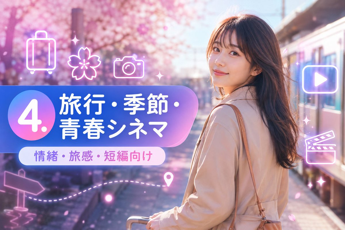
Full Prompt
Goal: Create a vibrant Japanese travel-video title card for a short-form prompt collection, combining a cinematic spring travel photo background with glossy neon UI graphics. Canvas: Horizontal 16:9 image, 1152×768 feel, high-resolution, bright pastel color grading, soft bloom and lens flare. Background: A young woman traveler stands on the right side at a train platform beside a modern train, viewed from behind/three-quarter back, face intentionally obscured by a plain skin-tone rectangular blur. She has long wavy dark brown hair, wears a light beige trench coat, carries a tan shoulder bag, and holds the handle of a small rolling suitcase near the bottom center. The setting is a dreamy cherry-blossom station in spring, with pink sakura trees filling the left and upper background, scattered falling petals, warm sunlight, and shallow depth of field. Main graphic layout: Place a large rounded gradient banner across the left-center, extending toward the woman. The banner uses a blue-to-purple-to-pink translucent glossy gradient with a large circular badge on the far left. Inside the circle, display a huge white number {argument name="section number" default="4."}. To the right of the circle, set bold rounded Japanese headline text in white: {argument name="headline text" default="旅行・季節・青春シネマ"}. Below it, add a smaller white rounded pill label with purple-pink text: {argument name="subtitle text" default="情緒・旅感・短編向け"}. Visible text count: exactly 3 text elements: 1 large number badge reading "4.", 1 main Japanese headline reading "旅行・季節・青春シネマ", and 1 subtitle pill reading "情緒・旅感・短編向け". Neon icon overlay count: exactly 9 glowing white-pink line icons and decorative elements around the banner and right side: 1 suitcase icon at upper left, 1 cherry blossom icon near upper center-left, 1 camera icon above the banner, 1 play button icon inside a rounded rectangle on the upper right, 1 clapperboard icon on the mid-right, 1 signpost arrow icon at lower left, 1 dotted travel path sweeping along the lower left-to-center, 1 map pin near the end of the dotted path, and 2 small sparkle/star accents near the top center and right side. Keep all icons semi-transparent, neon outlined, and softly glowing. Style: Japanese social-media thumbnail design, cute travel aesthetic, glossy gradient panels, soft pink and lavender atmosphere, cinematic bokeh, dreamy sakura petals, clean rounded typography, bright white text with subtle glow, polished promotional-card composition. Constraints: Keep the woman on the right and the graphic title block on the left, do not add extra text, do not add logos or watermarks, keep the face covered by a simple rectangular blur, and maintain a cheerful spring travel mood.