Case Media
Case Notes
This page keeps the media, full prompt, and original source together so you can inspect the result first and decide whether the prompt is worth copying, saving, or comparing.
Case Insights
To make this page easier to search, cite, and reuse later, the case is also broken down into practical guidance about usage, visual cues, and prompt structure.
Best Fit Scenarios
- Use this as a ui & social screens benchmark when you need a fast style baseline before rewriting your own prompt.
- It is especially helpful if your target overlaps with Cinematic, Fashion, Poster and you want to judge the image result before tuning wording.
- Keep it as a control sample when you compare nearby prompt variants one variable at a time.
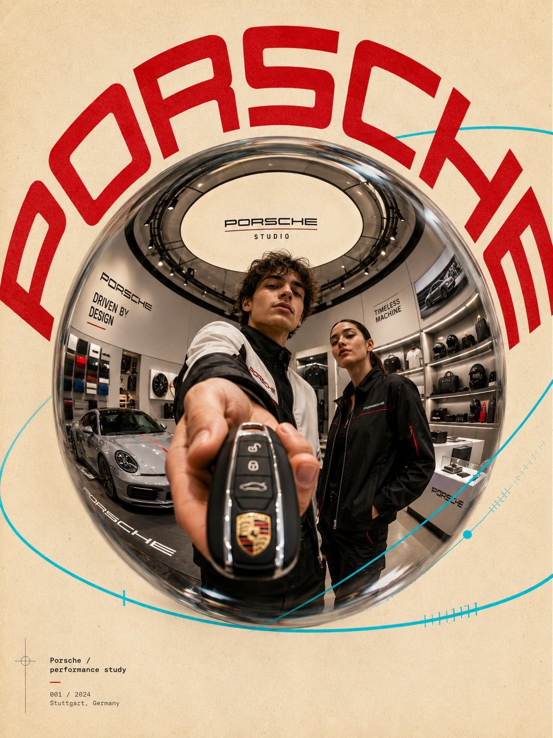
Visual Signals To Notice
- The clearest style signals here are Cinematic, Fashion, Poster, so those should usually stay in your first rewrite.
- The important layer is usually interface density, card hierarchy, and how the screen tells the story before you read small text.
- This case keeps 2 media outputs, which makes it easier to check whether the style remains stable across multiple results.
How The Prompt Is Structured
- The prompt reads as a long, highly specified prompt, which is useful when you want to judge how much specificity this direction needs.
- Its keyword cluster is centered on Cinematic, Fashion, Poster, so you can usually keep that cluster while swapping subject, camera, layout, or copy details.
- A practical rewrite path is: keep the outcome, keep the strongest style cues, then replace only the subject and environment blocks.
Good Follow-up Questions
- What changes first if you keep Cinematic, Fashion, Poster but switch the subject matter?
- Which part of the result comes from section-level structure (UI & Social Screens) versus tag-level style cues?
- Which related cases in the same section give you a cleaner or more extreme variation of the same direction?
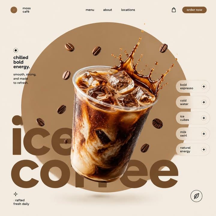
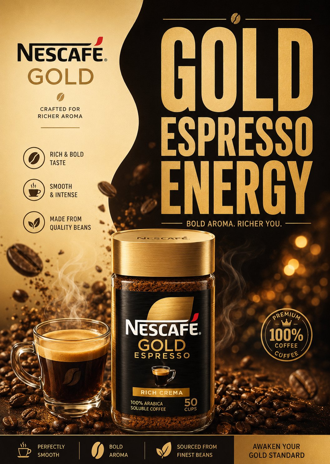
Full Prompt
“BREWED ELEGANCE. CLEAN EUROPEAN CAFÉ ENERGY.” Create a premium minimalist FMCG coffee poster for Eilles Gourmet Café inspired by modern European supermarket campaigns, Scandinavian graphic design, and retro-modern café advertising. The design should feel: minimal, premium, clean, balanced, editorial, commercial, and distinctly European. Avoid: — cinematic luxury scenes — cluttered coffee explosions — heavy realism — busy café environments — excessive effects or textures The final result should resemble a modern premium FMCG print advertisement. LAYOUT Vertical 4:5 composition with: — smooth split-background design — oversized stacked typography — centered coffee composition — minimal floating coffee beans — clean geometric spacing — simple promotional UI blocks — strong negative space The layout should feel organized, stylish, easy to read, and commercially polished. SPLIT BACKGROUND Create a soft organic two-tone background split. Left Side — cream — ivory — latte beige Right Side — royal Eilles blue — espresso brown — matte navy The split should feel smooth, fluid, minimal, and modern. Use only: — subtle gradients — soft shadows — light glow accents Avoid dramatic textures or cinematic smoke. TYPOGRAPHY Use HUGE ultra-bold condensed sans-serif typography occupying 40–50% of the poster. Style inspiration: — Bebas Neue — Anton — Druk Condensed — Oswald Bold Typography should feel: bold, clean, retro-modern, premium FMCG. Example headlines: “PURE CAFÉ ENERGY” “BREWED TO PERFECTION” “BOLD AROMA DAILY” Use: — tight spacing — strong vertical stacking — thin divider lines — minimal captions — subtle gold accents Avoid decorative fonts or excessive styling. HERO COFFEE COMPOSITION Create a semi-realistic premium coffee setup with minimalist commercial styling. Include: — gourmet coffee cup or espresso — soft steam curves — subtle splash arcs — glossy ceramic reflections — clean liquid highlights The rendering should feel like premium vector-style FMCG artwork, not cinematic realism. FLOATING ELEMENTS Add only a FEW controlled floating elements: — roasted coffee beans — subtle coffee droplets — soft steam ribbons Keep everything balanced and intentional. PRODUCT PACKAGING Include realistic Eilles Gourmet Café packaging integrated naturally into the layout. Packaging should: — maintain the iconic royal-blue-and-gold branding — feel glossy but simplified — look premium and clean Placement: — lower foreground — beside the coffee cup — slightly overlapping typography Do not overpower the composition. LIGHTING Use soft commercial studio lighting with: — clean highlights — subtle reflections — minimal shadows — flat premium rendering Avoid dramatic cinematic contrast. COLOR PALETTE Use only 2–4 dominant colors: — royal blue — cream — espresso brown — subtle gold accents Colors should feel flat, coordinated, premium, and print-ad ready. FINAL STYLE Modern European FMCG coffee poster. Minimal split-layout composition. Huge condensed typography. Semi-realistic vector-commercial rendering. Clean editorial spacing. Instagram-ready commercial aesthetic. Premium supermarket campaign quality. Aspect Ratio: 4:5 Ultra-clean poster realism High-detail commercial rendering