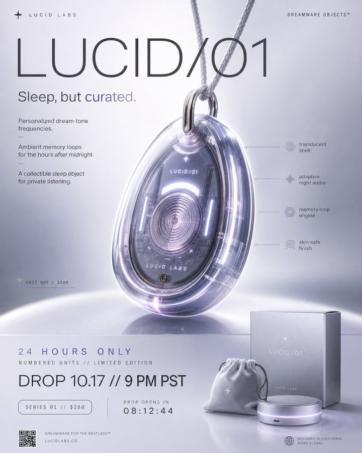
Case Media
Case Notes
This page keeps the media, full prompt, and original source together so you can inspect the result first and decide whether the prompt is worth copying, saving, or comparing.
Case Insights
To make this page easier to search, cite, and reuse later, the case is also broken down into practical guidance about usage, visual cues, and prompt structure.
Best Fit Scenarios
- Use this as a ui & social screens benchmark when you need a fast style baseline before rewriting your own prompt.
- It is especially helpful if your target overlaps with Neon, Fashion, Poster and you want to judge the image result before tuning wording.
- Keep it as a control sample when you compare nearby prompt variants one variable at a time.
Visual Signals To Notice
- The clearest style signals here are Neon, Fashion, Poster, so those should usually stay in your first rewrite.
- The important layer is usually interface density, card hierarchy, and how the screen tells the story before you read small text.
- This case keeps one primary output, so the first image should be treated as the main visual reference.
How The Prompt Is Structured
- The prompt reads as a long, highly specified prompt, which is useful when you want to judge how much specificity this direction needs.
- Its keyword cluster is centered on Neon, Fashion, Poster, so you can usually keep that cluster while swapping subject, camera, layout, or copy details.
- A practical rewrite path is: keep the outcome, keep the strongest style cues, then replace only the subject and environment blocks.
Good Follow-up Questions
- What changes first if you keep Neon, Fashion, Poster but switch the subject matter?
- Which part of the result comes from section-level structure (UI & Social Screens) versus tag-level style cues?
- Which related cases in the same section give you a cleaner or more extreme variation of the same direction?
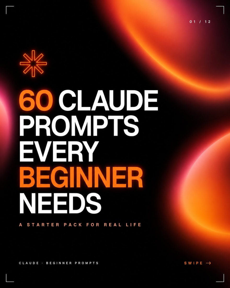
Full Prompt
Create a square 1:1 social media carousel cover with a premium dark tech aesthetic on a nearly black background. Use huge bold uppercase condensed sans-serif typography aligned left in stacked lines reading “{argument name="headline text" default="60 CLAUDE PROMPTS EVERY BEGINNER NEEDS"}”, with the words “60” and “BEGINNER” in vivid glowing orange and the remaining words in bright white. Beneath the headline, add a small widely spaced uppercase subtitle reading “{argument name="subtitle text" default="A STARTER PACK FOR REAL LIFE"}” in pale peach. Add a tiny footer label at bottom left reading “{argument name="footer text" default="CLAUDE · BEGINNER PROMPTS"}” and a bottom-right call to action reading “{argument name="call to action" default="SWIPE →"}” in orange. Include exactly 3 large soft blurred orange-red gradient orb shapes: one partial crescent orb entering from the upper right, one partial hot pink/orange glow entering from the lower right edge, and one small pink glow peeking from the left edge. Include exactly 1 orange outlined eight-point asterisk icon above the headline on the left. Add exactly 4 thin white corner crop marks, one in each corner, plus a small page indicator at the top right reading “{argument name="page indicator" default="01 / 12"}”. Overall style: high-contrast black, neon orange glow, clean editorial grid, sharp modern startup branding, minimal futuristic UI details, crisp typography, professional carousel thumbnail design.