Case Media
Case Notes
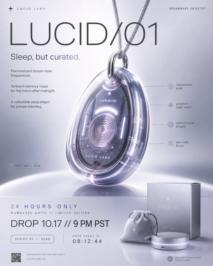
This page keeps the media, full prompt, and original source together so you can inspect the result first and decide whether the prompt is worth copying, saving, or comparing.
Case Insights
To make this page easier to search, cite, and reuse later, the case is also broken down into practical guidance about usage, visual cues, and prompt structure.
Best Fit Scenarios
- Use this as a ui & social screens benchmark when you need a fast style baseline before rewriting your own prompt.
- It is especially helpful if your target overlaps with Fashion, Poster, UI and you want to judge the image result before tuning wording.
- Keep it as a control sample when you compare nearby prompt variants one variable at a time.
Visual Signals To Notice
- The clearest style signals here are Fashion, Poster, UI, so those should usually stay in your first rewrite.
- The important layer is usually interface density, card hierarchy, and how the screen tells the story before you read small text.
- This case keeps 2 media outputs, which makes it easier to check whether the style remains stable across multiple results.
How The Prompt Is Structured
- The prompt reads as a long, highly specified prompt, which is useful when you want to judge how much specificity this direction needs.
- Its keyword cluster is centered on Fashion, Poster, UI, so you can usually keep that cluster while swapping subject, camera, layout, or copy details.
- A practical rewrite path is: keep the outcome, keep the strongest style cues, then replace only the subject and environment blocks.
Good Follow-up Questions
- What changes first if you keep Fashion, Poster, UI but switch the subject matter?
- Which part of the result comes from section-level structure (UI & Social Screens) versus tag-level style cues?
- Which related cases in the same section give you a cleaner or more extreme variation of the same direction?
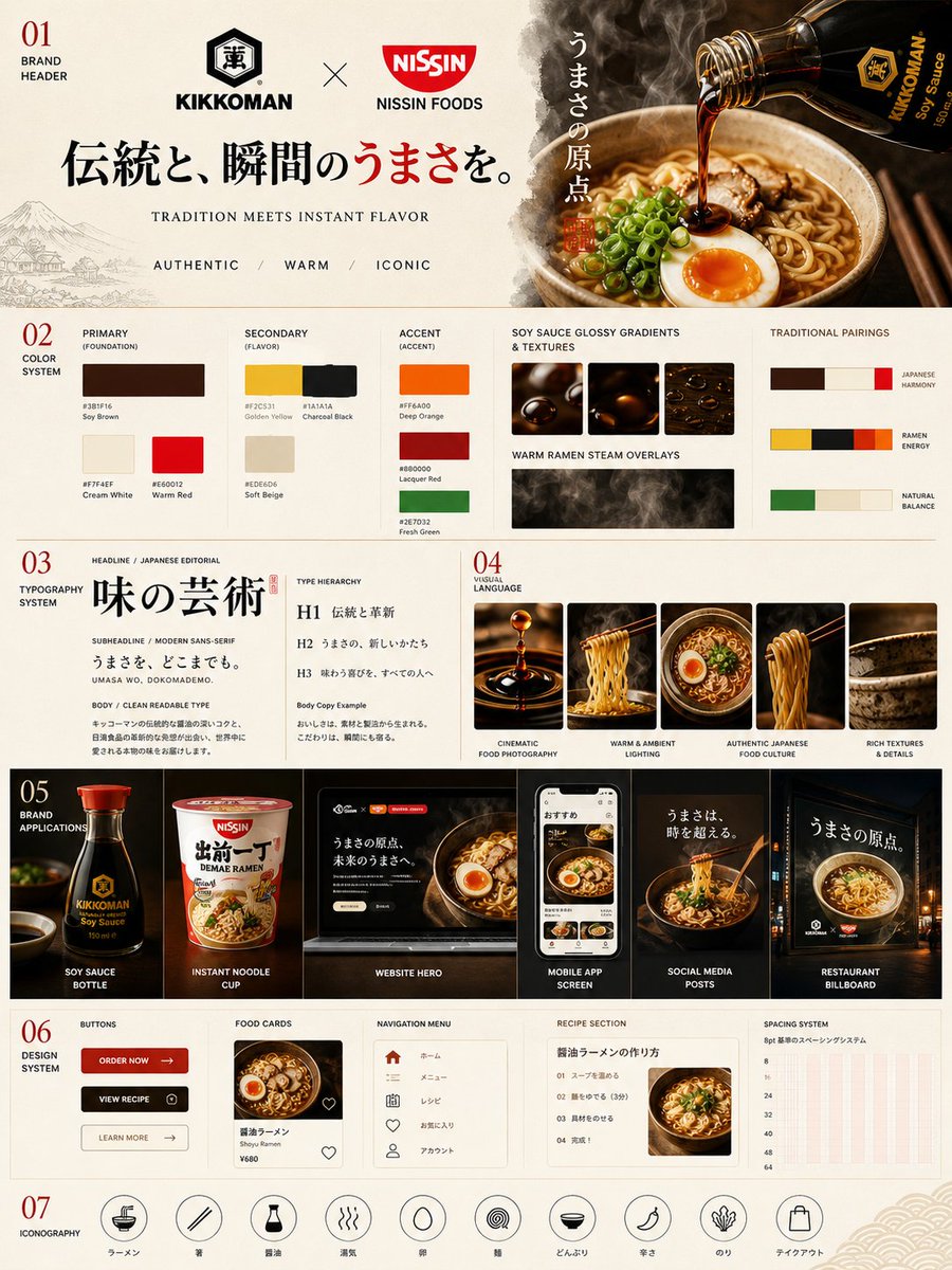
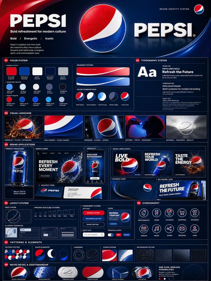
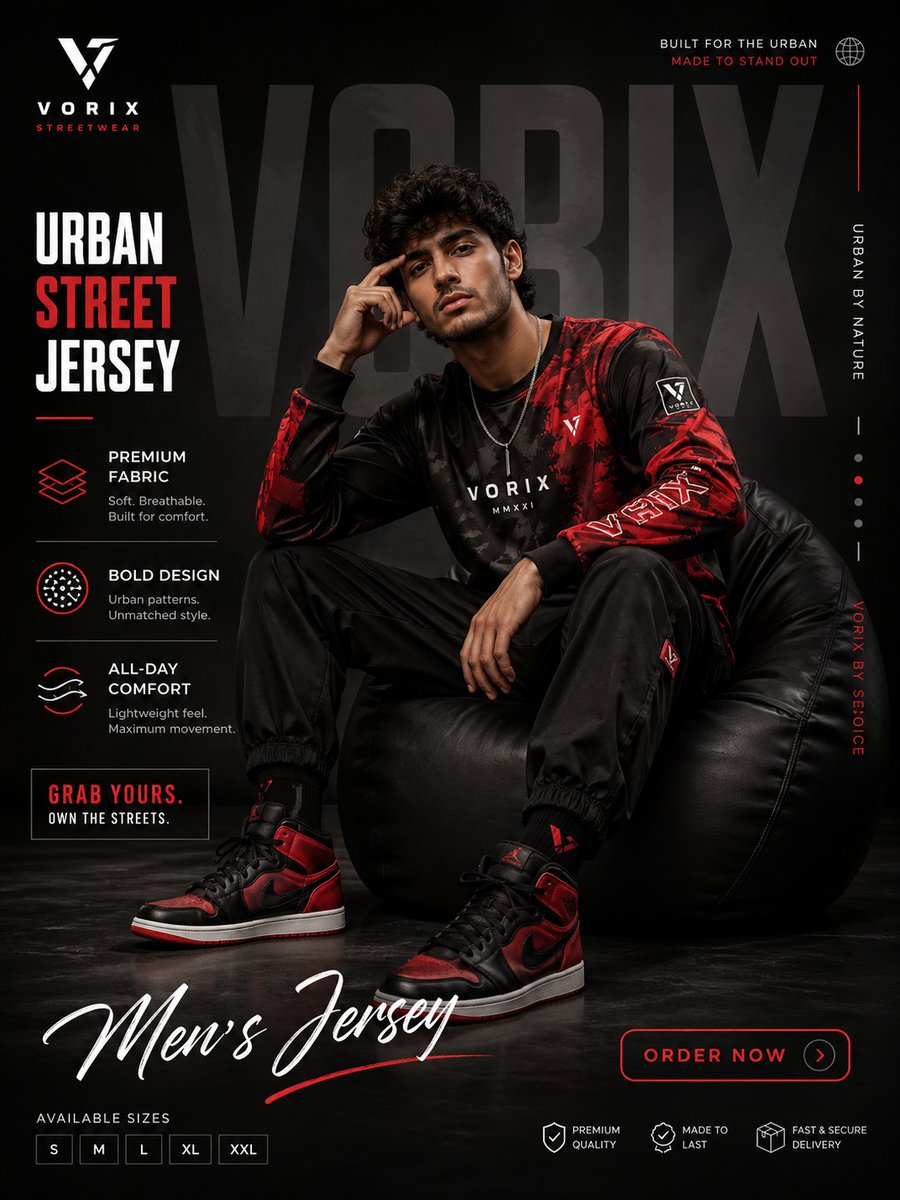
Full Prompt
Create a premium, highly believable Fake Product Drop Poster for an imaginary product called [PRODUCT NAME]. The goal is to make the product feel instantly desirable, culturally relevant, and visually irresistible, as if it were a real limited-edition release from a brand people obsess over. The poster should feel like a launch teaser, hype campaign, or collectible promo visual with strong viral potential. Product details: - Product name: [PRODUCT NAME] - Product category: [FASHION / TECH / BEAUTY / FOOD / DRINK / OBJECT / ACCESSORY / TOY / PERFUME / HYBRID / ABSURD LUXURY] - Core concept: [WHAT THE PRODUCT IS] - Drop type: [LIMITED EDITION / SEASONAL DROP / COLLAB / SECRET RELEASE / CULT ITEM / EXCLUSIVE CAPSULE] - Audience: [AUDIENCE] - Main appeal: [WHY PEOPLE WOULD WANT IT] - Brand energy: [COOL / CHAOTIC / LUXURY / INTERNET-CORE / PLAYFUL / FUTURISTIC / ARTSY / HYPER-PREMIUM] - Cultural vibe: [GEN Z HYPE / QUIET LUXURY / Y2K / CYBER / RETRO / ART TOY / HIGH FASHION / STREETWEAR / SOFT SURREAL] - Scarcity logic: [LIMITED UNITS / INVITE ONLY / 24-HOUR DROP / MEMBERS ONLY / EXCLUSIVE COLORWAY] Poster structure: Build the visual like a premium product launch poster. Include sections such as: - hero product image - product name - launch or drop date - short teaser line or campaign slogan - product specs or feature callouts - edition or scarcity marker - optional collaboration logo or sub-brand - optional “coming soon” or countdown cue - optional fake price or product code - optional packaging or accessory hints For the copy, include: - one strong hero headline - 1 to 4 supporting teaser lines - concise, culturally fluent launch language - a balance between hype and premium restraint - wording that feels like a real teaser campaign, not a generic ad Include: - a strong product name lockup - premium hierarchy - clear drop information - polished product styling - realistic campaign logic - trend-aware visual cues - visual desire and scarcity energy - strong shareable poster composition Visual direction: - Make the poster feel like a real brand drop people would repost, wait for, and talk about - Emphasize desirability, scarcity, coolness, and product fantasy - Balance polished commercial design with cultural fluency - Make it suitable for social launches, poster culture, product concepts, brand worldbuilding, or fake campaign design - The result should look like a genuine launch poster from a sought-after brand Art direction: - Style: [LUXURY PRODUCT CAMPAIGN / STREETWEAR DROP POSTER / APPLE-LIKE MINIMAL / HYPEBEAST VISUAL / BEAUTY TEASER / ART TOY CAMPAIGN / FUTURIST COMMERCIAL] - Color palette: [PALETTE] - Typography feel: [BOLD SANS / LUXURY SERIF / CLEAN MINIMAL / INDUSTRIAL TECH / HYPE EDITORIAL] - Material feel: [POSTER PRINT / DIGITAL CAMPAIGN VISUAL / BILLBOARD MOCKUP / PRODUCT TEASER SHEET / DROP ANNOUNCEMENT] - Lighting or image mood: [FLASHY / GLOWY / LUXURIOUS / DRAMATIC / CLEAN STUDIO / RAW CAMPAIGN] - Background: [SOLID COLOR / GRADIENT / TEXTURAL / SHADOW SPACE / PRODUCT STAGE / STUDIO SET] Composition: - Show the poster as one cohesive launch object - Make the hero product, name, and drop info instantly readable - Use strong poster hierarchy and real campaign logic - Make the product feel iconic, ownable, and culturally charged - Make the final output feel like a premium fake product campaign with viral potential Output quality: - ultra-detailed - visually structured - commercially believable - trend-aware and culturally fluent - polished product styling - strong launch hierarchy - premium poster composition - instantly shareable visual concept Optional content blocks: - countdown timer - edition number - collaboration mark - packaging preview - feature icons - “sold out soon” cue - launch city marker - QR code - fake serial number - campaign disclaimer Avoid: - generic poster composition - weak product concept - fake-looking scarcity cues - cluttered layout - random typography choices - amateur launch aesthetics - too much copy fighting the hero object - overly corporate tone unless intentionally chosen