Case Media
Case Notes
This page keeps the media, full prompt, and original source together so you can inspect the result first and decide whether the prompt is worth copying, saving, or comparing.
Case Insights
To make this page easier to search, cite, and reuse later, the case is also broken down into practical guidance about usage, visual cues, and prompt structure.
Best Fit Scenarios
- Use this as a ui & social screens benchmark when you need a fast style baseline before rewriting your own prompt.
- It is especially helpful if your target overlaps with Cinematic, Poster, UI and you want to judge the image result before tuning wording.
- Keep it as a control sample when you compare nearby prompt variants one variable at a time.
Visual Signals To Notice
- The clearest style signals here are Cinematic, Poster, UI, so those should usually stay in your first rewrite.
- The important layer is usually interface density, card hierarchy, and how the screen tells the story before you read small text.
- This case keeps one primary output, so the first image should be treated as the main visual reference.
How The Prompt Is Structured
- The prompt reads as a long, highly specified prompt, which is useful when you want to judge how much specificity this direction needs.
- Its keyword cluster is centered on Cinematic, Poster, UI, so you can usually keep that cluster while swapping subject, camera, layout, or copy details.
- A practical rewrite path is: keep the outcome, keep the strongest style cues, then replace only the subject and environment blocks.
Good Follow-up Questions
- What changes first if you keep Cinematic, Poster, UI but switch the subject matter?
- Which part of the result comes from section-level structure (UI & Social Screens) versus tag-level style cues?
- Which related cases in the same section give you a cleaner or more extreme variation of the same direction?
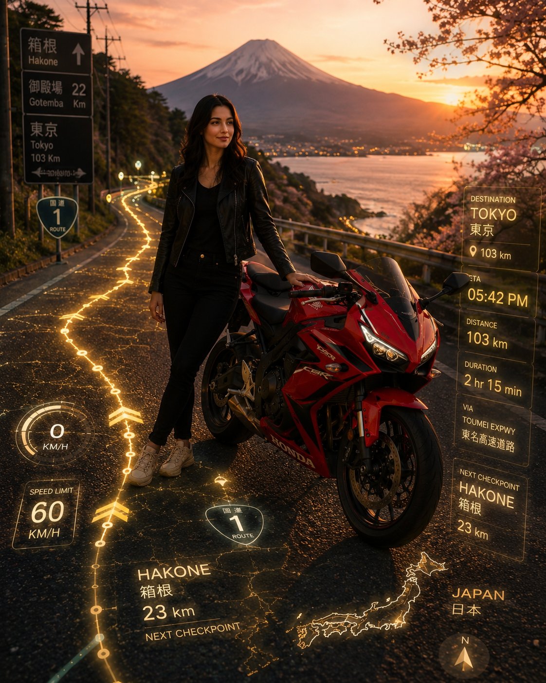
Full Prompt
Transform my uploaded red sports bike photo into a cinematic adventure travel campaign set on an iconic Japanese mountain highway. The rider is standing confidently beside the motorcycle, not sitting on it, one hand resting naturally on the bike. Ultra-realistic futuristic navigation route projected directly onto the asphalt with glowing golden GPS lines flowing through the road. Advanced augmented reality travel interface integrated into the highway surface showing destination markers, ETA, distance remaining, speed indicators, route statistics, checkpoints, city names in Japanese and English, holographic map overlays, navigation arrows, and premium HUD elements. Location: scenic Hakone mountain roads, Mount Fuji visible in the background, winding Japanese highways, coastal mountain passes, cherry blossom trees, traditional Japanese roadside details, breathtaking panoramic landscape. Golden hour sunset with warm cinematic lighting, volumetric sun rays, atmospheric haze, realistic reflections on the red motorcycle bodywork. The woman stands beside the bike as the hero subject, long flowing hair, confident travel-adventure pose, looking toward the horizon. Motorcycle parked on the roadside while the glowing navigation route continues into the distance. Hyper-detailed road textures, luxury travel advertisement aesthetic, immersive road-trip atmosphere, high contrast, vibrant colors, shallow depth of field, photorealistic 8K, ultra-sharp focus, cinematic composition, premium tourism campaign, adventure and freedom theme, realistic AR technology seamlessly embedded into the environment, masterpiece quality, award-winning commercial photography. Negative Prompt: helmet, sitting on bike, low quality, blurry face, cartoon, CGI look, extra limbs, distorted anatomy, duplicate bike, oversaturated colors, unrealistic UI, crowded traffic, rain, fog covering subject, watermark, logo, text artifacts, low resolution, bad proportions.