Case Media
Case Notes
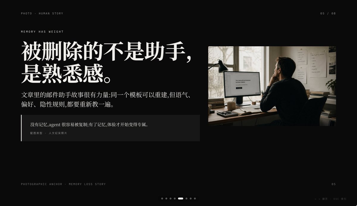
This page keeps the media, full prompt, and original source together so you can inspect the result first and decide whether the prompt is worth copying, saving, or comparing.
Case Insights
To make this page easier to search, cite, and reuse later, the case is also broken down into practical guidance about usage, visual cues, and prompt structure.
Best Fit Scenarios
- Use this as a ui & social screens benchmark when you need a fast style baseline before rewriting your own prompt.
- It is especially helpful if your target overlaps with Cinematic, Fashion, UI and you want to judge the image result before tuning wording.
- Keep it as a control sample when you compare nearby prompt variants one variable at a time.
Visual Signals To Notice
- The clearest style signals here are Cinematic, Fashion, UI, so those should usually stay in your first rewrite.
- The important layer is usually interface density, card hierarchy, and how the screen tells the story before you read small text.
- This case keeps one primary output, so the first image should be treated as the main visual reference.
How The Prompt Is Structured
- The prompt reads as a long, highly specified prompt, which is useful when you want to judge how much specificity this direction needs.
- Its keyword cluster is centered on Cinematic, Fashion, UI, so you can usually keep that cluster while swapping subject, camera, layout, or copy details.
- A practical rewrite path is: keep the outcome, keep the strongest style cues, then replace only the subject and environment blocks.
Good Follow-up Questions
- What changes first if you keep Cinematic, Fashion, UI but switch the subject matter?
- Which part of the result comes from section-level structure (UI & Social Screens) versus tag-level style cues?
- Which related cases in the same section give you a cleaner or more extreme variation of the same direction?
Full Prompt
A premium dark presentation slide in a minimalist editorial tech style, widescreen 16:9 layout, matte black background with refined off-white typography and subtle gray divider lines. The overall mood is sleek, cinematic, and high-end, like a product keynote or design-forward AI startup deck. In the top left, place 2 small navigation lines of text: "UI SCENE · OPEN HARNESS" and below it "DEEP AGENTS" in thin uppercase sans serif with generous tracking. In the top right, add a small page indicator reading "07 / 08". The main headline dominates the upper left in large elegant serif Chinese and English mixed typography: {argument name="headline text" default="开放 harness,开放记忆。"}. Below it, add a 2-line Chinese body paragraph in smaller serif text: {argument name="body text" default="解决方案不是让模型供应商替你保管状态,而是把 harness、标准和记忆后端都放回开发者手里。"}. In the left-middle area, create 3 horizontal feature rows separated by thin gray lines, each row using a bold Chinese label on the left, a short Chinese description in the center, and a tiny uppercase English keyword aligned right. Row 1 label: "标准", description: "agents.md / skills 让上下文入口可见。", keyword: "OPEN". Row 2 label: "模型", description: "模型可替换,记忆不应被单一平台绑定。", keyword: "AGNOSTIC". Row 3 label: "存储", description: "Mongo / Postgres / Redis 可作为自有记忆后端。", keyword: "OWNED". On the right side, place a large embedded UI mockup inside a soft light-gray rounded rectangular frame with a subtle shadow, resembling a product dashboard screenshot. The mockup should be monochrome light beige and gray, highly structured, and divided into 3 main columns. Left column: a narrow vertical icon sidebar plus a project/file panel listing items such as "agents.md", "skills", "workflows", "memories", "tools", and a code editor block at the bottom. Center column: a section titled "模型无关" with 4 selectable model rows and small controls, plus 3 feature cards along the bottom. Right column: a section titled "记忆后端" with 3 database cards for MongoDB, Postgres, and Redis, and a lower panel titled "可迁移" showing a code snippet. Include another top card in the mockup titled "开放标准" with tab-like controls. At the bottom left outside the mockup, add a tiny caption line in Chinese and English reading "UI 情景图 · 三张同高画面板测试". At the bottom center, include a carousel indicator made of 8 small dots with the 7th highlighted as a short white pill and the others as dim gray circles. At the bottom right, place a small page number "07". Also add a faint tiny footer note near the lower right edge in Chinese and English, very subtle, such as a presentation metadata line. Use precise grid alignment, lots of negative space, understated luxury, Swiss-style composition, and a polished AI-product keynote aesthetic.