Case Media
Case Notes
This page keeps the media, full prompt, and original source together so you can inspect the result first and decide whether the prompt is worth copying, saving, or comparing.
Case Insights
To make this page easier to search, cite, and reuse later, the case is also broken down into practical guidance about usage, visual cues, and prompt structure.
Best Fit Scenarios
- Use this as a ui & social screens benchmark when you need a fast style baseline before rewriting your own prompt.
- It is especially helpful if your target overlaps with 35mm, Cinematic, Fashion and you want to judge the image result before tuning wording.
- Keep it as a control sample when you compare nearby prompt variants one variable at a time.
Visual Signals To Notice
- The clearest style signals here are 35mm, Cinematic, Fashion, so those should usually stay in your first rewrite.
- The important layer is usually interface density, card hierarchy, and how the screen tells the story before you read small text.
- This case keeps one primary output, so the first image should be treated as the main visual reference.
How The Prompt Is Structured
- The prompt reads as a long, highly specified prompt, which is useful when you want to judge how much specificity this direction needs.
- Its keyword cluster is centered on 35mm, Cinematic, Fashion, so you can usually keep that cluster while swapping subject, camera, layout, or copy details.
- A practical rewrite path is: keep the outcome, keep the strongest style cues, then replace only the subject and environment blocks.
Good Follow-up Questions
- What changes first if you keep 35mm, Cinematic, Fashion but switch the subject matter?
- Which part of the result comes from section-level structure (UI & Social Screens) versus tag-level style cues?
- Which related cases in the same section give you a cleaner or more extreme variation of the same direction?
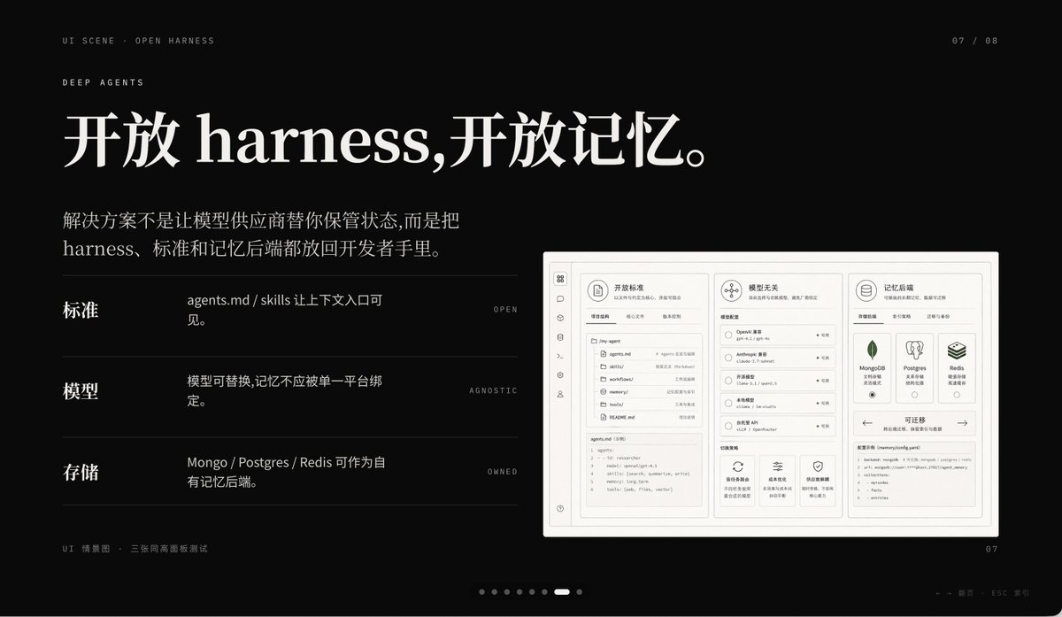
Full Prompt
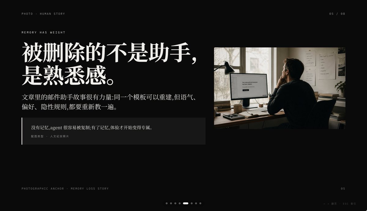
Create a minimalist cinematic presentation slide on a deep black background in a premium editorial PPT style, widescreen 16:9. The layout is asymmetrical, with a large text block on the left and one documentary-style photo on the upper right, leaving generous negative space. Use elegant high-contrast Chinese typography with an upscale magazine feel. At the top left, place small uppercase microtext reading "PHOTO • HUMAN STORY". Slightly below it, add another small uppercase line reading "MEMORY HAS WEIGHT". The main headline on the left is very large, bold, white Chinese serif text across 2 lines: {argument name="headline text" default="被删除的不是助手,\n是熟悉感。"}. Beneath it, place a smaller Chinese paragraph in white or light gray, 2 lines, reading: {argument name="body text" default="文章里的邮件助手故事很有力量:同一个模板可以重建,但语气、\n偏好、隐性规则,都要重新教一遍。"}. Below that, add a dark translucent quote box with a thin vertical white line at its left edge; inside, include 2 text levels: the quote in Chinese, {argument name="quote" default="没有记忆,agent 很容易被复制;有了记忆,体验才开始变得专属。"}, and a smaller attribution line reading "配图类型 · 人文纪实照片". On the right, insert a single warm-toned humanistic documentary photo: 1 adult person seen from behind, seated at a desk in a dim office, looking at a computer monitor; a desk lamp stands to the left of the monitor, papers are pinned on the wall, and soft daylight comes through a window. The monitor displays a simple white interface with the centered English message {argument name="screen text" default="Your conversational Assistant has been deleted."}. The photo should feel like film photography, muted browns and grays, intimate, reflective, and slightly melancholic. Add small interface-like pagination details: top right "05 / 08", bottom left microtext "PHOTOGRAPHIC ANCHOR · MEMORY LOSS STORY", bottom right small "05", and at the bottom center 8 tiny pagination dots with the 5th dot highlighted as an elongated white pill while the others are dim gray circles. In the extreme bottom right corner, add tiny navigation hints "← → 翻页 · ESC 关闭". Overall mood: editorial, restrained, cinematic, memory and loss, premium keynote slide design, clean spacing, precise alignment, high-end storytelling presentation aesthetic.