Case Media
Case Notes
This page keeps the media, full prompt, and original source together so you can inspect the result first and decide whether the prompt is worth copying, saving, or comparing.
Case Insights
To make this page easier to search, cite, and reuse later, the case is also broken down into practical guidance about usage, visual cues, and prompt structure.
Best Fit Scenarios
- Use this as a ui & social screens benchmark when you need a fast style baseline before rewriting your own prompt.
- It is especially helpful if your target overlaps with Neon, Cinematic, Fashion and you want to judge the image result before tuning wording.
- Keep it as a control sample when you compare nearby prompt variants one variable at a time.
Visual Signals To Notice
- The clearest style signals here are Neon, Cinematic, Fashion, so those should usually stay in your first rewrite.
- The important layer is usually interface density, card hierarchy, and how the screen tells the story before you read small text.
- This case keeps one primary output, so the first image should be treated as the main visual reference.
How The Prompt Is Structured
- The prompt reads as a long, highly specified prompt, which is useful when you want to judge how much specificity this direction needs.
- Its keyword cluster is centered on Neon, Cinematic, Fashion, so you can usually keep that cluster while swapping subject, camera, layout, or copy details.
- A practical rewrite path is: keep the outcome, keep the strongest style cues, then replace only the subject and environment blocks.
Good Follow-up Questions
- What changes first if you keep Neon, Cinematic, Fashion but switch the subject matter?
- Which part of the result comes from section-level structure (UI & Social Screens) versus tag-level style cues?
- Which related cases in the same section give you a cleaner or more extreme variation of the same direction?
Full Prompt
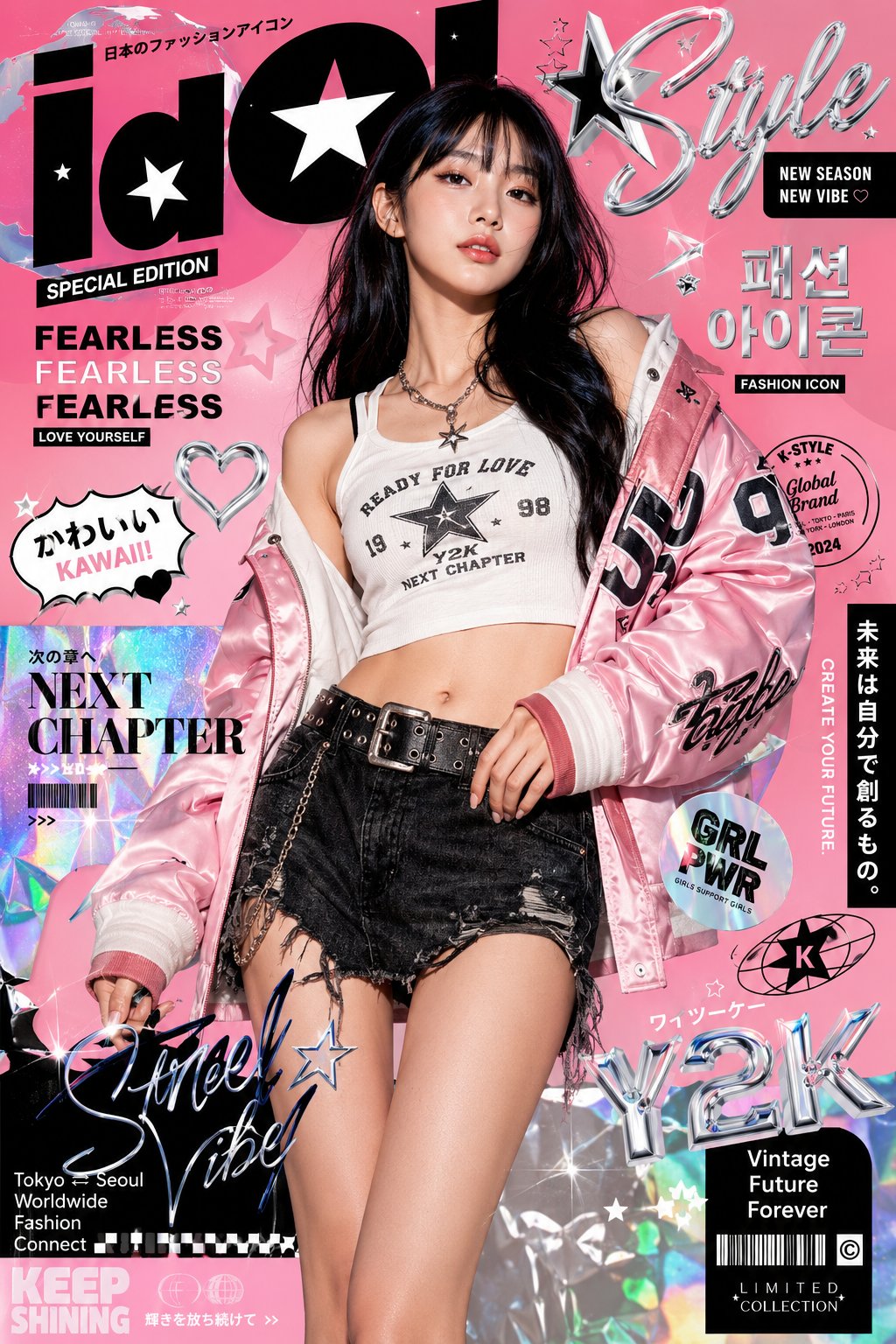
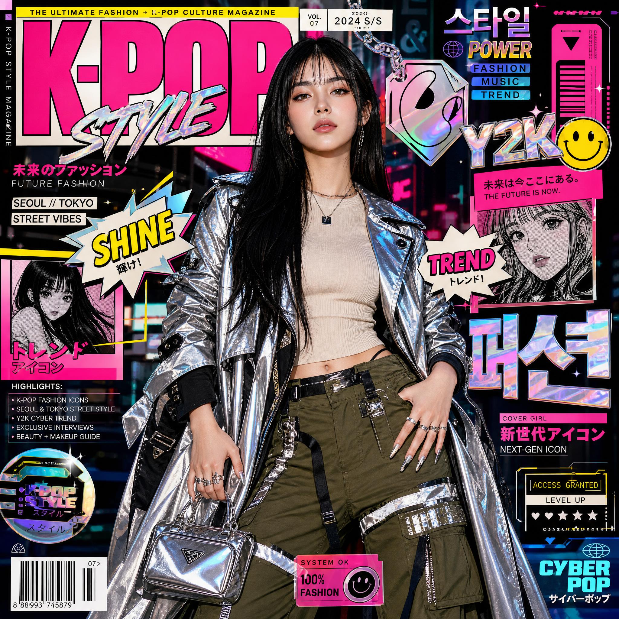
Hyper-stylized K-pop fashion magazine cover featuring a glamorous young woman with long straight jet-black hair and soft bangs, flawless glowing skin, sharp makeup, standing confidently in futuristic streetwear. She wears a metallic silver and black trench coat, beige knit top, olive green cargo pants with reflective panels, luxury mini handbag, statement rings, and long chrome nails. Background filled with vibrant pop-art collage elements, holographic stickers, manga panels, neon typography, Japanese and Korean text, fashion magazine layouts, comic speech bubbles saying “SHINE” and “TREND,” barcode graphics, cyber UI overlays, and urban Seoul/Tokyo street-fashion vibes. Color palette of neon pink, cyan, yellow, black, and holographic chrome. Bold editorial composition, centered full-body pose, glossy magazine aesthetic, Y2K cyberpop style, luxury fashion campaign look, anime-inspired graphic design, ultra detailed textures, cinematic lighting, sharp focus, high contrast, vibrant saturation, futuristic Gen-Z aesthetic, photorealistic face, mixed with illustrated magazine collage elements, 8k, premium editorial quality.