Case Media
Case Notes
This page keeps the media, full prompt, and original source together so you can inspect the result first and decide whether the prompt is worth copying, saving, or comparing.
Case Insights
To make this page easier to search, cite, and reuse later, the case is also broken down into practical guidance about usage, visual cues, and prompt structure.
Best Fit Scenarios
- Use this as a ui & social screens benchmark when you need a fast style baseline before rewriting your own prompt.
- It is especially helpful if your target overlaps with UI, Screenshot, Minimal and you want to judge the image result before tuning wording.
- Keep it as a control sample when you compare nearby prompt variants one variable at a time.
Visual Signals To Notice
- The clearest style signals here are UI, Screenshot, Minimal, so those should usually stay in your first rewrite.
- The important layer is usually interface density, card hierarchy, and how the screen tells the story before you read small text.
- This case keeps one primary output, so the first image should be treated as the main visual reference.
How The Prompt Is Structured
- The prompt reads as a long, highly specified prompt, which is useful when you want to judge how much specificity this direction needs.
- Its keyword cluster is centered on UI, Screenshot, Minimal, so you can usually keep that cluster while swapping subject, camera, layout, or copy details.
- A practical rewrite path is: keep the outcome, keep the strongest style cues, then replace only the subject and environment blocks.
Good Follow-up Questions
- What changes first if you keep UI, Screenshot, Minimal but switch the subject matter?
- Which part of the result comes from section-level structure (UI & Social Screens) versus tag-level style cues?
- Which related cases in the same section give you a cleaner or more extreme variation of the same direction?
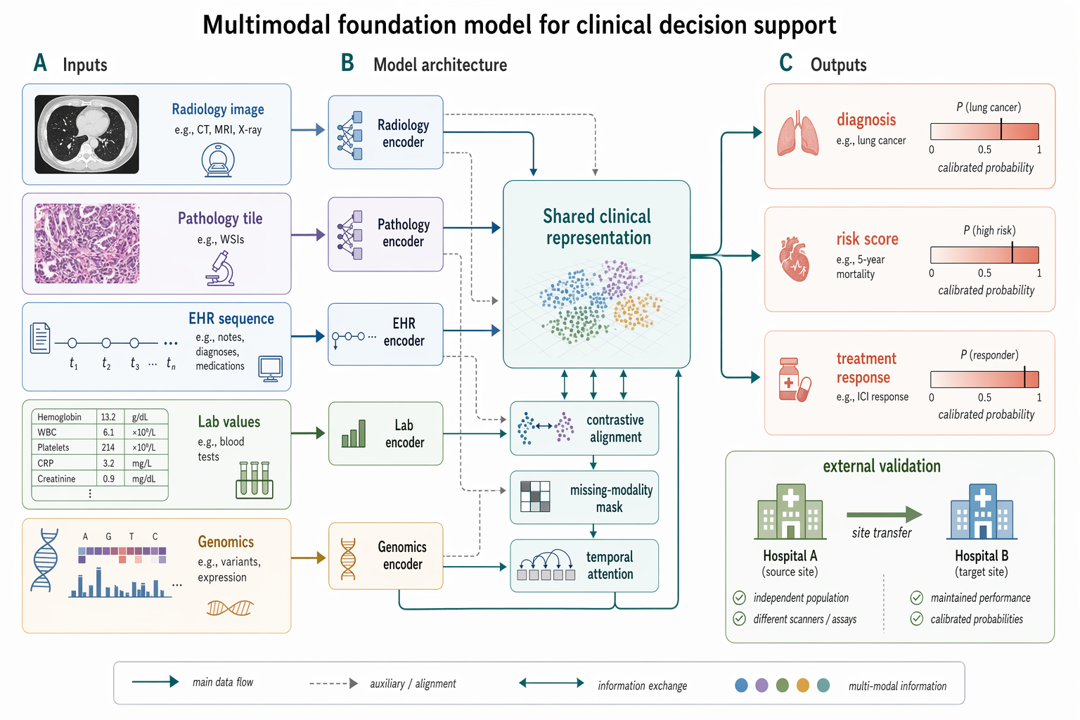
Full Prompt
Create a Nature Biomedical Engineering / NeurIPS medical-AI method figure, landscape 3:2 (1536×1024), soft literature-science colors and minimal academic layout. Figure title: "Multimodal foundation model for clinical decision support". Layout: a left-to-right method pipeline with three horizontal bands and panel labels A–C. A. Inputs on the left: small clean icons and labeled cards "Radiology image", "Pathology tile", "EHR sequence", "Lab values", "Genomics". Use subtle rounded rectangles. B. Middle architecture: five modality encoders feeding into a central pale-teal block "Shared clinical representation"; include small modules "contrastive alignment", "missing-modality mask", "temporal attention". Add thin arrows and skip connections. C. Outputs on the right: three task heads "diagnosis", "risk score", "treatment response" with small calibrated probability bars. Add a lower inset "external validation" showing two hospital icons and an arrow labeled "site transfer". Style requirements: soft Nature/Science palette (muted teal, dusty blue, sage green, warm sand, coral accents), white background, precise vector-like arrows, modest shadows only, readable labels, lots of whitespace, no futuristic HUD, no clinical gore, no real hospital logos, no watermark.