Case Media
Case Notes
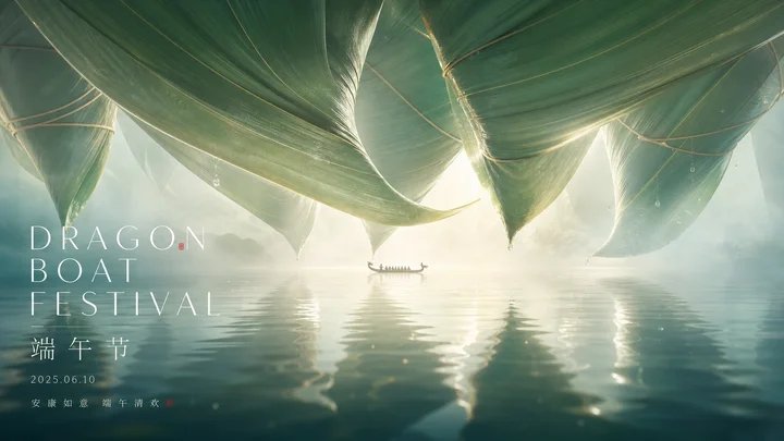
This page keeps the media, full prompt, and original source together so you can inspect the result first and decide whether the prompt is worth copying, saving, or comparing.
Case Insights
To make this page easier to search, cite, and reuse later, the case is also broken down into practical guidance about usage, visual cues, and prompt structure.
Best Fit Scenarios
- Use this as a poster & illustration benchmark when you need a fast style baseline before rewriting your own prompt.
- It is especially helpful if your target overlaps with Poster, Illustration, City Visual and you want to judge the image result before tuning wording.
- Keep it as a control sample when you compare nearby prompt variants one variable at a time.
Visual Signals To Notice
- The clearest style signals here are Poster, Illustration, City Visual, so those should usually stay in your first rewrite.
- Pay close attention to layout rhythm, headline hierarchy, illustration texture, and how information is staged in the frame.
- This case keeps 2 media outputs, which makes it easier to check whether the style remains stable across multiple results.
How The Prompt Is Structured
- The prompt reads as a long, highly specified prompt, which is useful when you want to judge how much specificity this direction needs.
- Its keyword cluster is centered on Poster, Illustration, City Visual, so you can usually keep that cluster while swapping subject, camera, layout, or copy details.
- A practical rewrite path is: keep the outcome, keep the strongest style cues, then replace only the subject and environment blocks.
Good Follow-up Questions
- What changes first if you keep Poster, Illustration, City Visual but switch the subject matter?
- Which part of the result comes from section-level structure (Poster & Illustration) versus tag-level style cues?
- Which related cases in the same section give you a cleaner or more extreme variation of the same direction?
Full Prompt
Generate a visual image with a sense of giant scale and clear negative space around any theme object: let the main form derived from the theme be extremely enlarged, pressing down from the top of the frame like a soft and textured hanging structure, occupying the maximum visual weight, with edges forming continuous curved shielding and narrow slits of light; keep a strong and bright breathing zone in the middle, where tiny carriers derived from the theme or human-scale markers quietly pass through, creating an instantly readable contrast between the giant and the small. Below, use a transparent, reflective, and slightly wavy medium to catch the main form and light source, with reflections elongated and scattered, the foreground gradually deepening while maintaining soft-focus layers, making the space feel supported by light mist and water vapor. Colors are extracted from the materials, seasons, emotions, or cultural semantics of the theme itself, mapped into large areas of clean warm and cold structural fields, bright high-value translucent base colors, low-saturation secondary supporting colors, a small amount of clear and restrained emotional accent colors, and high-contrast but non-glaring informational text colors; maintain a clear and quiet, bright and clean, transparent and well-layered feel, avoiding muddiness or aging. If text needs to appear, it should float in front of the reflective space as a sparse, thin, and wide-spaced modern information layer, with the main title large and light and sub-information smaller and more concentrated, leaving ample blank space overall, so all information is subordinate to the first visual instant composed of giant shielding, bright gaps, tiny scale markers, and reflective media. This theme: Farewell My Concubine. Purpose: Movie poster. Aspect ratio 16:9.