Case Media
Case Notes
This page keeps the media, full prompt, and original source together so you can inspect the result first and decide whether the prompt is worth copying, saving, or comparing.
Case Insights
To make this page easier to search, cite, and reuse later, the case is also broken down into practical guidance about usage, visual cues, and prompt structure.
Best Fit Scenarios
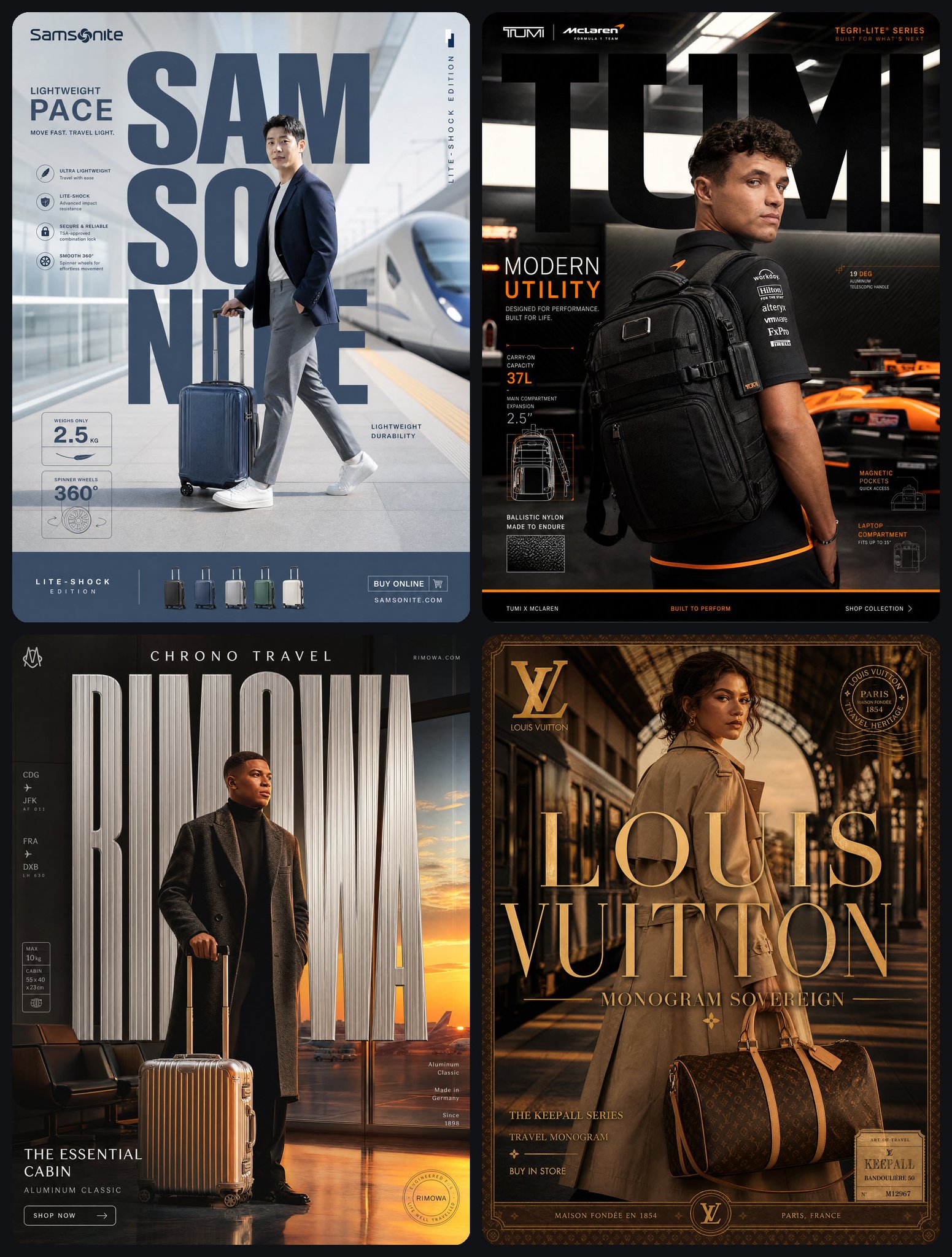
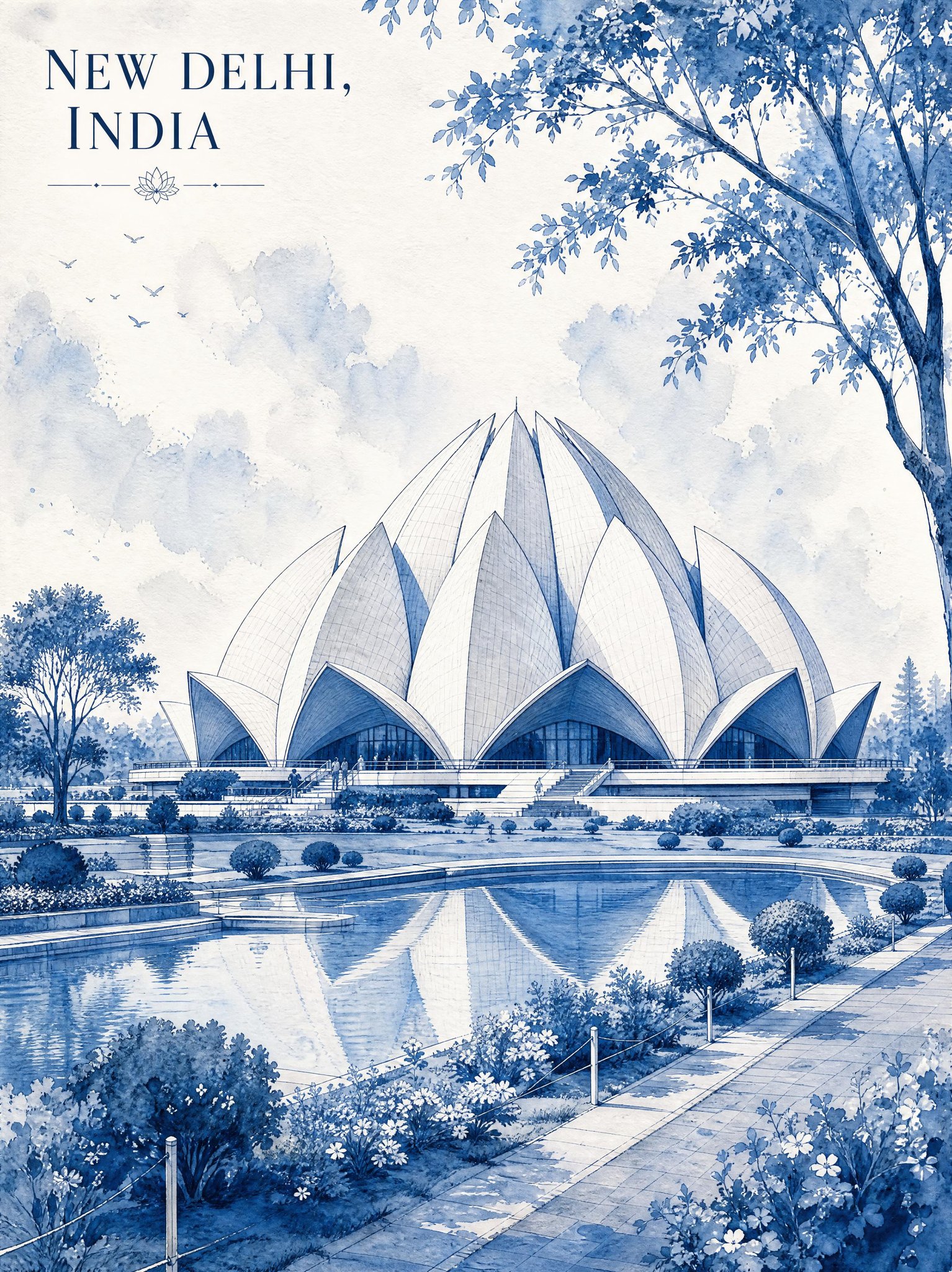
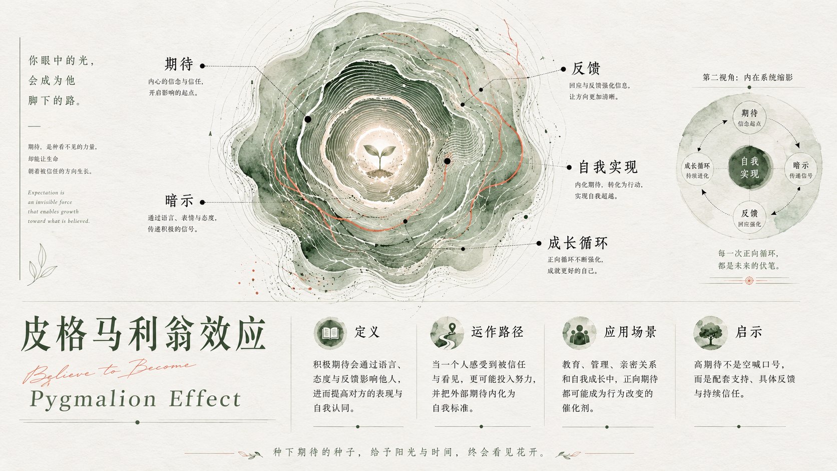
- Use this as a poster & illustration benchmark when you need a fast style baseline before rewriting your own prompt.
- It is especially helpful if your target overlaps with Poster, Illustration, Screenshot and you want to judge the image result before tuning wording.
- Keep it as a control sample when you compare nearby prompt variants one variable at a time.
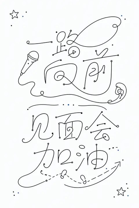
Visual Signals To Notice
- The clearest style signals here are Poster, Illustration, Screenshot, so those should usually stay in your first rewrite.
- Pay close attention to layout rhythm, headline hierarchy, illustration texture, and how information is staged in the frame.
- This case keeps 2 media outputs, which makes it easier to check whether the style remains stable across multiple results.
How The Prompt Is Structured
- The prompt reads as a long, highly specified prompt, which is useful when you want to judge how much specificity this direction needs.
- Its keyword cluster is centered on Poster, Illustration, Screenshot, so you can usually keep that cluster while swapping subject, camera, layout, or copy details.
- A practical rewrite path is: keep the outcome, keep the strongest style cues, then replace only the subject and environment blocks.
Good Follow-up Questions
- What changes first if you keep Poster, Illustration, Screenshot but switch the subject matter?
- Which part of the result comes from section-level structure (Poster & Illustration) versus tag-level style cues?
- Which related cases in the same section give you a cleaner or more extreme variation of the same direction?
Full Prompt
Generate a set of minimalist handwritten glyph graphics around any subject, translating the theme content into single-line symbols between readable and unreadable: the main body consists of continuous strokes like fine black lines, with stable line thickness and rounded turns, strokes extending locally into loops, arcs, back hooks, and intersecting structures, making the graphics look like text, marks, or lightweight abstract patterns. The screen uses a large amount of clean white space to support the main body, the visual weight is concentrated near the central axis, multiple glyph units maintain clear spacing, forming a quiet reading rhythm vertically; inside each unit, a few dots are used as start, stop, pause, and emphasis of strokes, the dot area is very small but accurately positioned, strengthening the beat of the hand-drawn trajectory. Line edges are clean, no burrs, no shadows, no complex textures, overall looking like a restrained and precise handwritten design draft. Colors are extracted from the material and emotion of the theme itself, but only mapped to very few roles: a large area of high-brightness clear base color serves as airiness and cleanliness, the main body uses clear structural dark colors derived from the theme, and small dots can carry the same structural color or a small amount of theme accent color; maintain a bright, clean, well-ventilated emotion, relying on high contrast, low color volume, and clear color steps to establish memory points, without letting color overwhelm the main subject. The final effect should retain the visual surprise of lightweight line drawing, white space pressure, dot-line rhythm, and glyph superposition, avoiding becoming ordinary typography, decorative graffiti, or dense illustration. —————— Bookstore banner: horizontal version 16:9, theme of new book sharing session, several sets of single-line glyphs like open book pages, bookmarks, and a circled excerpt. Information printed in the picture: "Write the Days a Little Slower" Author Sharing, Saturday 15:00, Second Floor Small Hall. Detail reminder: Dots can be like pencil pause points, the main body is concentrated on the central axis, and large areas of white space are maintained around it suitable for public account covers.