Case Media

Case Notes
This page keeps the media, full prompt, and original source together so you can inspect the result first and decide whether the prompt is worth copying, saving, or comparing.
Case Insights
To make this page easier to search, cite, and reuse later, the case is also broken down into practical guidance about usage, visual cues, and prompt structure.
Best Fit Scenarios
- Use this as a poster & illustration benchmark when you need a fast style baseline before rewriting your own prompt.
- It is especially helpful if your target overlaps with Poster, Illustration, Typography and you want to judge the image result before tuning wording.
- Keep it as a control sample when you compare nearby prompt variants one variable at a time.
Visual Signals To Notice
- The clearest style signals here are Poster, Illustration, Typography, so those should usually stay in your first rewrite.
- Pay close attention to layout rhythm, headline hierarchy, illustration texture, and how information is staged in the frame.
- This case keeps 2 media outputs, which makes it easier to check whether the style remains stable across multiple results.
How The Prompt Is Structured
- The prompt reads as a long, highly specified prompt, which is useful when you want to judge how much specificity this direction needs.
- Its keyword cluster is centered on Poster, Illustration, Typography, so you can usually keep that cluster while swapping subject, camera, layout, or copy details.
- A practical rewrite path is: keep the outcome, keep the strongest style cues, then replace only the subject and environment blocks.
Good Follow-up Questions
- What changes first if you keep Poster, Illustration, Typography but switch the subject matter?
- Which part of the result comes from section-level structure (Poster & Illustration) versus tag-level style cues?
- Which related cases in the same section give you a cleaner or more extreme variation of the same direction?
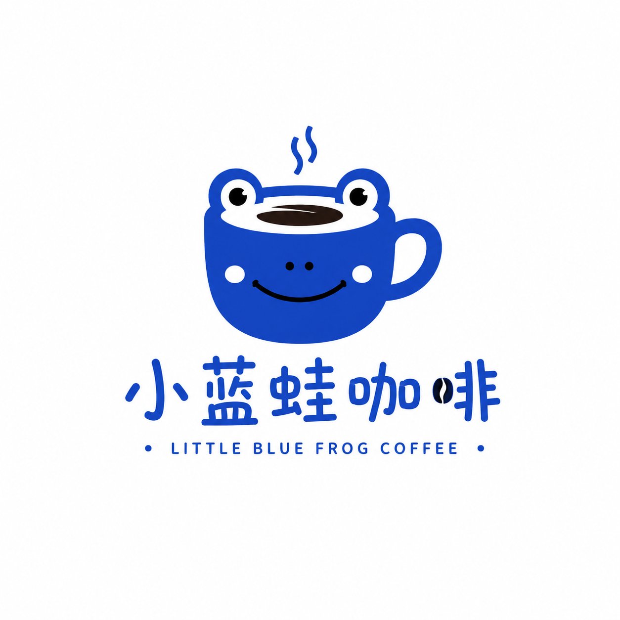
Full Prompt
Create a single original Retro Animal Symbol Wordmark Logo. Brand name: [BRAND NAME] Subtitle: [CATEGORY / TAGLINE] Brand type: [coffee shop / pet café / kids music studio / craft whisky / bakery / lifestyle brand, etc.] Animal: [otter / cat / finch / bison / fox / dog / rabbit / bird, etc.] Brand mood: [warm / playful / elegant / vintage / friendly / premium / cozy / bold] Color direction: [muted retro colors, 2–4 colors only] Background: [warm cream / soft ivory / muted sage / deep forest green / dark charcoal] Style requirements: - flat vector logo - simplified animal symbol - retro but clean - small-brand identity feeling - custom typography, not generic font - clear readable brand name - balanced logo composition - comfortable medium size on the canvas - enough negative space - 2–4 muted colors only - optional small details: stars, dots, short lines, badge elements, year marks The animal should feel like a brand symbol, not a random illustration. It can have a small action or personality, such as holding a cup, playing music, sitting calmly, walking, stretching, or carrying a tiny object. Avoid: 3D, metallic texture, grunge texture, paper grain, realistic shading, overly cute cartoon style, complex background, messy colors, poster layout, sticker look, generic fonts.