Case Media
Case Notes
This page keeps the media, full prompt, and original source together so you can inspect the result first and decide whether the prompt is worth copying, saving, or comparing.
Case Insights
To make this page easier to search, cite, and reuse later, the case is also broken down into practical guidance about usage, visual cues, and prompt structure.
Best Fit Scenarios
- Use this as a poster & illustration benchmark when you need a fast style baseline before rewriting your own prompt.
- It is especially helpful if your target overlaps with Poster, Illustration, Brand and you want to judge the image result before tuning wording.
- Keep it as a control sample when you compare nearby prompt variants one variable at a time.
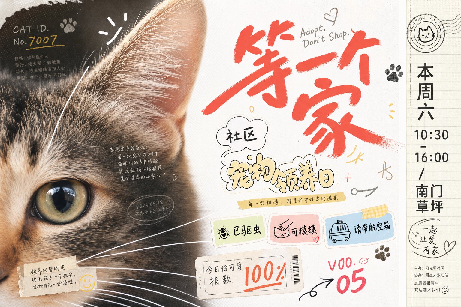
Visual Signals To Notice
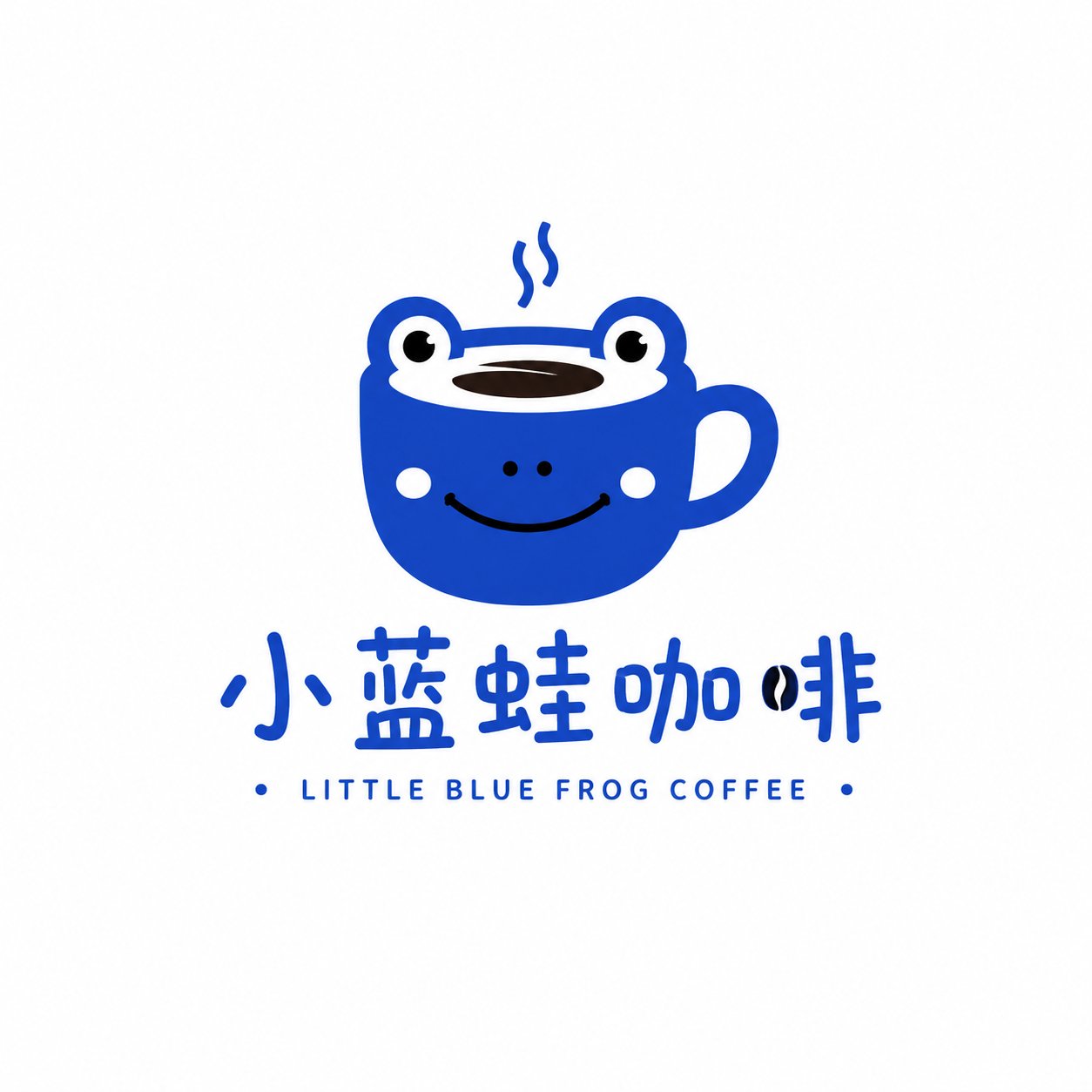
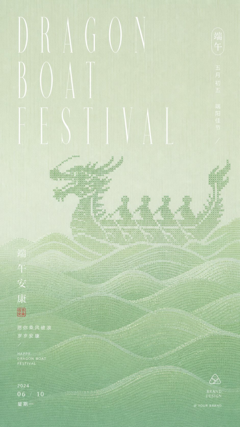
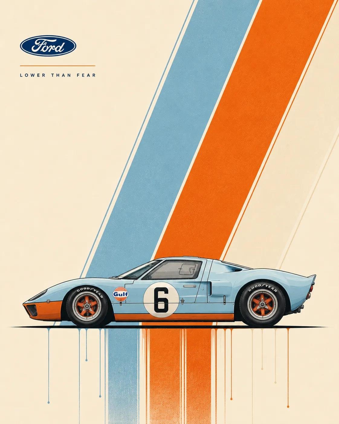
- The clearest style signals here are Poster, Illustration, Brand, so those should usually stay in your first rewrite.
- Pay close attention to layout rhythm, headline hierarchy, illustration texture, and how information is staged in the frame.
- This case keeps 2 media outputs, which makes it easier to check whether the style remains stable across multiple results.
How The Prompt Is Structured
- The prompt reads as a long, highly specified prompt, which is useful when you want to judge how much specificity this direction needs.
- Its keyword cluster is centered on Poster, Illustration, Brand, so you can usually keep that cluster while swapping subject, camera, layout, or copy details.
- A practical rewrite path is: keep the outcome, keep the strongest style cues, then replace only the subject and environment blocks.
Good Follow-up Questions
- What changes first if you keep Poster, Illustration, Brand but switch the subject matter?
- Which part of the result comes from section-level structure (Poster & Illustration) versus tag-level style cues?
- Which related cases in the same section give you a cleaner or more extreme variation of the same direction?
Full Prompt
Generate a visual image with a strong sense of graphic collage around any subject: the subject enters the frame at an extremely close range, occupying the main visual weight on one side, revealing only the most recognizable partial edges, surfaces, outlines, or core details, while the other side retains a clean, airy background and includes a narrow information bar forming a spine-like sense of order. Overlay multiple sets of theme-derived text, symbols, and small graphic markers between the subject's surface and the negative space, like stickers, handwritten signatures, graffiti numbers, and miniature explanatory text floating on the same level; text size jumps significantly, the main identifier should have a quick, handwritten sweeping stroke, secondary text should be rounder, looser, and more bubble-like, and tiny text with low transparency is buried in the shadows or textures of the subject, providing only density and rhythm without stealing the main visual. The composition should make the first glance read the heavily cropped subject part and the largest handwritten identifier, and the second glance discover the surrounding sticker numbers, sidebar text, and semi-hidden information, forming a light pressure mix of youth magazine clippings, record liners, and journal stickers. Colors are extracted from the material, emotion, and cultural semantics of the subject: large areas of the background remain high-brightness, clear, and clean, the subject uses the main material color or structural color of the theme, text information uses clear light and dark scales to establish readable layers, and a small amount of high-saturation accent colors only fall on handwritten identifiers, numbers, or small stickers to create bright, lively moments; the overall feel should be bright and light, boundaries clear, dark parts kept clean, without old, cloudy, or gray-dirty processing. The image texture carries slight scanning dots, printing grains, and sticker edges, but the subject part remains fine and clear, with images and text blocking, interspersing, and overlapping each other, like carefully typeset casual scribbling rather than neat templates or ordinary information posters. ---- Recruitment scene: Make a 16:9 horizontal cover for a youth street dance club recruitment, the frame only closely crops the sneaker tip, loose pant cuffs, and floor reflections, making the action look like it just stepped into the frame. Main text processing: Large handwritten identifier says 'Come dance for a bit', sticker small text interspersed with 'Friday 7 PM', 'Zero foundation welcome', 'Rehearsal Room B1'. Needs to appear: A wrinkled-edge registration sticker, a circular team logo, and several graffiti lines like rehearsal numbers, with text pasted at the junction of the shoe edge and the blank space.