Case Media
Case Notes
This page keeps the media, full prompt, and original source together so you can inspect the result first and decide whether the prompt is worth copying, saving, or comparing.
Case Insights
To make this page easier to search, cite, and reuse later, the case is also broken down into practical guidance about usage, visual cues, and prompt structure.
Best Fit Scenarios
- Use this as a poster & illustration benchmark when you need a fast style baseline before rewriting your own prompt.
- It is especially helpful if your target overlaps with Fashion, Poster, Illustration and you want to judge the image result before tuning wording.
- Keep it as a control sample when you compare nearby prompt variants one variable at a time.
Visual Signals To Notice
- The clearest style signals here are Fashion, Poster, Illustration, so those should usually stay in your first rewrite.
- Pay close attention to layout rhythm, headline hierarchy, illustration texture, and how information is staged in the frame.
- This case keeps one primary output, so the first image should be treated as the main visual reference.
How The Prompt Is Structured
- The prompt reads as a long, highly specified prompt, which is useful when you want to judge how much specificity this direction needs.
- Its keyword cluster is centered on Fashion, Poster, Illustration, so you can usually keep that cluster while swapping subject, camera, layout, or copy details.
- A practical rewrite path is: keep the outcome, keep the strongest style cues, then replace only the subject and environment blocks.
Good Follow-up Questions
- What changes first if you keep Fashion, Poster, Illustration but switch the subject matter?
- Which part of the result comes from section-level structure (Poster & Illustration) versus tag-level style cues?
- Which related cases in the same section give you a cleaner or more extreme variation of the same direction?
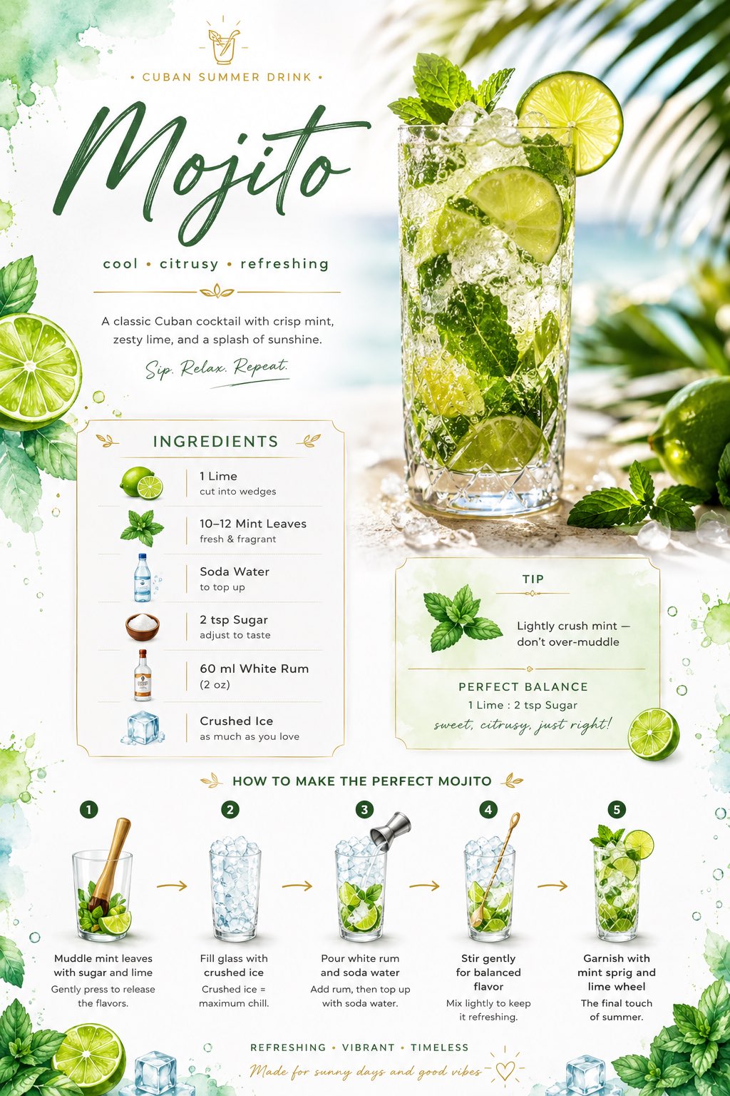
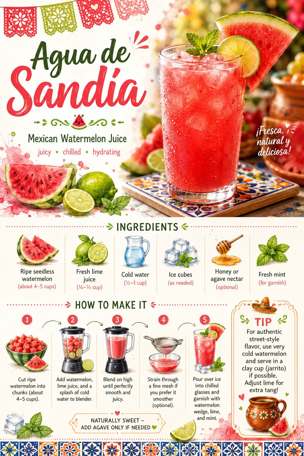
Full Prompt
Create a visually stunning, modern recipe card for “Agua de Sandía (Mexican Watermelon Juice)” designed for social media sharing. Style: Minimal yet artistic. Blend vibrant Mexican summer market aesthetics with festive tropical vibes. Use soft watercolor watermelon and lime splashes, subtle Talavera tile-inspired patterns, and elegant modern typography with a touch of playful Mexican flair. Keep the layout airy, premium, and irresistibly refreshing. Layout: Single-page vertical composition (not a collage), divided into elegant sections with clear visual hierarchy. Top Section: - Title: “Agua de Sandía” - Subtitle: “Mexican Watermelon Juice • juicy • chilled • hydrating” - A gorgeous hero image of fresh watermelon juice served in a tall clear glass with ice cubes, a fresh watermelon wedge on the rim, lime slice, mint sprig, and beautiful condensation droplets, soft golden sunlight, vibrant pink-red tones with Mexican market feel Middle Section (Ingredients): - Cleanly arranged ingredient list with tiny illustrated icons: ripe seedless watermelon, fresh lime juice, cold water, ice cubes, optional honey or agave nectar, fresh mint - Minimal bullet points with perfect spacing and alignment Lower Section (Steps with Visual Flow): Include 4–5 steps with small supporting visuals or icons: 1. Cut ripe watermelon into chunks (about 4–5 cups) 2. Add watermelon, lime juice, and a splash of cold water to blender 3. Blend on high until perfectly smooth and juicy 4. Strain through a fine mesh if you prefer it smoother (optional) 5. Pour over ice into chilled glasses and garnish with watermelon wedge, lime, and mint Add elegant connecting lines or curved arrows between steps. Side Element: - Small tip box with Mexican touch: “For authentic street-style flavor, use very cold watermelon and serve in a clay cup (jarrito) if possible. Adjust lime for extra tang!” - Sweetness note: “Naturally sweet – add agave only if needed” Design Details: - Festive Mexican-inspired palette (watermelon pink-red, bright lime green, sunny coral, crisp white, warm terracotta accents) - Subtle decorative dividers inspired by Mexican papel picado or tile patterns - Tiny doodles (watermelon slices, lime wedges, ice cubes, mint, small Mexican flag colors) - Clean, uncluttered editorial-style layout with warm, joyful energy Mood: Refreshing, juicy, vibrant, sunny Mexican summer feel – festive yet premium Composition: Highly balanced with generous negative space, premium café / taquería menu aesthetic Aspect ratio: Vertical (2:3), ultra high resolution, Instagram/Pinterest ready