Case Media
Case Notes
This page keeps the media, full prompt, and original source together so you can inspect the result first and decide whether the prompt is worth copying, saving, or comparing.
Case Insights
To make this page easier to search, cite, and reuse later, the case is also broken down into practical guidance about usage, visual cues, and prompt structure.
Best Fit Scenarios
- Use this as a poster & illustration benchmark when you need a fast style baseline before rewriting your own prompt.
- It is especially helpful if your target overlaps with Poster, Illustration, City Visual and you want to judge the image result before tuning wording.
- Keep it as a control sample when you compare nearby prompt variants one variable at a time.
Visual Signals To Notice
- The clearest style signals here are Poster, Illustration, City Visual, so those should usually stay in your first rewrite.
- Pay close attention to layout rhythm, headline hierarchy, illustration texture, and how information is staged in the frame.
- This case keeps 2 media outputs, which makes it easier to check whether the style remains stable across multiple results.
How The Prompt Is Structured
- The prompt reads as a long, highly specified prompt, which is useful when you want to judge how much specificity this direction needs.
- Its keyword cluster is centered on Poster, Illustration, City Visual, so you can usually keep that cluster while swapping subject, camera, layout, or copy details.
- A practical rewrite path is: keep the outcome, keep the strongest style cues, then replace only the subject and environment blocks.
Good Follow-up Questions
- What changes first if you keep Poster, Illustration, City Visual but switch the subject matter?
- Which part of the result comes from section-level structure (Poster & Illustration) versus tag-level style cues?
- Which related cases in the same section give you a cleaner or more extreme variation of the same direction?
Full Prompt
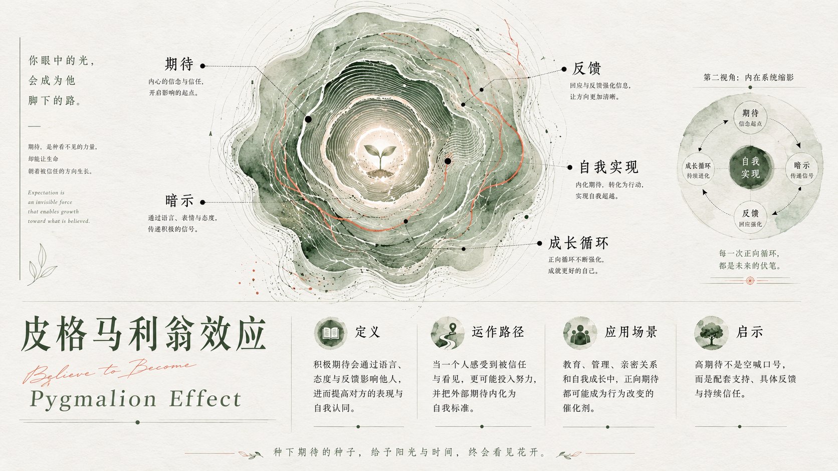
Design a high-end conceptual poster for "[Subject]". The core of the image is not a direct depiction of the subject itself, but transforms the subject into an "Internal System Map" with a sense of life. Use a large organic circular structure as the main visual, with a form similar to tree rings, water ripples, fingerprint textures, topographic contour lines, energy vortexes, or slices of life; there is a clear core point in the center, diffusing outward with multiple layers of irregular ring textures, representing the growth, accumulation, evolution, expansion, and internal order of the theme. Set several small black nodes and extremely fine guide lines within the circular system, using "[Keyword 1], [Keyword 2], [Keyword 3], [Keyword 4], [Keyword 5]" as spiritual coordinates in the system, rather than an ordinary text list. Text annotations should be naturally distributed like scientific maps, star charts, anatomical diagrams, or research manuscripts, forming a contrast between rational annotations and emotional textures. The overall style is minimalist high-end poster, art school graduation exhibition, conceptual visual design, information map, natural texture experiment, abstract brand visual. The background uses a large amount of clean white space with a slight paper texture, without using complex scenes. The main visual occupies the upper or center-upper position of the frame, leaving quiet space below for titles, short copy, or brand information. A miniature version of the small circular system can be added as a "partial enlargement / soul slice / second perspective" to enhance the contrast between macro and micro. Colors use "[Main Color]" as a large-area organic base color, overlaying a small amount of "[Secondary Color]" as texture veins, and using black as anchors for text, nodes, and thin lines. Colors should be transparent, blooming, grainy, with a handmade watercolor or printmaking texture, and edges should be naturally broken with a strong sense of breathing. Overall, avoid a commercial template feel, avoid excessive decoration, avoid mechanical geometry, and pursue a balance of emotion, rationality, vitality, and spirituality. —————— Current Subject: Psychology knowledge point explanation For example: Broken Windows Effect A total of 9 such effects Each image should have diverse changes in main color / layout / font temperament Intelligently arrange keywords for each image yourself Text should introduce the knowledge point from multiple dimensions and multi-style attributes, making people feel they have gained a lot. Aspect ratio 16:9