Case Media
Case Notes
This page keeps the media, full prompt, and original source together so you can inspect the result first and decide whether the prompt is worth copying, saving, or comparing.
Case Insights
To make this page easier to search, cite, and reuse later, the case is also broken down into practical guidance about usage, visual cues, and prompt structure.
Best Fit Scenarios
- Use this as a poster & illustration benchmark when you need a fast style baseline before rewriting your own prompt.
- It is especially helpful if your target overlaps with Poster, Illustration, Screenshot and you want to judge the image result before tuning wording.
- Keep it as a control sample when you compare nearby prompt variants one variable at a time.
Visual Signals To Notice
- The clearest style signals here are Poster, Illustration, Screenshot, so those should usually stay in your first rewrite.
- Pay close attention to layout rhythm, headline hierarchy, illustration texture, and how information is staged in the frame.
- This case keeps one primary output, so the first image should be treated as the main visual reference.
How The Prompt Is Structured
- The prompt reads as a long, highly specified prompt, which is useful when you want to judge how much specificity this direction needs.
- Its keyword cluster is centered on Poster, Illustration, Screenshot, so you can usually keep that cluster while swapping subject, camera, layout, or copy details.
- A practical rewrite path is: keep the outcome, keep the strongest style cues, then replace only the subject and environment blocks.
Good Follow-up Questions
- What changes first if you keep Poster, Illustration, Screenshot but switch the subject matter?
- Which part of the result comes from section-level structure (Poster & Illustration) versus tag-level style cues?
- Which related cases in the same section give you a cleaner or more extreme variation of the same direction?
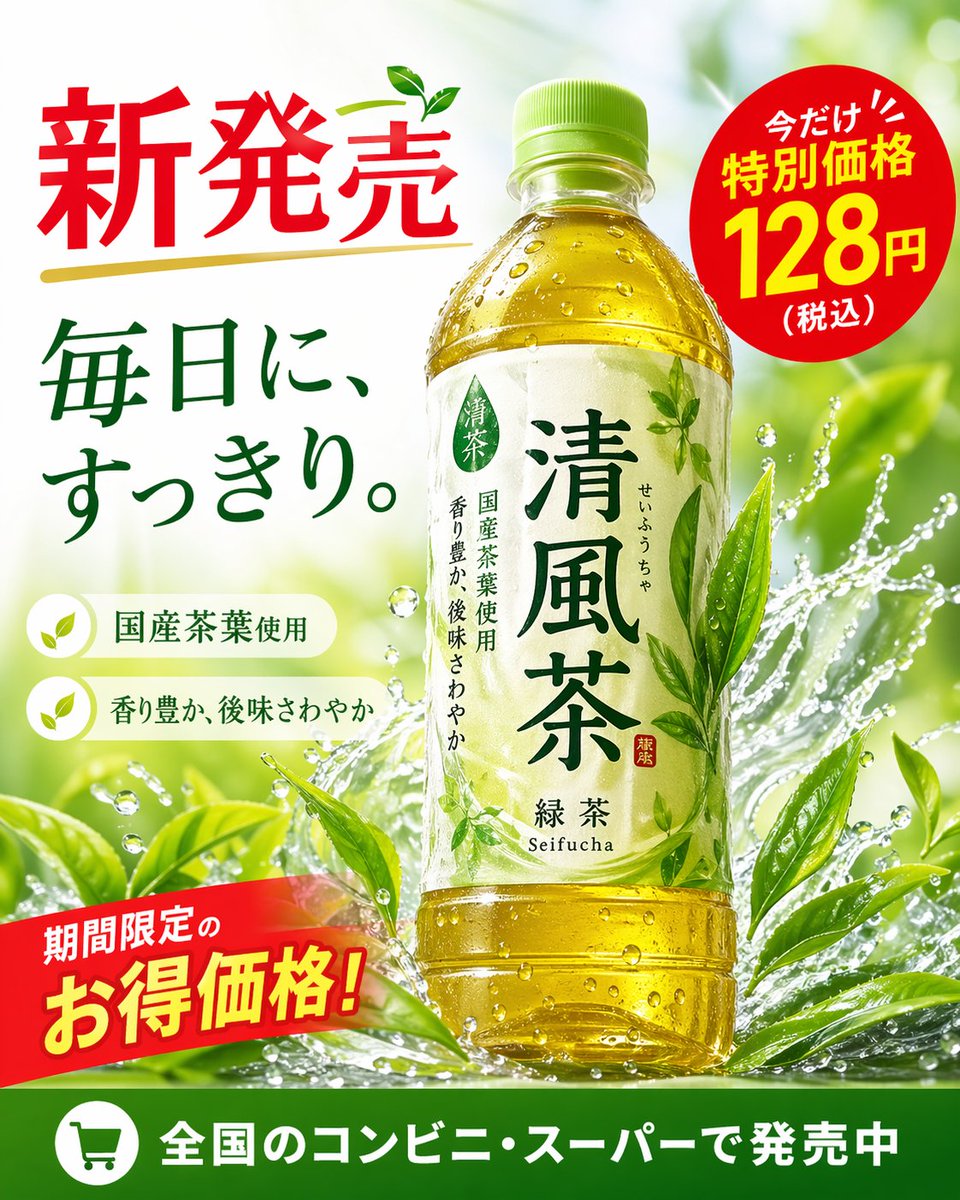
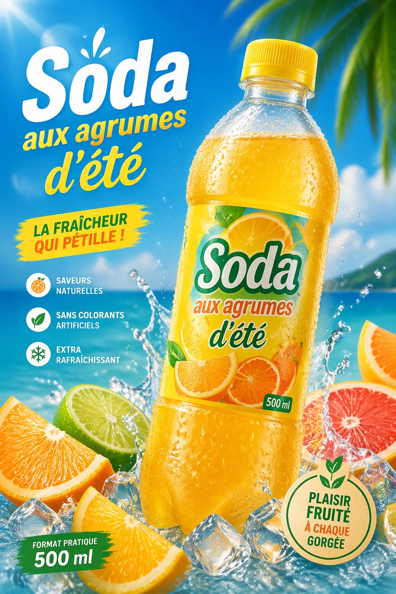
Full Prompt
Create a vibrant tropical commercial poster for a citrus soda bottle, in a bright summer advertising style. Show a single large plastic bottle of {argument name="product name" default="Soda"} centered slightly to the right, tilted a little left, with a yellow cap and transparent bottle covered in cold condensation droplets, filled with glowing golden-orange soda. The label should feature sliced oranges and citrus artwork with the brand text "{argument name="product name" default="Soda"}", the phrase "aux agrumes d'été", and a small green "500 ml" mark. Use a sunny beach background with vivid blue sky, turquoise ocean, soft clouds, and blurred tropical palm leaves entering from the upper right corner. Add dramatic water splashes around the base of the bottle, scattered clear ice cubes, and 5 visible citrus pieces in the foreground: 2 orange wedges, 1 lime half, 1 grapefruit half, and 1 partial orange slice at the far right edge. Place large French promotional text on the left: a huge white headline "{argument name="headline text" default="Soda"}" with a small splash accent above it, then yellow script text "aux agrumes d'été" underneath. Add a yellow paint-stroke badge at mid-left with the text "LA FRAÎCHEUR QUI PÉTILLE !". Add a vertical feature list on the lower left with 3 round icons and French captions: "SAVEURS NATURELLES", "SANS COLORANTS ARTIFICIELS", and "EXTRA RAFRAÎCHISSANT". Add a green brushstroke banner at the bottom left reading "FORMAT PRATIQUE 500 ml". Add a round beige eco-style seal at the bottom right with green outline and leaf motif, containing the text "{argument name="seal text" default="PLAISIR FRUITÉ À CHAQUE GORGÉE"}". Lighting should be glossy and high-energy with strong sun flare from the upper left, saturated citrus colors, crisp packaging detail, realistic droplets, and polished supermarket-ad realism.