Case Media
Case Notes
This page keeps the media, full prompt, and original source together so you can inspect the result first and decide whether the prompt is worth copying, saving, or comparing.
Case Insights
To make this page easier to search, cite, and reuse later, the case is also broken down into practical guidance about usage, visual cues, and prompt structure.
Best Fit Scenarios
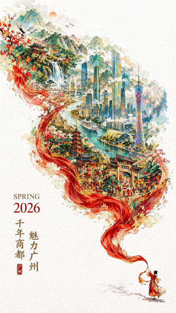
- Use this as a poster & illustration benchmark when you need a fast style baseline before rewriting your own prompt.
- It is especially helpful if your target overlaps with Poster, Illustration, City Visual and you want to judge the image result before tuning wording.
- Keep it as a control sample when you compare nearby prompt variants one variable at a time.
Visual Signals To Notice
- The clearest style signals here are Poster, Illustration, City Visual, so those should usually stay in your first rewrite.
- Pay close attention to layout rhythm, headline hierarchy, illustration texture, and how information is staged in the frame.
- This case keeps 2 media outputs, which makes it easier to check whether the style remains stable across multiple results.
How The Prompt Is Structured
- The prompt reads as a long, highly specified prompt, which is useful when you want to judge how much specificity this direction needs.
- Its keyword cluster is centered on Poster, Illustration, City Visual, so you can usually keep that cluster while swapping subject, camera, layout, or copy details.
- A practical rewrite path is: keep the outcome, keep the strongest style cues, then replace only the subject and environment blocks.
Good Follow-up Questions
- What changes first if you keep Poster, Illustration, City Visual but switch the subject matter?
- Which part of the result comes from section-level structure (Poster & Illustration) versus tag-level style cues?
- Which related cases in the same section give you a cleaner or more extreme variation of the same direction?
Full Prompt
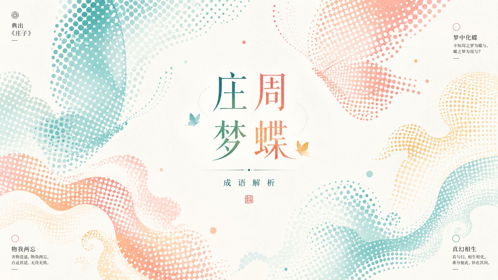
Generate a bright and clear graphical visual around any theme subject: the subject does not appear as a realistic, complete object, but is translated into large areas of halftone dot forms; several enlarged partial sections cut in from the edges, forming a slight tilted encirclement and negative space pressure, with a quiet open space preserved near the center, allowing small-scale theme symbols and title information to become the second reading point. The main forms use regular dot density to shape contours, textures, and light/shadow, with halftone edges remaining clear but having natural density variations; parts can be cropped, broken, or floating, creating a light sense of breathing. The background is a high-brightness, highly airy clean field, with very fine paper grain or soft mist texture, but it must not become dirty, gray, or vintage yellow. Colors are extracted from the theme's own materials, seasons, emotions, and cultural signals, mapped into large areas of light and bright base colors, a small amount of high-saturation emotional colors, clear structural colors, and very small areas of informational colors; maintaining a bright, light, clear, and clean relationship, with emphasis colors concentrated on the halftone main forms and titles, and dark colors used only for tiny informational anchor points. Typography consists of a restrained center title and small corner information to form a reading path; titles can use slender serif or elegant Songti temperament, with relaxed letter spacing and composed line spacing; information blocks are small and precise, and must not overpower the main forms and negative space. The overall look is a combination of print halftone, refreshing commercial layout, and light graphical experimentation; most importantly, let the enlarged halftone forms and the empty field shape each other, rather than drawing the subject as a common illustration. Theme: An insufficient effort (杯水车薪). Purpose: Idiom analysis. Aspect ratio 16:9.