Case Media
Case Notes
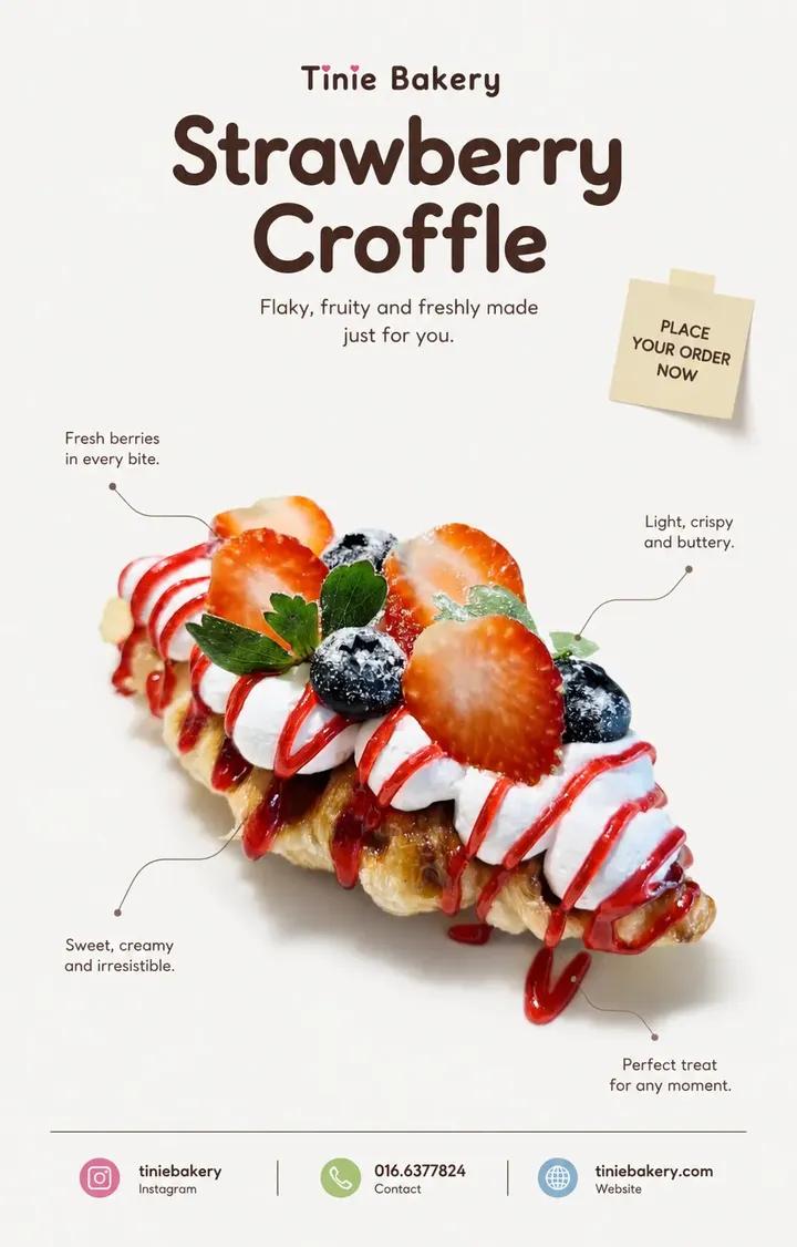
This page keeps the media, full prompt, and original source together so you can inspect the result first and decide whether the prompt is worth copying, saving, or comparing.
Case Insights
To make this page easier to search, cite, and reuse later, the case is also broken down into practical guidance about usage, visual cues, and prompt structure.
Best Fit Scenarios
- Use this as a poster & illustration benchmark when you need a fast style baseline before rewriting your own prompt.
- It is especially helpful if your target overlaps with Fashion, Poster, Illustration and you want to judge the image result before tuning wording.
- Keep it as a control sample when you compare nearby prompt variants one variable at a time.
Visual Signals To Notice
- The clearest style signals here are Fashion, Poster, Illustration, so those should usually stay in your first rewrite.
- Pay close attention to layout rhythm, headline hierarchy, illustration texture, and how information is staged in the frame.
- This case keeps one primary output, so the first image should be treated as the main visual reference.
How The Prompt Is Structured
- The prompt reads as a long, highly specified prompt, which is useful when you want to judge how much specificity this direction needs.
- Its keyword cluster is centered on Fashion, Poster, Illustration, so you can usually keep that cluster while swapping subject, camera, layout, or copy details.
- A practical rewrite path is: keep the outcome, keep the strongest style cues, then replace only the subject and environment blocks.
Good Follow-up Questions
- What changes first if you keep Fashion, Poster, Illustration but switch the subject matter?
- Which part of the result comes from section-level structure (Poster & Illustration) versus tag-level style cues?
- Which related cases in the same section give you a cleaner or more extreme variation of the same direction?
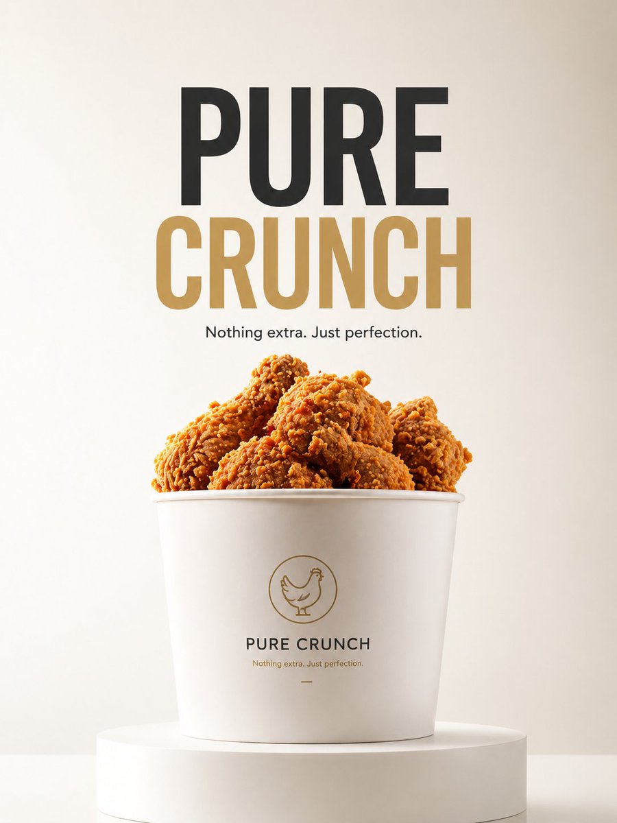
Full Prompt
MINIMAL EDITORIAL PRODUCT POSTER (CLEAN REFERENCE STYLE • DESIGN LOCKED • STRICT PRODUCT PRESERVATION) ASPECT RATIO: 4:5 VERTICAL PRODUCT : [……] BRAND : [……] CONTACT / INSTAGRAM : […..] ━━━━━━━━━━━━━━━━━━ Analyze the uploaded product first. Use the reference ONLY for: • composition • typography hierarchy • whitespace • editorial mood • color atmosphere Keep the SAME visual direction. Do not redesign the style. ━━━━━━━━━━━━━━━━━━ DESIGN LOCK — IMPORTANT Preserve the existing design language. Keep: • clean editorial layout • cute atmosphere • center-focused product • quote placement • thin callout lines • sticky note placement • footer structure • rounded typography • generous whitespace Do not introduce new design ideas. ━━━━━━━━━━━━━━━━━━ PRODUCT — ULTRA STRICT MODE The uploaded product is the ONLY visual source. Treat the product as LOCKED. Maintain approximately 99% visual similarity. Do NOT: • regenerate product • redesign product • reinterpret product • recreate hidden parts • change shape • change texture • change color • change proportions • improve appearance • smooth imperfections • add ingredients • remove ingredients • modify details • replace packaging STRICTLY PRESERVE: • silhouette • proportions • original texture • original reflections • original toppings • original details • original count • original placement • original imperfections • original colors Allowed ONLY: ✓ isolate ✓ reposition ✓ crop ✓ soft realistic shadow ✓ remove packaging ONLY if product remains identical If product changes: KEEP ORIGINAL PRODUCT. Adjust layout around the product. Never adjust product for layout. ━━━━━━━━━━━━━━━━━━ LAYOUT Product remains visually centered. Do not force perfect symmetry. Keep large breathing space. Keep composition clean. Adding Brand Name and product name at Header ━━━━━━━━━━━━━━━━━━ CALLOUT Create 2–4 short editorial quotes. Place around the product. Every quote MUST connect to the product using: thin subtle callout lines. Callout lines are mandatory. Style: clean minimal editorial ━━━━━━━━━━━━━━━━━━ STICKY NOTE Create ONE small sticky note. Place near upper composition area. Text: PLACE YOUR ORDER NOW Style: • natural paper feeling • lightly attached • slightly imperfect angle • subtle paper texture • small scale • soft shadow Feels natural. Not decorative. ━━━━━━━━━━━━━━━━━━ TYPOGRAPHY Rounded sans only. No italic. Elegant. Minimal. Premium. ━━━━━━━━━━━━━━━━━━ FOOTER Include: [PRODUCT NAME] [BRAND] [CONTACT / INSTAGRAM] Clean hierarchy. Minimal spacing. adding coloured symbol for instagram, contact, website ━━━━━━━━━━━━━━━━━━ BACKGROUND Keep clean. No decorative elements. Do not add: • leaves • botanical shadow • flowers • props • sparkles • icons • decorative fillers Use whitespace. ━━━━━━━━━━━━━━━━━━ COLOR Cool neutral tone. Soft contrast. Keep product colors original. ━━━━━━━━━━━━━━━━━━ FINAL FEEL Same clean editorial design. Same cute atmosphere. Only improve product preservation.