Case Media

Case Notes
This page keeps the media, full prompt, and original source together so you can inspect the result first and decide whether the prompt is worth copying, saving, or comparing.
Case Insights
To make this page easier to search, cite, and reuse later, the case is also broken down into practical guidance about usage, visual cues, and prompt structure.
Best Fit Scenarios
- Use this as a poster & illustration benchmark when you need a fast style baseline before rewriting your own prompt.
- It is especially helpful if your target overlaps with Poster, Illustration, Watercolor and you want to judge the image result before tuning wording.
- Keep it as a control sample when you compare nearby prompt variants one variable at a time.
Visual Signals To Notice
- The clearest style signals here are Poster, Illustration, Watercolor, so those should usually stay in your first rewrite.
- Pay close attention to layout rhythm, headline hierarchy, illustration texture, and how information is staged in the frame.
- This case keeps one primary output, so the first image should be treated as the main visual reference.
How The Prompt Is Structured
- The prompt reads as a long, highly specified prompt, which is useful when you want to judge how much specificity this direction needs.
- Its keyword cluster is centered on Poster, Illustration, Watercolor, so you can usually keep that cluster while swapping subject, camera, layout, or copy details.
- A practical rewrite path is: keep the outcome, keep the strongest style cues, then replace only the subject and environment blocks.
Good Follow-up Questions
- What changes first if you keep Poster, Illustration, Watercolor but switch the subject matter?
- Which part of the result comes from section-level structure (Poster & Illustration) versus tag-level style cues?
- Which related cases in the same section give you a cleaner or more extreme variation of the same direction?
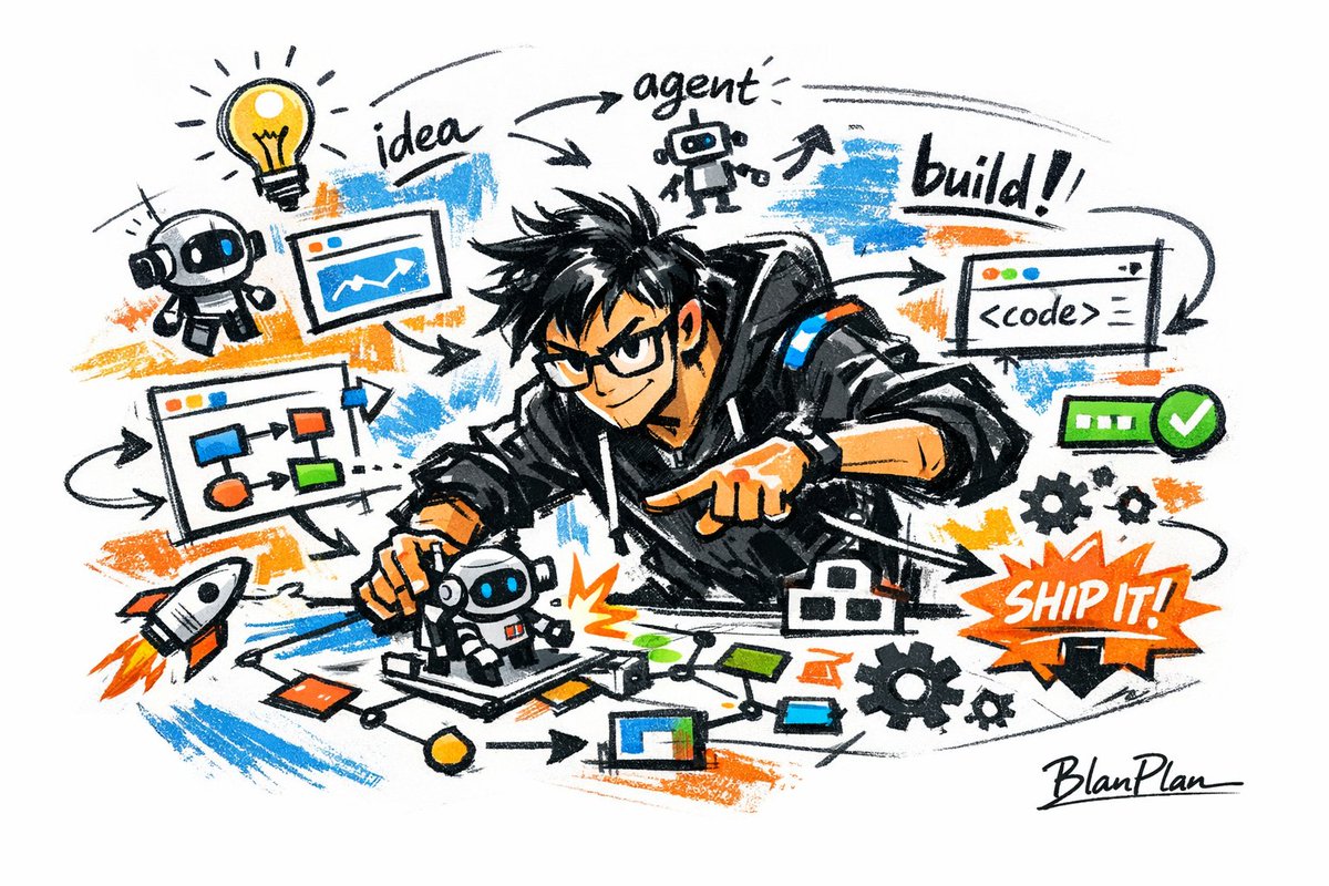
Full Prompt
[中文] 以涂鸦速写风表现【一个厉害的AI builder】,整体呈现快速勾勒、自由变形、即兴手绘与草稿式的视觉效果。线条随手、夸张、可粗细不一,略显凌乱但具有节奏和表现力,强调概括、夸张、趣味和随性,而不是严谨写实或精细刻画。 颜色采用粗糙、干刷感明显的块面表现,可保留不均匀的涂抹痕迹、刷痕、飞白与覆盖感,色彩根据【主题/主体】自动适配,但整体保持涂鸦式、速写式、概括式的表达。不要透明水彩晕染效果,不要细腻水彩过渡,不要纸纹理,不要柔和雾化,不要梦幻质感。 背景以留白为主,保持简洁、轻松、未完成感和设计感,可加入少量辅助性符号、箭头、记号、圈画、重复线、随手写的文字或其他涂鸦元素,以增强速写本或随笔式视觉语言,但不可过于拥挤,不可破坏主体和留白气质。 画面内容不需要预先写清楚,由【一个厉害的AI builder】自动推演并生成最适合的主体形象、动作、相关元素、符号或简化场景,整体保持统一的涂鸦速写风和夸张概括的表现方式,避免复杂写实背景和过度铺陈。 画面中需自然加入专属签名"BlanPlan",作为画面的一部分,位置低调但清晰,可放在左下角、右下角或标题附近,风格需与整体版式统一,像作品署名或设计落款;签名字体精致、克制、高级,不可过大,不可破坏主体构图,不可显得突兀或廉价。 [English] Express [an awesome AI builder] in a graffiti sketch style, overall presenting a visual effect of quick sketching, free deformation, impromptu hand-drawing and draft-like. The lines are casual, exaggerated, and can vary in thickness, slightly messy but with rhythm and expressiveness, emphasizing summarization, exaggeration, fun and casualness, rather than rigorous realism or fine depiction. The colors use rough blocks with obvious dry brush feel, retaining uneven smearing traces, brush strokes, flying white and covering feel, the colors automatically adapt according to [theme/subject], but overall maintain a graffiti-style, sketch-style, and summarized expression. Do not use transparent watercolor smudging effects, do not use delicate watercolor transitions, do not use paper texture, do not use soft atomization, do not use dreamy texture. The background is mainly blank, keeping it simple, relaxed, unfinished and designed, can add a small amount of auxiliary symbols, arrows, marks, circled drawings, repeated lines, casually written text or other graffiti elements, to enhance the sketchbook or essay-style visual language, but it must not be too crowded, and must not destroy the subject and blank temperament. The picture content does not need to be written clearly in advance; [an awesome AI builder] automatically deduces and generates the most suitable subject image, movements, related elements, symbols or simplified scenes, overall maintaining a unified graffiti sketch style and exaggerated summarized expression method, avoiding complex realistic backgrounds and excessive padding. The exclusive signature "BlanPlan" needs to be naturally added into the picture as a part of the picture, the position is low-key but clear, can be placed in the bottom left corner, bottom right corner or near the title, the style needs to be unified with the overall layout, like an artwork signature or design sign-off; the signature font is exquisite, restrained, and high-end, must not be too large, must not destroy the subject composition, must not appear abrupt or cheap.