Case Media

Case Notes
This page keeps the media, full prompt, and original source together so you can inspect the result first and decide whether the prompt is worth copying, saving, or comparing.
Case Insights
To make this page easier to search, cite, and reuse later, the case is also broken down into practical guidance about usage, visual cues, and prompt structure.
Best Fit Scenarios
- Use this as a poster & illustration benchmark when you need a fast style baseline before rewriting your own prompt.
- It is especially helpful if your target overlaps with Poster, Illustration, City Visual and you want to judge the image result before tuning wording.
- Keep it as a control sample when you compare nearby prompt variants one variable at a time.
Visual Signals To Notice
- The clearest style signals here are Poster, Illustration, City Visual, so those should usually stay in your first rewrite.
- Pay close attention to layout rhythm, headline hierarchy, illustration texture, and how information is staged in the frame.
- This case keeps one primary output, so the first image should be treated as the main visual reference.
How The Prompt Is Structured
- The prompt reads as a long, highly specified prompt, which is useful when you want to judge how much specificity this direction needs.
- Its keyword cluster is centered on Poster, Illustration, City Visual, so you can usually keep that cluster while swapping subject, camera, layout, or copy details.
- A practical rewrite path is: keep the outcome, keep the strongest style cues, then replace only the subject and environment blocks.
Good Follow-up Questions
- What changes first if you keep Poster, Illustration, City Visual but switch the subject matter?
- Which part of the result comes from section-level structure (Poster & Illustration) versus tag-level style cues?
- Which related cases in the same section give you a cleaner or more extreme variation of the same direction?
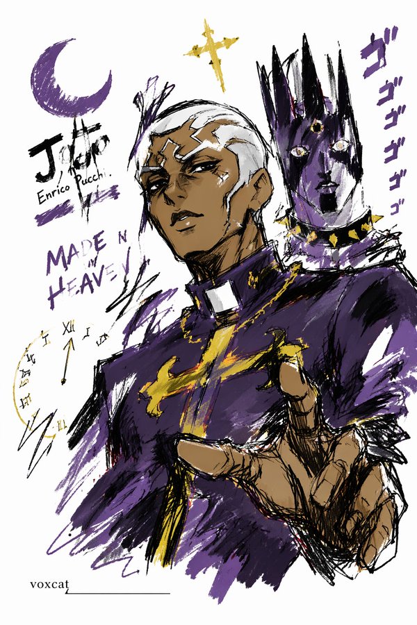
Full Prompt
Express [Subject/Theme] in a graffiti sketch style, presenting an overall visual effect of quick outlining, free deformation, impromptu hand-drawing, and draft-like appearance. The lines are casual, exaggerated, and can vary in thickness, slightly messy but rhythmic and expressive, emphasizing generalization, exaggeration, playfulness, and spontaneity, rather than rigorous realism or detailed rendering. Colors are expressed in rough blocks with a distinct dry-brush feel, retaining uneven smearing traces, brush strokes, dry-brush effects, and a sense of coverage. Colors automatically adapt to [Subject/Theme], but the overall expression remains graffiti-style, sketch-style, and generalized. Do not use transparent watercolor blooming effects, do not use delicate watercolor transitions, do not use paper textures, do not use soft atomization, and do not use dreamy textures. The background is mainly left blank, maintaining a sense of simplicity, relaxation, incompleteness, and design. A small number of auxiliary symbols, arrows, marks, circled areas, repeated lines, casually written text, or other graffiti elements can be added to enhance the visual language of a sketchbook or jotting style, but it must not be too crowded, and must not destroy the subject and the blank space temperament. The image content does not need to be written out in advance; the most suitable subject image, actions, related elements, symbols, or simplified scenes are automatically deduced and generated by [Subject/Theme], keeping the overall unified graffiti sketch style and exaggerated generalized expression, avoiding complex realistic backgrounds and over-elaboration. The exclusive signature "voxcat" needs to be naturally added to the image as a part of the picture. The position should be low-key but clear, and can be placed in the bottom left corner, bottom right corner, or near the title. The style must be consistent with the overall layout, like an artwork signature or a design sign-off; the signature font should be exquisite, restrained, and high-end, must not be too large, must not destroy the subject composition, and must not appear abrupt or cheap.