Case Media

Case Notes
This page keeps the media, full prompt, and original source together so you can inspect the result first and decide whether the prompt is worth copying, saving, or comparing.
Case Insights
To make this page easier to search, cite, and reuse later, the case is also broken down into practical guidance about usage, visual cues, and prompt structure.
Best Fit Scenarios
- Use this as a poster & illustration benchmark when you need a fast style baseline before rewriting your own prompt.
- It is especially helpful if your target overlaps with Poster, Illustration, City Visual and you want to judge the image result before tuning wording.
- Keep it as a control sample when you compare nearby prompt variants one variable at a time.
Visual Signals To Notice
- The clearest style signals here are Poster, Illustration, City Visual, so those should usually stay in your first rewrite.
- Pay close attention to layout rhythm, headline hierarchy, illustration texture, and how information is staged in the frame.
- This case keeps one primary output, so the first image should be treated as the main visual reference.
How The Prompt Is Structured
- The prompt reads as a long, highly specified prompt, which is useful when you want to judge how much specificity this direction needs.
- Its keyword cluster is centered on Poster, Illustration, City Visual, so you can usually keep that cluster while swapping subject, camera, layout, or copy details.
- A practical rewrite path is: keep the outcome, keep the strongest style cues, then replace only the subject and environment blocks.
Good Follow-up Questions
- What changes first if you keep Poster, Illustration, City Visual but switch the subject matter?
- Which part of the result comes from section-level structure (Poster & Illustration) versus tag-level style cues?
- Which related cases in the same section give you a cleaner or more extreme variation of the same direction?
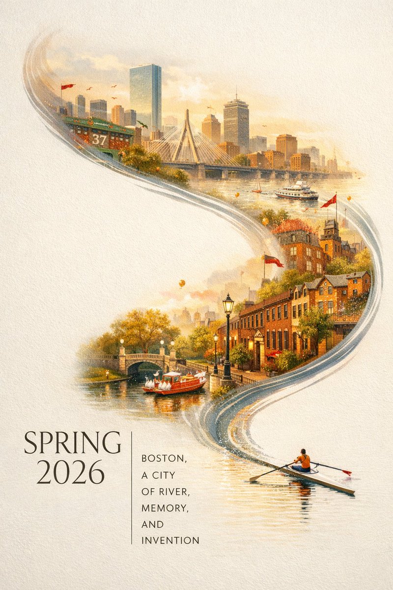
Full Prompt
A striking Spring 2026 city poster for Boston with an elegant celebratory mood and a bold contemporary design. On a clean off-white textured background with large areas of negative space, a miniature single sculler rows across the lower right corner of the image on a narrow ribbon of reflective water. The wake from the oar sweeps upward in a dynamic calligraphic curve, gradually transforming into the Charles River and then into a dreamlike hand-painted panorama of Boston. Inside this flowing river-shaped composition are iconic Boston elements: the Back Bay skyline, Beacon Hill brownstones, Acorn Street, Boston Public Garden, Swan Boats, Zakim Bridge, Fenway-inspired details, historic brick architecture, harbor ferries, and the city’s waterfront atmosphere. Soft morning fog, golden spring light, subtle festive accents in crimson and gold, rich detail, layered depth, sophisticated city-poster aesthetics, fresh and refined, visually powerful but not overcrowded. Elegant typography in the lower left reads “SPRING 2026” with a vertical slogan “BOSTON, A CITY OF RIVER, MEMORY, AND INVENTION”, text clear and beautifully composed, premium graphic design, 9:16