Case Media

Case Notes
This page keeps the media, full prompt, and original source together so you can inspect the result first and decide whether the prompt is worth copying, saving, or comparing.
Case Insights
To make this page easier to search, cite, and reuse later, the case is also broken down into practical guidance about usage, visual cues, and prompt structure.
Best Fit Scenarios
- Use this as a poster & illustration benchmark when you need a fast style baseline before rewriting your own prompt.
- It is especially helpful if your target overlaps with Poster, Illustration, City Visual and you want to judge the image result before tuning wording.
- Keep it as a control sample when you compare nearby prompt variants one variable at a time.
Visual Signals To Notice
- The clearest style signals here are Poster, Illustration, City Visual, so those should usually stay in your first rewrite.
- Pay close attention to layout rhythm, headline hierarchy, illustration texture, and how information is staged in the frame.
- This case keeps one primary output, so the first image should be treated as the main visual reference.
How The Prompt Is Structured
- The prompt reads as a long, highly specified prompt, which is useful when you want to judge how much specificity this direction needs.
- Its keyword cluster is centered on Poster, Illustration, City Visual, so you can usually keep that cluster while swapping subject, camera, layout, or copy details.
- A practical rewrite path is: keep the outcome, keep the strongest style cues, then replace only the subject and environment blocks.
Good Follow-up Questions
- What changes first if you keep Poster, Illustration, City Visual but switch the subject matter?
- Which part of the result comes from section-level structure (Poster & Illustration) versus tag-level style cues?
- Which related cases in the same section give you a cleaner or more extreme variation of the same direction?
Full Prompt
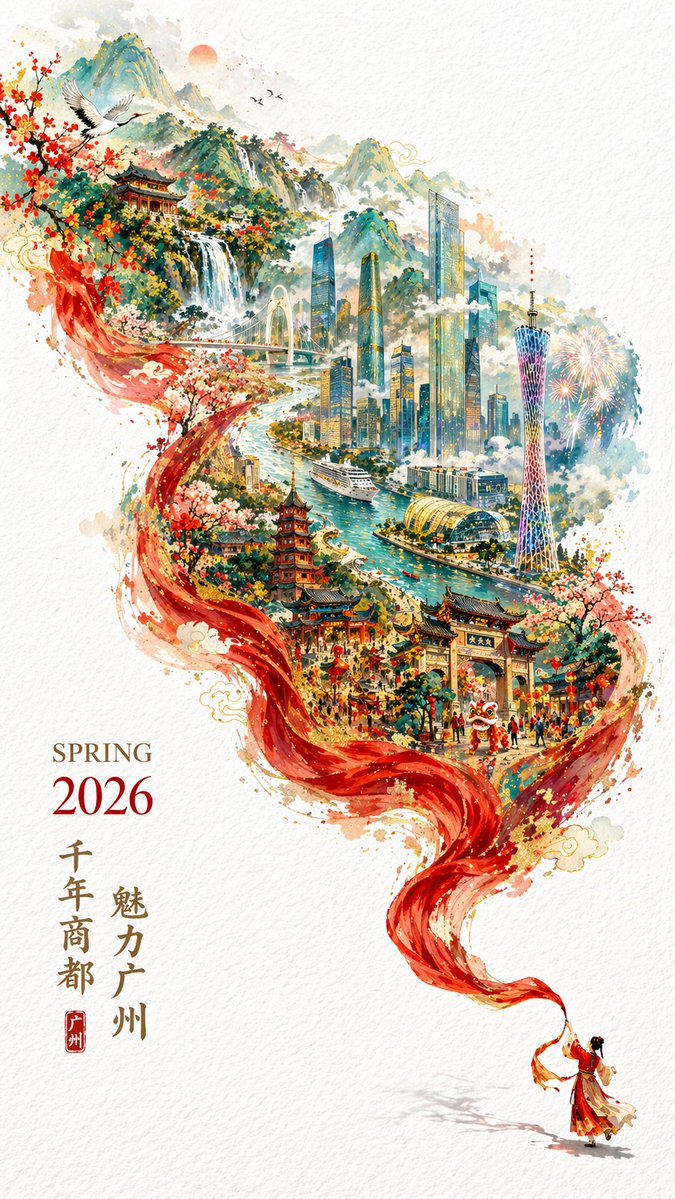
A 2026 city promotional poster full of a festive Chinese New Year atmosphere yet maintaining an elegant style. Double exposure, the composition continues the flowing sense of an S-shape; In the lower right corner of the pure white textured background, a miniature figure wearing traditional Chinese clothing is waving a long red silk dance ribbon, this red silk dances in the air, not only showing the smooth texture of the silk, but also in the process of drifting to the upper left, magically transforming into a magnificent mountain range and river. In this "river", a hand-drawn map of Guangzhou city with mountains, sea, and rivers is superimposed, Guochao, the scenery is fully in view, magnificent and majestic, breathtaking. Guangzhou's landmark buildings (Canton Tower, Pearl River New City building complex, Pearl River, ancient buildings in Guangzhou city, cruise ships, Baiyun Mountain). Surrounded by clouds and mist, ethereal and misty, rich in colors, complex in structure, rich in details, but because of a large area of negative space, the picture still appears fresh and refined, the lower left corner is typeset with "SPRING 2026" and vertical promotional slogans, the overall implication is "Millennium Commercial Capital, Charming Guangzhou". Beautiful and generous typography, clear and complete handwriting, aspect ratio 9:16.