Case Media
Case Notes
This page keeps the media, full prompt, and original source together so you can inspect the result first and decide whether the prompt is worth copying, saving, or comparing.
Case Insights
To make this page easier to search, cite, and reuse later, the case is also broken down into practical guidance about usage, visual cues, and prompt structure.
Best Fit Scenarios
- Use this as a portrait & photography benchmark when you need a fast style baseline before rewriting your own prompt.
- It is especially helpful if your target overlaps with Portrait, Fashion, Poster and you want to judge the image result before tuning wording.
- Keep it as a control sample when you compare nearby prompt variants one variable at a time.
Visual Signals To Notice
- The clearest style signals here are Portrait, Fashion, Poster, so those should usually stay in your first rewrite.
- Focus on framing, light direction, pose, and the distance between subject and camera.
- This case keeps 2 media outputs, which makes it easier to check whether the style remains stable across multiple results.
How The Prompt Is Structured
- The prompt reads as a long, highly specified prompt, which is useful when you want to judge how much specificity this direction needs.
- Its keyword cluster is centered on Portrait, Fashion, Poster, so you can usually keep that cluster while swapping subject, camera, layout, or copy details.
- A practical rewrite path is: keep the outcome, keep the strongest style cues, then replace only the subject and environment blocks.
Good Follow-up Questions
- What changes first if you keep Portrait, Fashion, Poster but switch the subject matter?
- Which part of the result comes from section-level structure (Portrait & Photography) versus tag-level style cues?
- Which related cases in the same section give you a cleaner or more extreme variation of the same direction?
Full Prompt
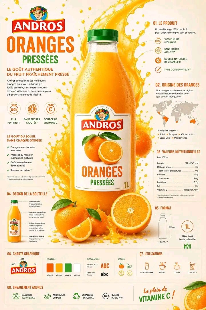
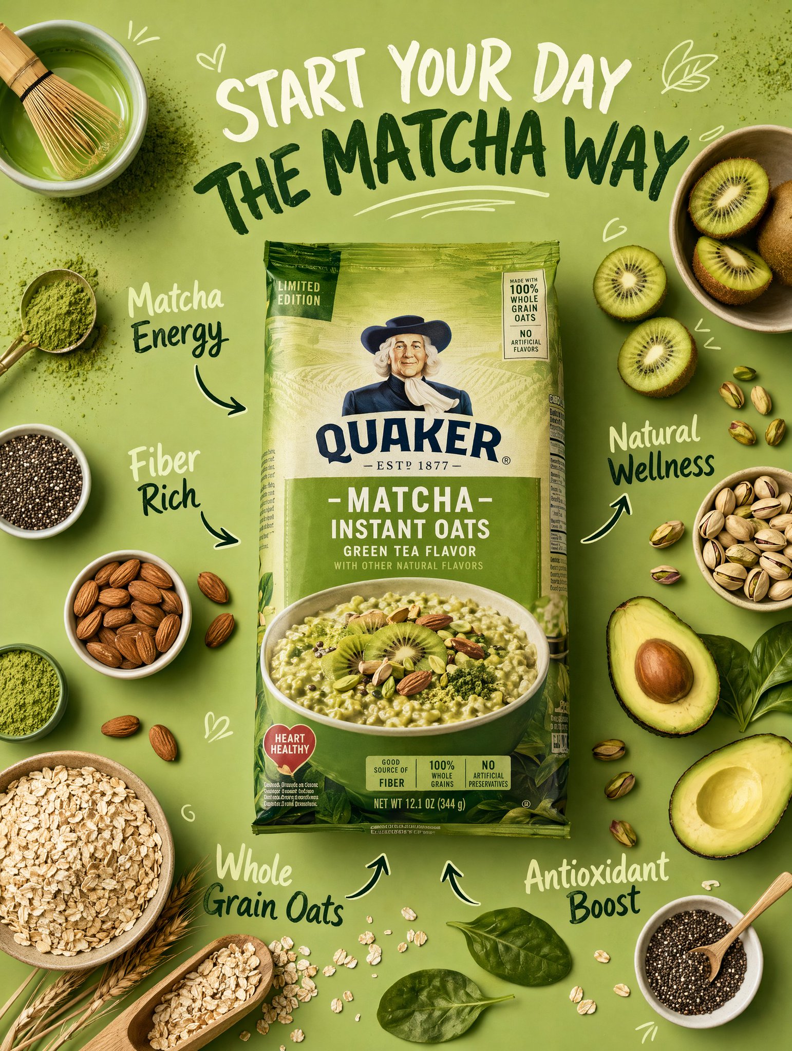
Create a premium healthy breakfast flat-lay advertising poster for [BRAND NAME] in a monochrome flavor-inspired color palette. TOPIC: Healthy breakfast / oats / chia seeds / granola / organic wellness food STYLE: Flat-lay healthy-food commercial photography Modern nutrition infographic aesthetic Premium wellness branding Instagram lifestyle campaign style Minimal colorful composition Soft playful typography Behance-quality FMCG advertising MAIN SUBJECT: Realistic product packaging centered prominently Flat lay top-view composition Ingredients surrounding the package naturally Realistic food textures and premium commercial styling Ingredient storytelling around the product LAYOUT: Symmetrical ingredient arrangement Infographic arrows and ingredient labels Spacious monochrome background matching the flavor theme Large playful headline typography at the top Clean editorial hierarchy TEXT: Main title: “[HEALTHY BREAKFAST MESSAGE]” Supporting labels: Natural Energy Fiber Rich Organic Wellness Superfood Boost LIGHTING: Bright soft studio lighting Realistic food highlights Clean commercial shadows Fresh premium breakfast atmosphere EXTRA DETAILS: Scattered oats, seeds, fruits, or powders Minimal wellness doodles Clean infographic nutrition layout COLOR PALETTE: One dominant monochrome flavor-inspired color Natural ingredient tones Soft healthy contrast palette Premium modern wellness aesthetic OUTPUT: Ultra-realistic food rendering Premium breakfast campaign poster Ultra-high resolution Clean modern advertising finish