Case Media
Case Notes
This page keeps the media, full prompt, and original source together so you can inspect the result first and decide whether the prompt is worth copying, saving, or comparing.
Case Insights
To make this page easier to search, cite, and reuse later, the case is also broken down into practical guidance about usage, visual cues, and prompt structure.
Best Fit Scenarios
- Use this as a portrait & photography benchmark when you need a fast style baseline before rewriting your own prompt.
- It is especially helpful if your target overlaps with Portrait, Poster, Illustration and you want to judge the image result before tuning wording.
- Keep it as a control sample when you compare nearby prompt variants one variable at a time.
Visual Signals To Notice
- The clearest style signals here are Portrait, Poster, Illustration, so those should usually stay in your first rewrite.
- Focus on framing, light direction, pose, and the distance between subject and camera.
- This case keeps one primary output, so the first image should be treated as the main visual reference.
How The Prompt Is Structured
- The prompt reads as a long, highly specified prompt, which is useful when you want to judge how much specificity this direction needs.
- Its keyword cluster is centered on Portrait, Poster, Illustration, so you can usually keep that cluster while swapping subject, camera, layout, or copy details.
- A practical rewrite path is: keep the outcome, keep the strongest style cues, then replace only the subject and environment blocks.
Good Follow-up Questions
- What changes first if you keep Portrait, Poster, Illustration but switch the subject matter?
- Which part of the result comes from section-level structure (Portrait & Photography) versus tag-level style cues?
- Which related cases in the same section give you a cleaner or more extreme variation of the same direction?
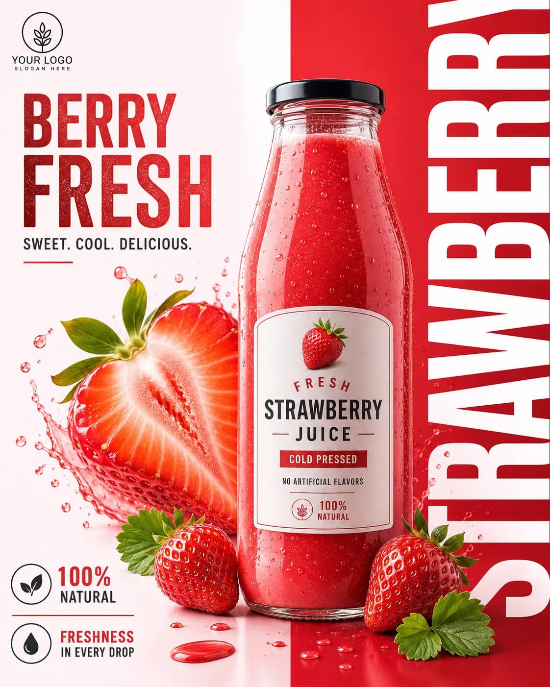
Full Prompt
Commercial product advertisement poster for a premium strawberry juice. Center: A tall, clear glass bottle with a black screw cap, filled with vibrant red, thick, textured strawberry juice showing tiny seed specs. The bottle features a clean white arched label reading "FRESH STRAWBERRY JUICE", "COLD PRESSED", and "100% NATURAL" with a small strawberry illustration at the top. Foreground & Composition: A dramatic, crisp cross-section of a large, juicy strawberry is positioned on the left, exploding with dynamic, crystal-clear water and juice splashes. Two whole, ripe red strawberries with fresh green leaves rest at the base of the bottle on a glossy surface reflecting tiny red juice droplets. Background & Layout: A sharp, vertical split background. The left 60% is a clean, bright, minimalist off-white/light pink gradient. The right 40% is a solid, bold crimson red block. Superimposed vertically on the far right red section is massive, bold, clean white typography spelling "STRAWBERRY". On the upper left side, bold red text reads "BERRY FRESH" with the subtext "SWEET. COOL. DELICIOUS." below it. In the bottom left corner, there are minimalist circular icons for "100% NATURAL" and "FRESHNESS IN EVERY DROP". Style: High-end commercial beverage photography, studio lighting, hyper-realistic, 8k resolution, razor-sharp focus, vivid color grading, professional branding layout. --ar 4:5