Case Media

Case Notes
This page keeps the media, full prompt, and original source together so you can inspect the result first and decide whether the prompt is worth copying, saving, or comparing.
Case Insights
To make this page easier to search, cite, and reuse later, the case is also broken down into practical guidance about usage, visual cues, and prompt structure.
Best Fit Scenarios
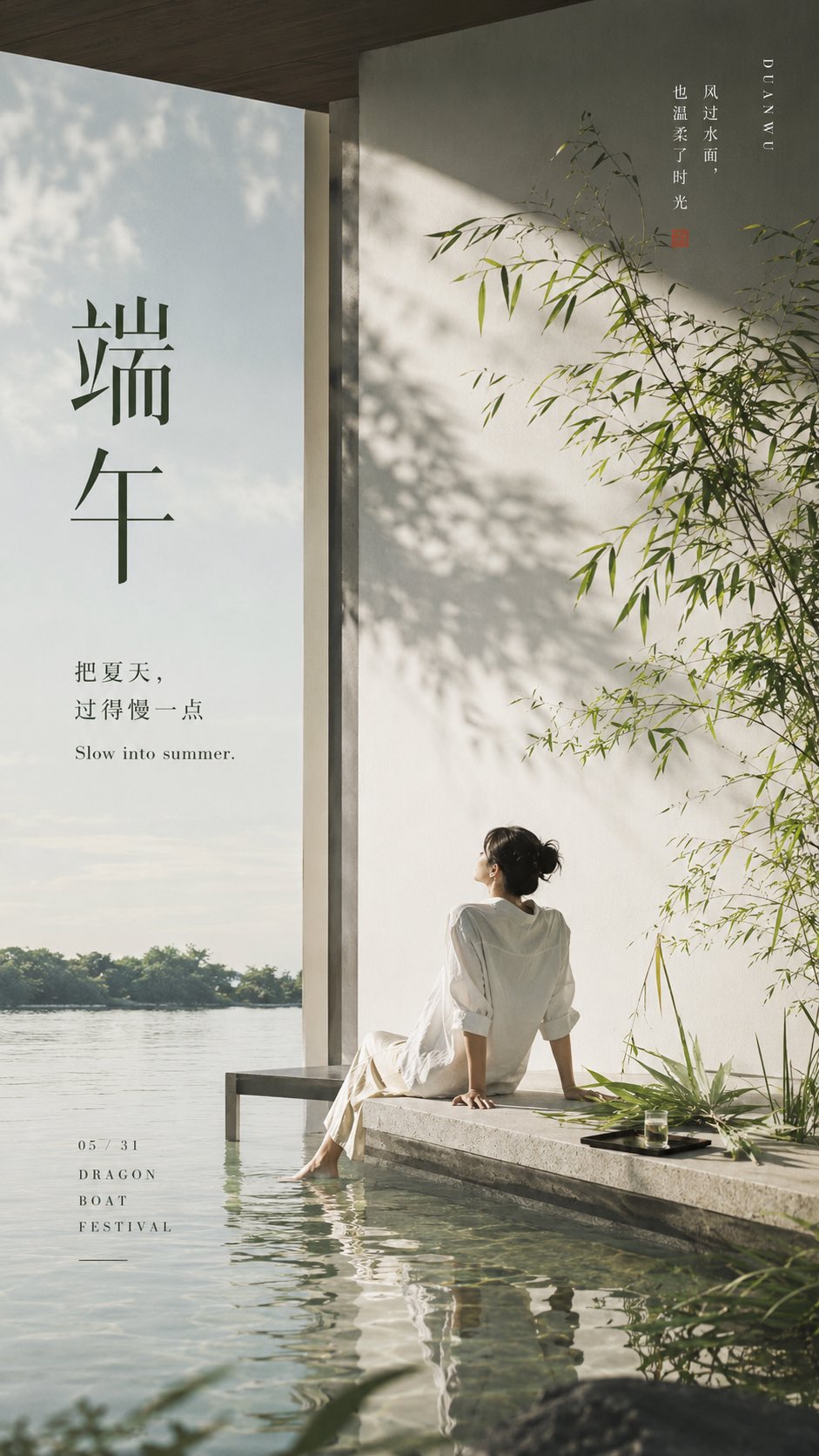
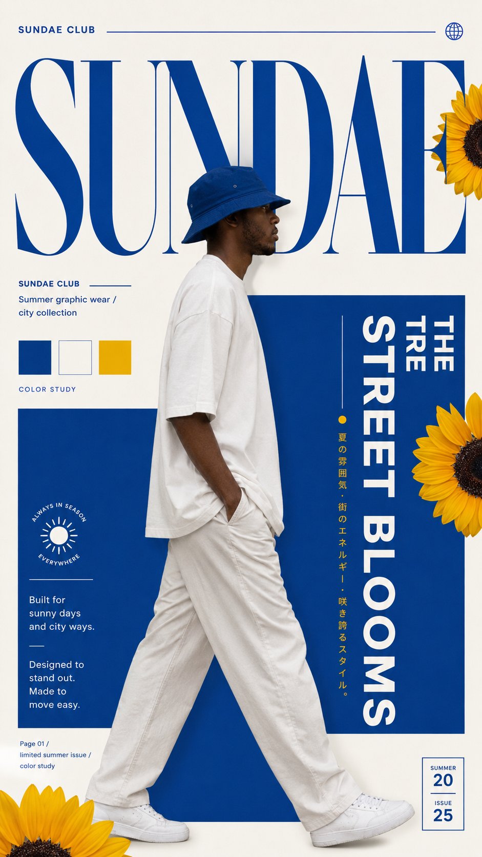
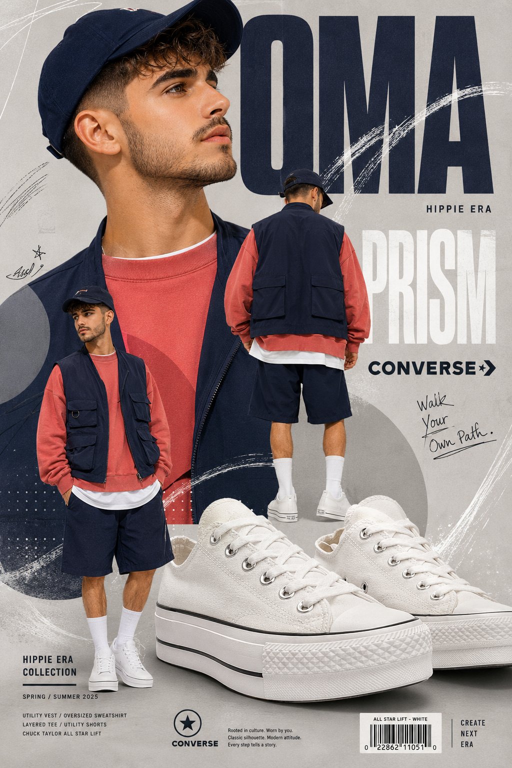
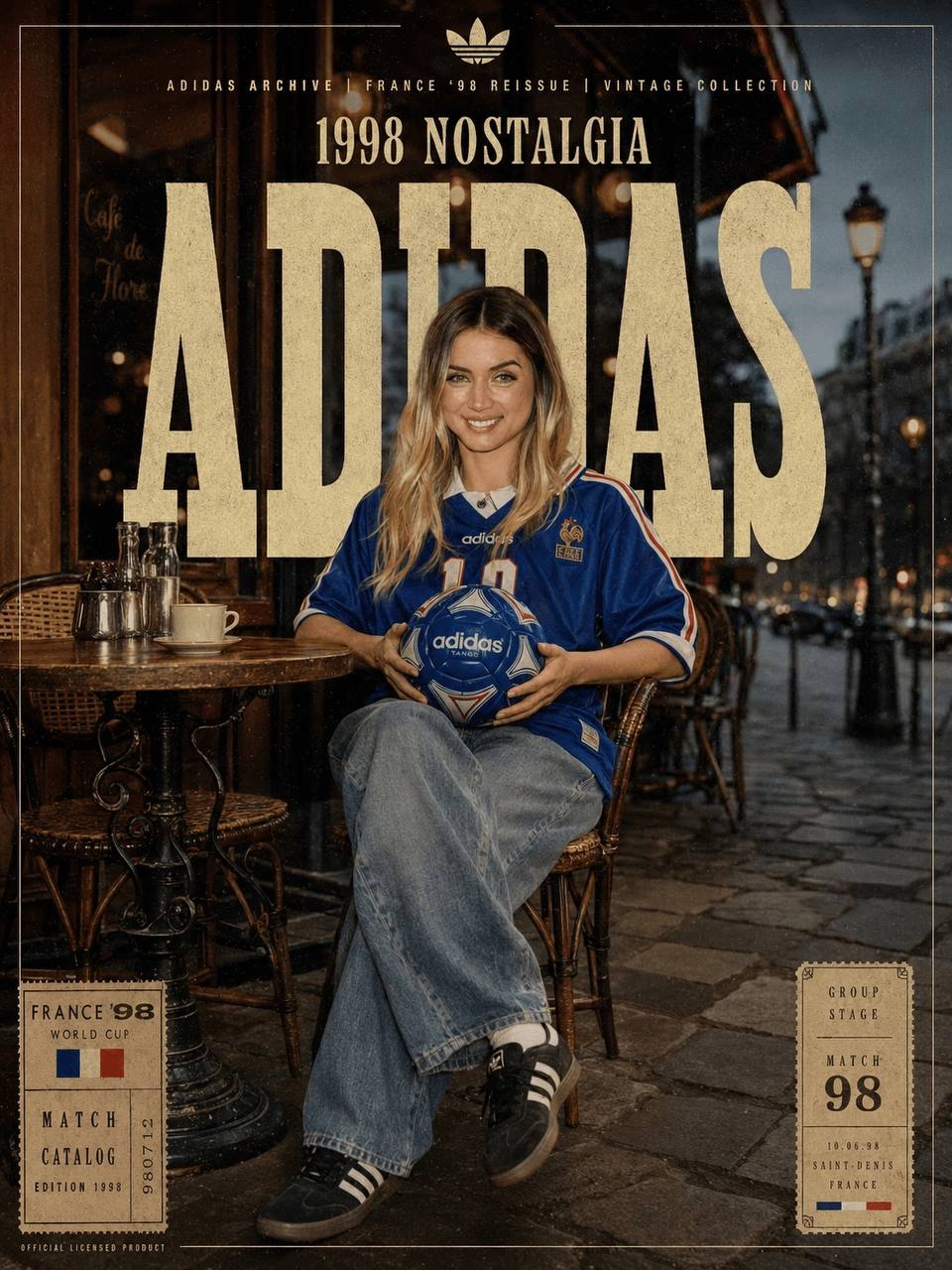
- Use this as a portrait & photography benchmark when you need a fast style baseline before rewriting your own prompt.
- It is especially helpful if your target overlaps with 35mm, Portrait, Poster and you want to judge the image result before tuning wording.
- Keep it as a control sample when you compare nearby prompt variants one variable at a time.
Visual Signals To Notice
- The clearest style signals here are 35mm, Portrait, Poster, so those should usually stay in your first rewrite.
- Focus on framing, light direction, pose, and the distance between subject and camera.
- This case keeps 2 media outputs, which makes it easier to check whether the style remains stable across multiple results.
How The Prompt Is Structured
- The prompt reads as a long, highly specified prompt, which is useful when you want to judge how much specificity this direction needs.
- Its keyword cluster is centered on 35mm, Portrait, Poster, so you can usually keep that cluster while swapping subject, camera, layout, or copy details.
- A practical rewrite path is: keep the outcome, keep the strongest style cues, then replace only the subject and environment blocks.
Good Follow-up Questions
- What changes first if you keep 35mm, Portrait, Poster but switch the subject matter?
- Which part of the result comes from section-level structure (Portrait & Photography) versus tag-level style cues?
- Which related cases in the same section give you a cleaner or more extreme variation of the same direction?
Full Prompt
Generate a 9:16 vertical high-end personal care product advertising poster. 【Product Type】: Sunscreen / Scalp Essence / Deodorant Balm / Cleansing Mud Mask / Body Lotion / Fragrance Spray / Hand Cream 【Brand Name】: Custom Brand Name 【Product Name】: Custom Product Name 【Core Keywords】: SHIELD / ROOT / AURA / DETOX / GLOW / CALM 【Main Color Palette】: Glacier Blue / Sage Green / Fog Purple / Charcoal Rock Gray / Other Independent Color Spectrums 【Ingredients or Materials】: Ice crystals, water film, glass pillars, herbal leaves, fragrance mist, rocks, mineral mud, acrylic, ceramics, metal, etc. 【Aspect Ratio】: 9:16 vertical poster The visual style is a high-end personal care product still life advertisement, minimalist, clean, light luxury, poster-like, with an international Campaign visual feel. The product as the core of the image is placed in the lower-middle part of the frame, with a clear subject, simple and high-end packaging design, realistic materials, and clean edges. Construct an "ingredient / efficacy installation" around the product: Do not just place props next to it, but let ingredients, materials, and the product form a structural relationship, such as a shield, protective barrier, vertical growth, fragrance surrounding, rock layer support, liquid application, transparent refraction, glass laboratory structure, etc. Let the image convey the product's efficacy concept at a glance. Keep the background clean with a large area of whitespace, using soft gradient backgrounds and high-end studio lighting. Add a lightweight white typography system to the image: a huge translucent English keyword as background text, such as "SHIELD / ROOT / AURA / DETOX"; then add a small amount of small-font product descriptions, series numbers, and ingredient phrases. The text should be light, thin, restrained, and have a sense of design, without overshadowing the main subject. The overall composition is a 9:16 vertical poster, with sufficient whitespace at the top, the middle displaying the relationship between the product and the installation, and the bottom can include a small amount of reflections, materials, descriptive text, or brand logos. The image should look like a complete high-end advertising poster, rather than a common e-commerce detail page. Quality requirements: realistic photography texture, high resolution, soft studio light, realistic materials, clean shadows, clear product, realistic and natural materials such as glass, liquid, plants, rocks, ceramics, metal, etc., overall high-end, restrained, and with a sense of series.