Case Media

Case Notes
This page keeps the media, full prompt, and original source together so you can inspect the result first and decide whether the prompt is worth copying, saving, or comparing.
Case Insights
To make this page easier to search, cite, and reuse later, the case is also broken down into practical guidance about usage, visual cues, and prompt structure.
Best Fit Scenarios
- Use this as a portrait & photography benchmark when you need a fast style baseline before rewriting your own prompt.
- It is especially helpful if your target overlaps with 35mm, Neon, Portrait and you want to judge the image result before tuning wording.
- Keep it as a control sample when you compare nearby prompt variants one variable at a time.
Visual Signals To Notice
- The clearest style signals here are 35mm, Neon, Portrait, so those should usually stay in your first rewrite.
- Focus on framing, light direction, pose, and the distance between subject and camera.
- This case keeps 2 media outputs, which makes it easier to check whether the style remains stable across multiple results.
How The Prompt Is Structured
- The prompt reads as a long, highly specified prompt, which is useful when you want to judge how much specificity this direction needs.
- Its keyword cluster is centered on 35mm, Neon, Portrait, so you can usually keep that cluster while swapping subject, camera, layout, or copy details.
- A practical rewrite path is: keep the outcome, keep the strongest style cues, then replace only the subject and environment blocks.
Good Follow-up Questions
- What changes first if you keep 35mm, Neon, Portrait but switch the subject matter?
- Which part of the result comes from section-level structure (Portrait & Photography) versus tag-level style cues?
- Which related cases in the same section give you a cleaner or more extreme variation of the same direction?
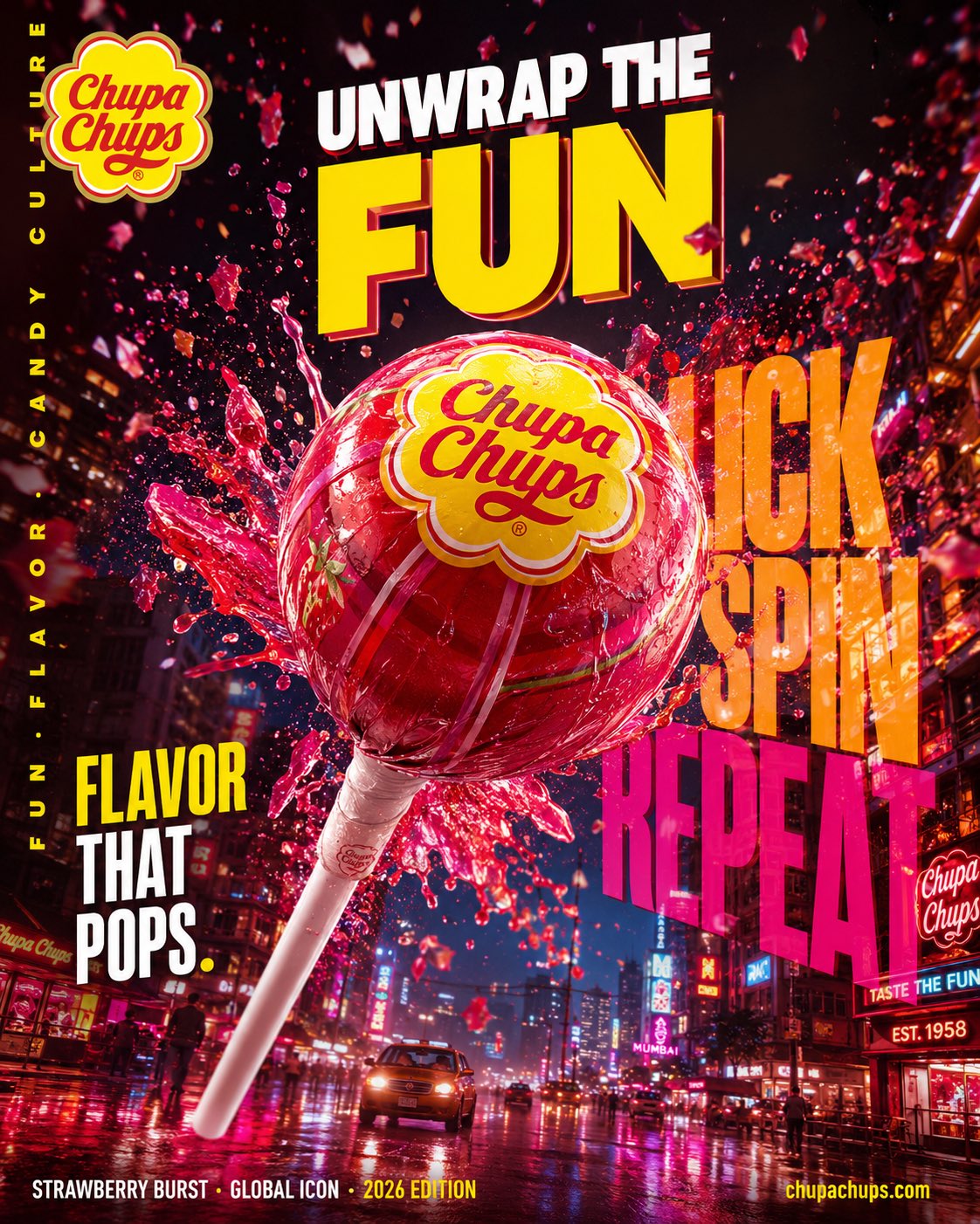
Full Prompt
Hyper-realistic cinematic FMCG billboard advertising poster for Chupa Chups India, focusing on playful energy, bold flavor explosion, and Gen-Z candy culture. Scene: a giant glossy Chupa Chups lollipop floating above a vibrant Indian street at night, candy shards and liquid flavor bursts exploding outward mid-air. Environment: neon-lit urban backdrop inspired by Mumbai nightlife, glowing signage, reflective wet streets, colorful haze. Subject: oversized strawberry swirl lollipop as the hero object, ultra-detailed glossy texture, cinematic flavor splash motion. Visual storytelling: iconic Chupa Chups flower logo glowing subtly on wrapper, reflections visible on wet surfaces and candy syrup splashes. Composition: dramatic low-angle shot, giant centered product dominating frame, dynamic explosion spreading diagonally across billboard composition. Typography: top left — Chupa Chups logo. center massive — “UNWRAP THE FUN” ultra bold playful typography. behind product (oversized layered text) — “LICK / SPIN / REPEAT”. mid-left — “FLAVOR THAT POPS.” bold condensed font. bottom left — “STRAWBERRY BURST · GLOBAL ICON · 2026 EDITION”. bottom right — “ http:// chupachups.com”. left vertical edge — “FUN · FLAVOR · CANDY CULTURE”. Typography style: playful bold sans-serif, glossy layered opacity, oversized billboard scale. Color palette: vibrant reds, yellows, pinks, neon orange accents, glossy candy textures. Lighting: dramatic neon backlight with glowing highlights and candy reflections. Atmosphere: sugar particles, mist, syrup splashes, floating candy dust. Mood: energetic, youthful, addictive, vibrant. Shot on ARRI Alexa Mini LF, 35mm anamorphic, HDR, ultra cinematic, premium FMCG billboard style, 4:5 portrait. Prompt : Hyper-realistic cinematic FMCG billboard advertising poster for Alpenliebe Juzt Jelly Pops, focusing on fruity excitement, soft candy textures, and playful sweetness. Scene: colorful jelly-filled lollipops bursting through floating liquid fruit waves, suspended mid-air above a dreamy pastel candy world. Environment: surreal candy landscape inspired by Indian summer fruits, glossy reflective surfaces, floating jelly cubes, soft clouds of sugar mist. Subject: ultra-detailed jelly lollipop with translucent texture, liquid-filled candy center glowing under cinematic light. Visual storytelling: fruit syrup streams wrapping around the product dynamically, reflections shimmering across glossy surfaces. Composition: centered hero product shot with sweeping curved motion trails and layered floating candy elements. Typography: top left — Alpenliebe logo. center massive — “JUICY INSIDE.” playful oversized typography. behind product (soft layered text) — “POP / CHEW / SMILE”. mid-left — “EVERY LICK BURSTS.” modern rounded font. bottom left — “FRUITY JELLY CORE · SOFT CANDY MAGIC · 2026 EDITION”. bottom right — “ http:// perfettivanmelle.in”. left vertical edge — “JUICY · SWEET · FUN”. Typography style: rounded bold sans-serif, glossy highlights, soft layered opacity. Color palette: mango yellow, strawberry pink, orange, translucent jelly reds. Lighting: soft cinematic glow with translucent candy highlights. Atmosphere: floating sugar particles, fruit mist, glossy reflections. Mood: cheerful, playful, juicy, dreamy. Shot on ARRI Alexa Mini LF, 50mm cinematic lens feel, HDR, ultra premium FMCG campaign style, 4:5 portrait.