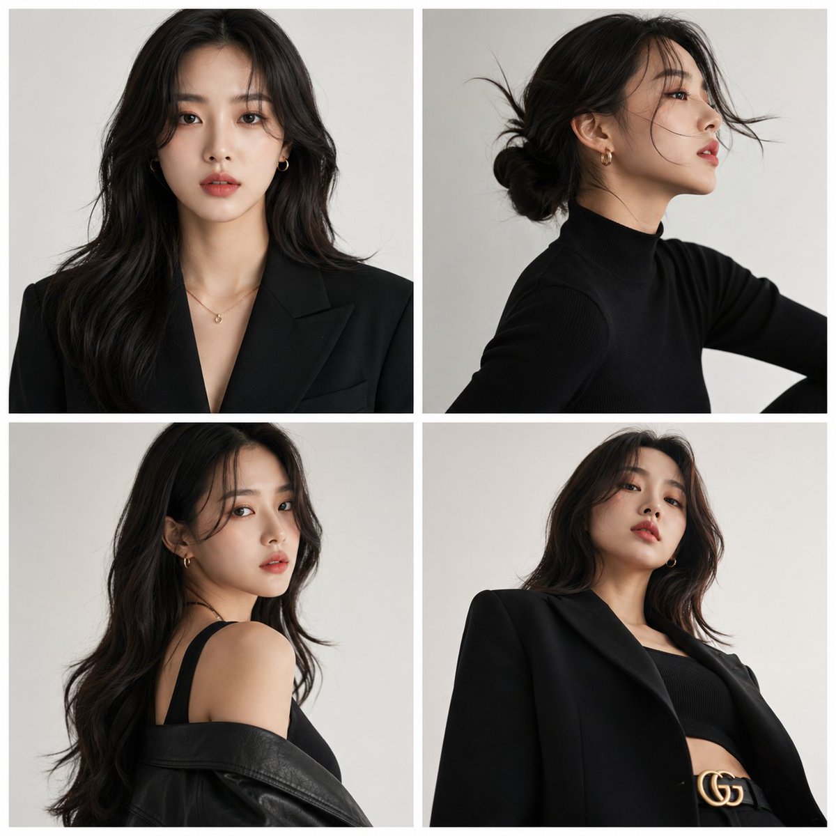
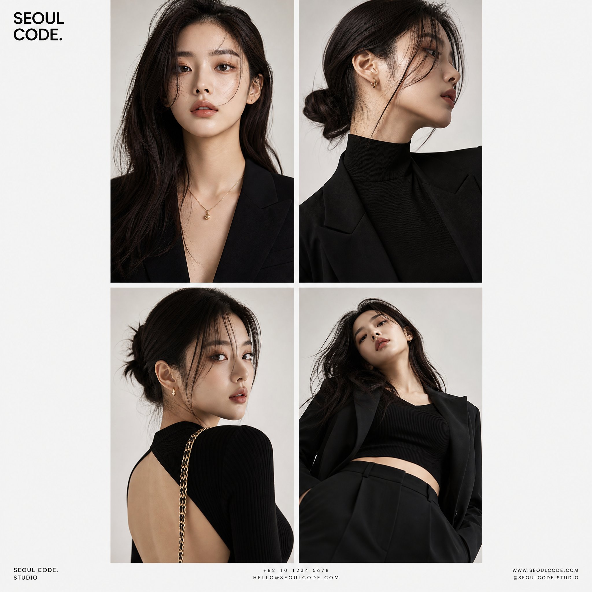
Case Media
Case Notes
This page keeps the media, full prompt, and original source together so you can inspect the result first and decide whether the prompt is worth copying, saving, or comparing.
Case Insights
To make this page easier to search, cite, and reuse later, the case is also broken down into practical guidance about usage, visual cues, and prompt structure.
Best Fit Scenarios
- Use this as a portrait & photography benchmark when you need a fast style baseline before rewriting your own prompt.
- It is especially helpful if your target overlaps with Portrait, Cinematic, Fashion and you want to judge the image result before tuning wording.
- Keep it as a control sample when you compare nearby prompt variants one variable at a time.
Visual Signals To Notice
- The clearest style signals here are Portrait, Cinematic, Fashion, so those should usually stay in your first rewrite.
- Focus on framing, light direction, pose, and the distance between subject and camera.
- This case keeps one primary output, so the first image should be treated as the main visual reference.
How The Prompt Is Structured
- The prompt reads as a long, highly specified prompt, which is useful when you want to judge how much specificity this direction needs.
- Its keyword cluster is centered on Portrait, Cinematic, Fashion, so you can usually keep that cluster while swapping subject, camera, layout, or copy details.
- A practical rewrite path is: keep the outcome, keep the strongest style cues, then replace only the subject and environment blocks.
Good Follow-up Questions
- What changes first if you keep Portrait, Cinematic, Fashion but switch the subject matter?
- Which part of the result comes from section-level structure (Portrait & Photography) versus tag-level style cues?
- Which related cases in the same section give you a cleaner or more extreme variation of the same direction?
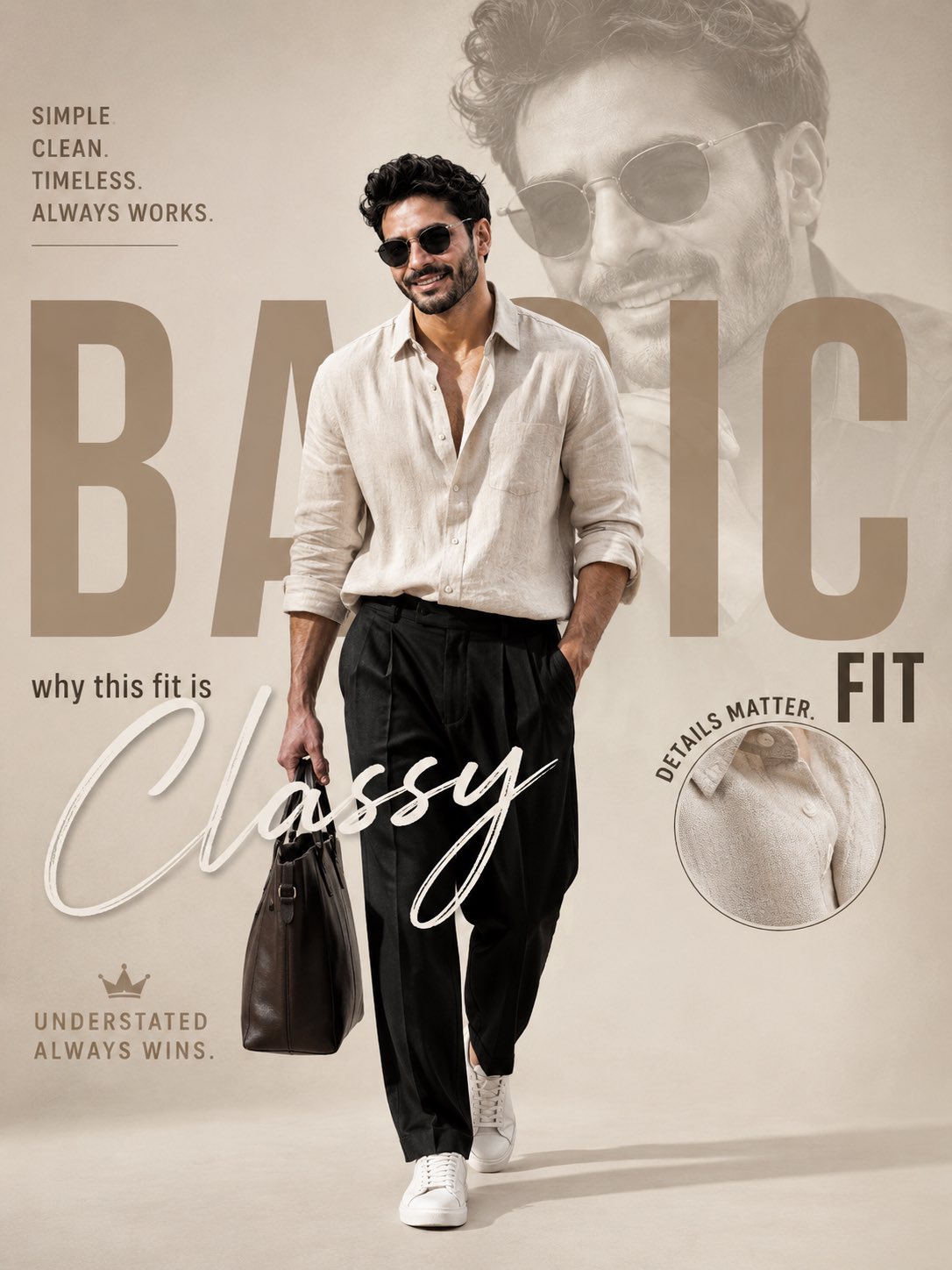
Full Prompt
Premium men’s fashion editorial poster, luxury Instagram campaign design, minimalist beige and ivory color palette, full-body confident man walking forward, wearing an oversized cream linen shirt with sleeves rolled up, relaxed black pleated trousers, white premium sneakers, black sunglasses, carrying a sophisticated leather tote bag. Large faded monochrome portrait of the same model in the background creating depth and luxury branding feel. Large bold typography behind the model reading: “BASIC” Smaller bold typography aligned right reading: “FIT” Elegant large handwritten brush script across the lower center reading: “Classy” Top-left editorial quote in clean modern typography: “SIMPLE.” “CLEAN.” “TIMELESS.” “ALWAYS WORKS.” Small caption beneath the headline: “why this fit is” Bottom-left luxury tagline with crown icon: “UNDERSTATED” “ALWAYS WINS.” Circular detail inset on the right side showing close-up shirt fabric texture with surrounding text: “DETAILS MATTER.” Magazine-quality typography hierarchy, luxury menswear advertisement, understated elegance, soft natural shadows, premium fashion photography, clean composition, balanced negative space, muted earth tones, realistic textures, luxury lookbook aesthetic, modern editorial layout, sophisticated branding, ultra-sharp focus, cinematic lighting, high-end fashion campaign, 4K, professional art direction. Leave the entire bottom-right corner empty with no signature, no watermark, no logo, and no text. Negative Prompt: signature, watermark, logo, photographer credit, brand mark, extra people, duplicate body, blurry face, distorted hands, bad anatomy, cluttered layout, low resolution, oversaturated colors, cropped feet, random text artifacts, excessive accessories, messy typography