Case Media
Case Notes
This page keeps the media, full prompt, and original source together so you can inspect the result first and decide whether the prompt is worth copying, saving, or comparing.
Case Insights
To make this page easier to search, cite, and reuse later, the case is also broken down into practical guidance about usage, visual cues, and prompt structure.
Best Fit Scenarios
- Use this as a portrait & photography benchmark when you need a fast style baseline before rewriting your own prompt.
- It is especially helpful if your target overlaps with Portrait, Cinematic, Fashion and you want to judge the image result before tuning wording.
- Keep it as a control sample when you compare nearby prompt variants one variable at a time.
Visual Signals To Notice
- The clearest style signals here are Portrait, Cinematic, Fashion, so those should usually stay in your first rewrite.
- Focus on framing, light direction, pose, and the distance between subject and camera.
- This case keeps one primary output, so the first image should be treated as the main visual reference.
How The Prompt Is Structured
- The prompt reads as a long, highly specified prompt, which is useful when you want to judge how much specificity this direction needs.
- Its keyword cluster is centered on Portrait, Cinematic, Fashion, so you can usually keep that cluster while swapping subject, camera, layout, or copy details.
- A practical rewrite path is: keep the outcome, keep the strongest style cues, then replace only the subject and environment blocks.
Good Follow-up Questions
- What changes first if you keep Portrait, Cinematic, Fashion but switch the subject matter?
- Which part of the result comes from section-level structure (Portrait & Photography) versus tag-level style cues?
- Which related cases in the same section give you a cleaner or more extreme variation of the same direction?
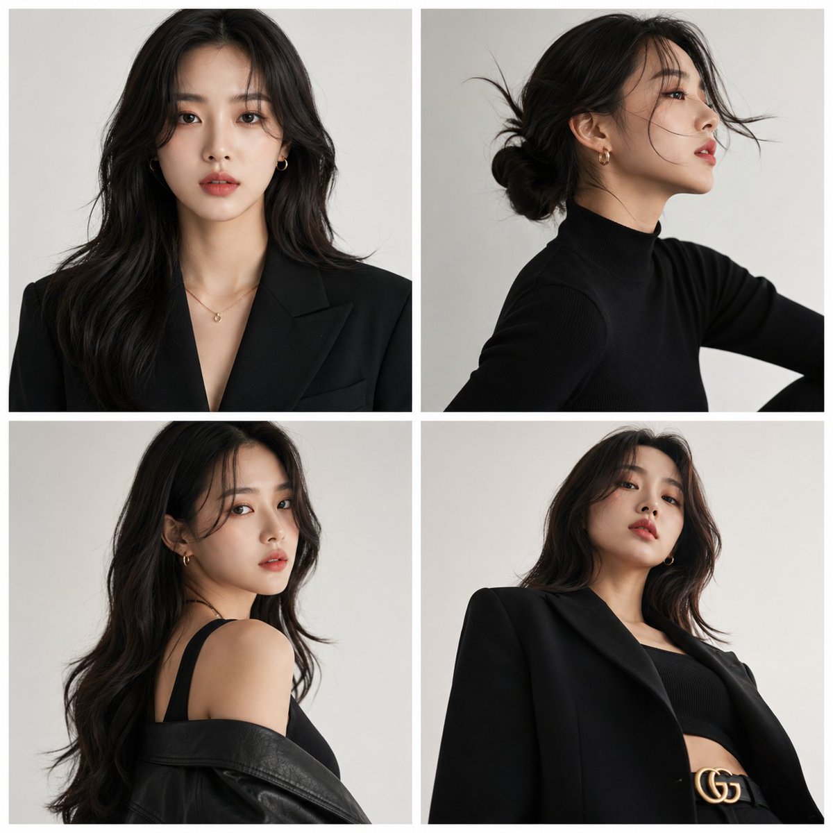
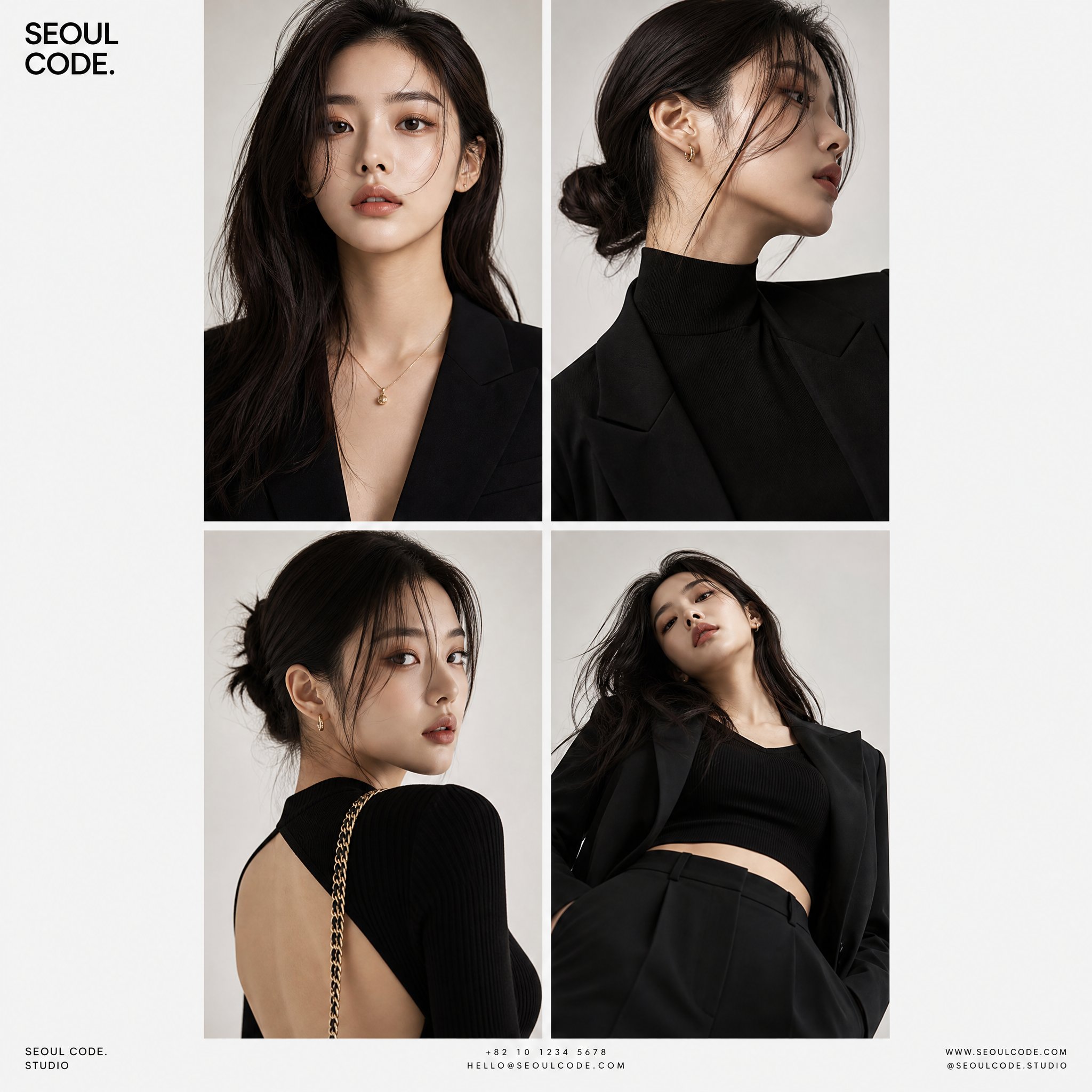
Full Prompt
Create a premium high-fashion editorial series featuring a stylish Korean female model with sharp, elegant, modern beauty aesthetics. Maintain consistent facial identity across all panels. Design a 2x2 grid layout composed of four separate 9:16 vertical posters, separated by thin white spacing. Each panel must show the same model in a different stylish pose, angle, and camera perspective: Panel 1: front-facing portrait, soft confident expression Panel 2: side profile with cinematic lighting and subtle motion pose Panel 3: over-the-shoulder glance, fashion editorial attitude Panel 4: low-angle shot for powerful luxury aesthetic Style & Direction: Ultra-stylish Korean fashion model aesthetic (Seoul street + luxury editorial vibe) Clean modern studio photography Softbox lighting with smooth shadows Minimal off-white / light gray background High-end magazine fashion look Natural makeup, flawless skin, elegant styling Outfits: simple but premium, modern street-luxury fusion Typography: Minimal bold headline at top-left of full composition Small subtle contact details at bottom in clean sans-serif font Overall feel: luxury Korean fashion editorial, ultra-clean, minimal, premium magazine cover series, 8K ultra-detailed photography