Case Media
Case Notes
This page keeps the media, full prompt, and original source together so you can inspect the result first and decide whether the prompt is worth copying, saving, or comparing.
Case Insights
To make this page easier to search, cite, and reuse later, the case is also broken down into practical guidance about usage, visual cues, and prompt structure.
Best Fit Scenarios
- Use this as a portrait & photography benchmark when you need a fast style baseline before rewriting your own prompt.
- It is especially helpful if your target overlaps with Portrait, Fashion, Poster and you want to judge the image result before tuning wording.
- Keep it as a control sample when you compare nearby prompt variants one variable at a time.
Visual Signals To Notice
- The clearest style signals here are Portrait, Fashion, Poster, so those should usually stay in your first rewrite.
- Focus on framing, light direction, pose, and the distance between subject and camera.
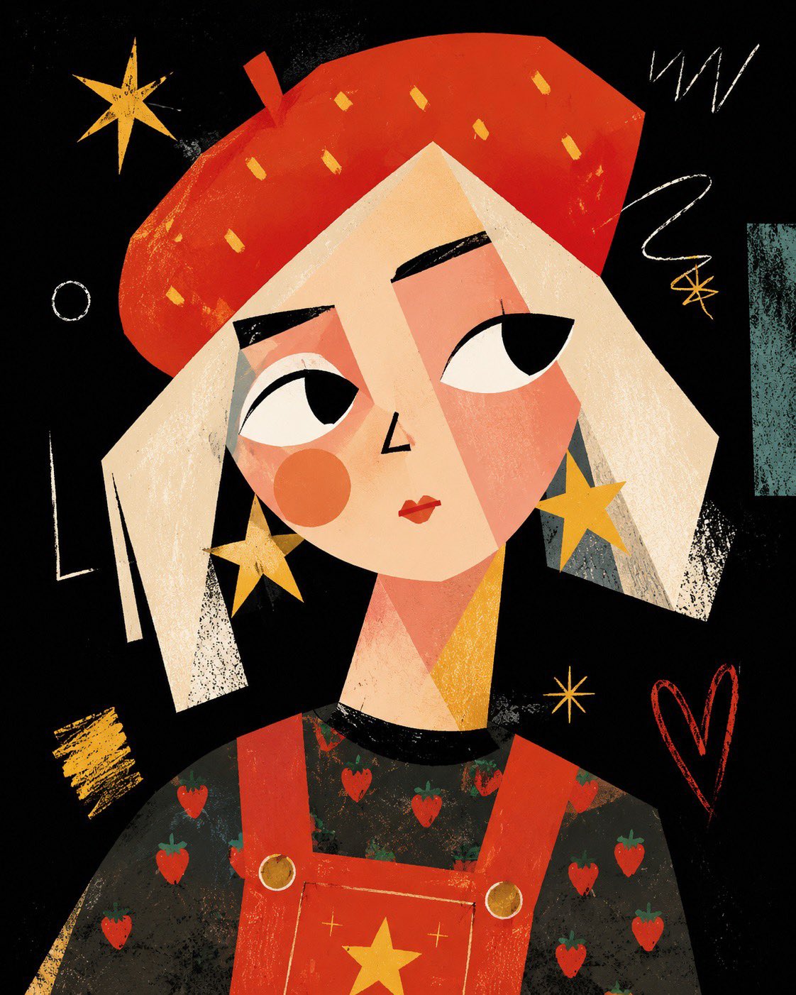
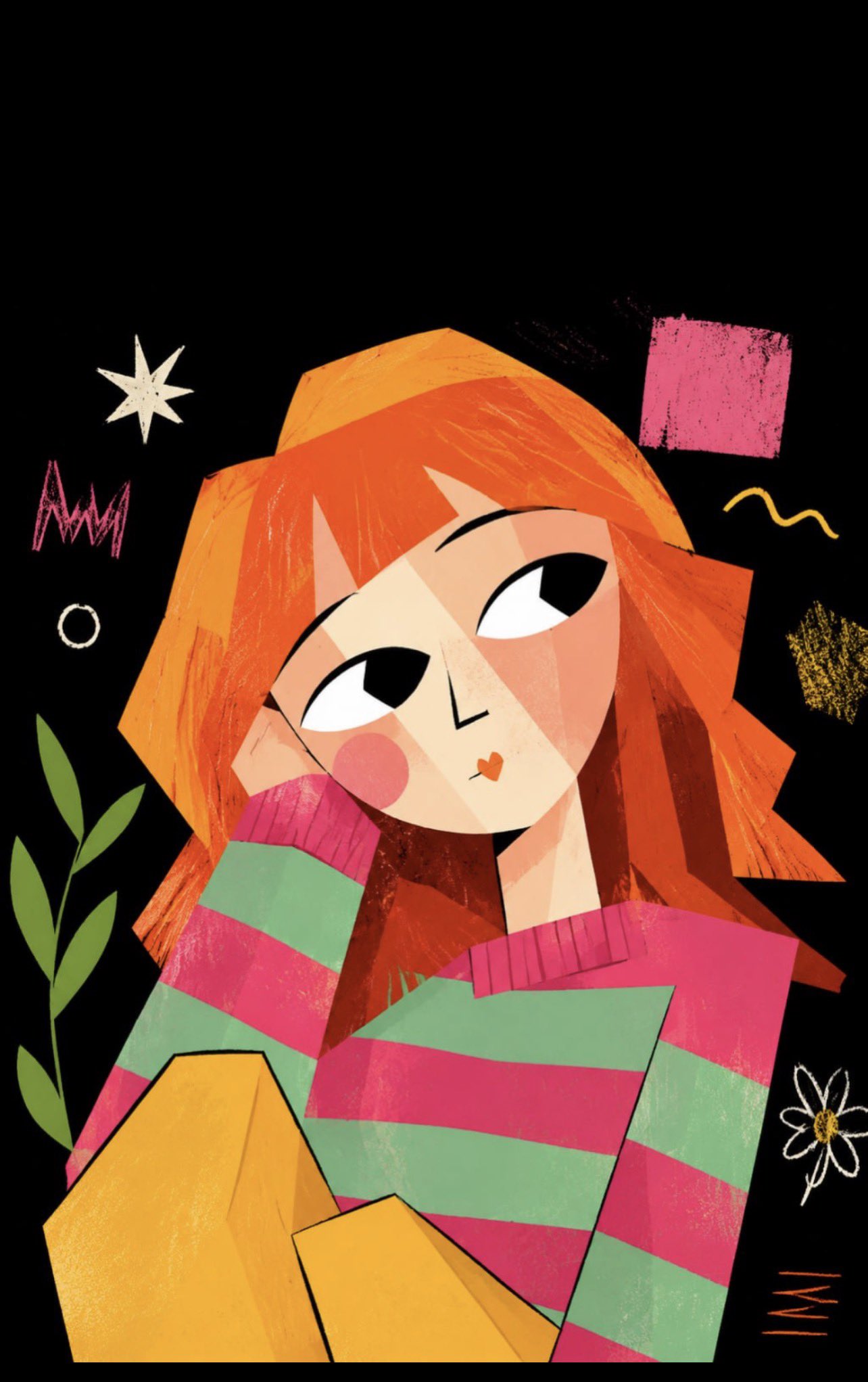
- This case keeps 2 media outputs, which makes it easier to check whether the style remains stable across multiple results.
How The Prompt Is Structured
- The prompt reads as a long, highly specified prompt, which is useful when you want to judge how much specificity this direction needs.
- Its keyword cluster is centered on Portrait, Fashion, Poster, so you can usually keep that cluster while swapping subject, camera, layout, or copy details.
- A practical rewrite path is: keep the outcome, keep the strongest style cues, then replace only the subject and environment blocks.
Good Follow-up Questions
- What changes first if you keep Portrait, Fashion, Poster but switch the subject matter?
- Which part of the result comes from section-level structure (Portrait & Photography) versus tag-level style cues?
- Which related cases in the same section give you a cleaner or more extreme variation of the same direction?
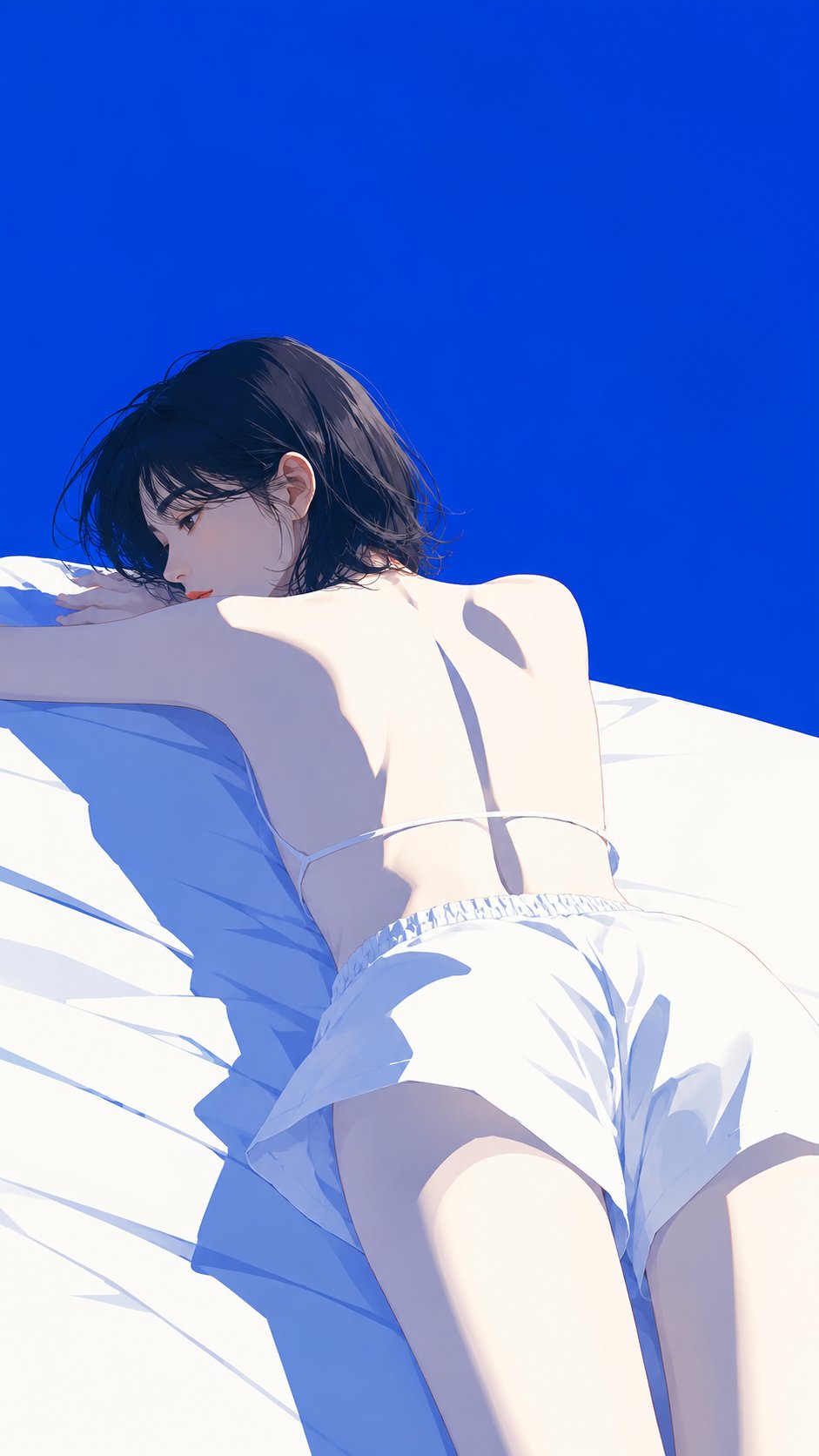
Full Prompt
Create a high-end Japanese fashion magazine cover illustration. The subject is [XXX]. Use a minimalist, modern fashion-digital-illustration style with refined cel shading, crisp clean large color-block modeling, almost no visible linework, and elegant sharp edges. Keep a blue-and-white structural palette as the foundation, with restrained accents of coral red, misty purple, pale yellow, ash pink, sage green, silver gray, or similar soft secondary tones. The final image should stay minimal, premium, cohesive, and not flashy. Use a clean background, such as cobalt blue, royal blue, misty blue, or another pure large color field, with generous negative space. Strong sunlight enters from the upper left. White areas should be bright and close to overexposed, while shadows are built from hard-edged planes of cool blue, gray-blue, and blue-purple. Give the subject a slender silhouette and a quiet, aloof posture. Simplify details while keeping the form accurate. The overall mood should feel translucent, cool, elegant, fashionable, and suitable for a premium magazine cover poster. Avoid text, watermarks, complex backgrounds, photorealistic photography, 3D, heavy impasto, childish cartoon styling, and cluttered decoration.