Case Media
Case Notes
This page keeps the media, full prompt, and original source together so you can inspect the result first and decide whether the prompt is worth copying, saving, or comparing.
Case Insights
To make this page easier to search, cite, and reuse later, the case is also broken down into practical guidance about usage, visual cues, and prompt structure.
Best Fit Scenarios
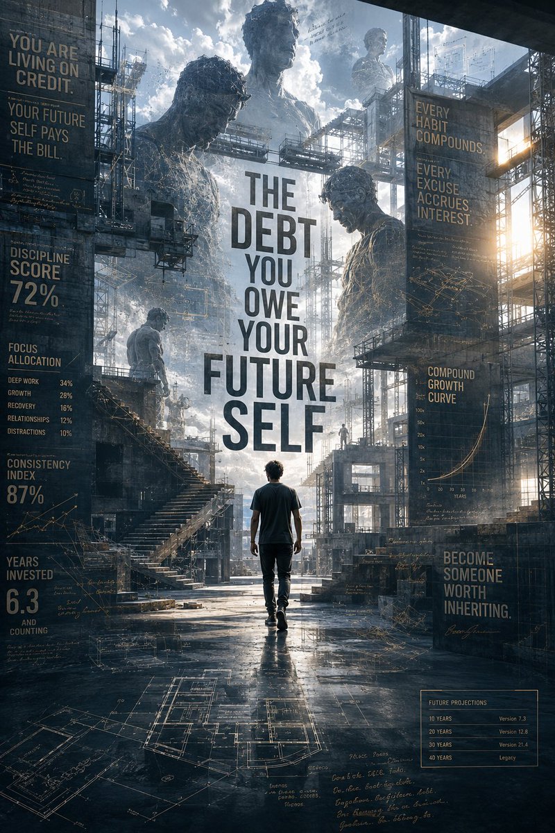
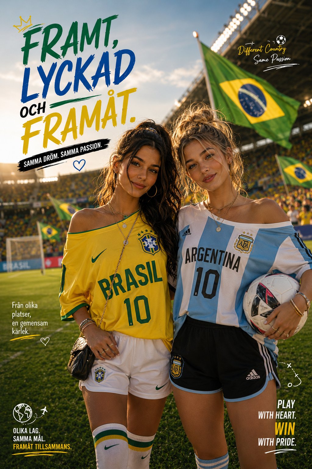
- Use this as a portrait & photography benchmark when you need a fast style baseline before rewriting your own prompt.
- It is especially helpful if your target overlaps with Portrait, Cinematic, Poster and you want to judge the image result before tuning wording.
- Keep it as a control sample when you compare nearby prompt variants one variable at a time.
Visual Signals To Notice
- The clearest style signals here are Portrait, Cinematic, Poster, so those should usually stay in your first rewrite.
- Focus on framing, light direction, pose, and the distance between subject and camera.
- This case keeps one primary output, so the first image should be treated as the main visual reference.
How The Prompt Is Structured
- The prompt reads as a long, highly specified prompt, which is useful when you want to judge how much specificity this direction needs.
- Its keyword cluster is centered on Portrait, Cinematic, Poster, so you can usually keep that cluster while swapping subject, camera, layout, or copy details.
- A practical rewrite path is: keep the outcome, keep the strongest style cues, then replace only the subject and environment blocks.
Good Follow-up Questions
- What changes first if you keep Portrait, Cinematic, Poster but switch the subject matter?
- Which part of the result comes from section-level structure (Portrait & Photography) versus tag-level style cues?
- Which related cases in the same section give you a cleaner or more extreme variation of the same direction?
Full Prompt
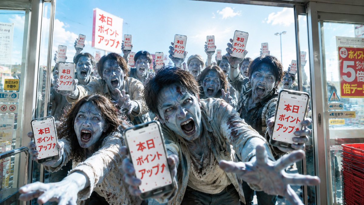
Create a cinematic photorealistic blog cover image showing a chaotic crowd of zombie-like shoppers pressed against the glass entrance of a Japanese retail store on a bright sunny day. The camera is inside the store looking outward through automatic sliding glass doors, wide 16:9 composition, low slightly wide-angle perspective, intense backlight, blue sky and small clouds outside, reflections on the glass, metal door frames, posters on the side windows, and a stack of red shopping baskets at the lower right. About 14 pale, dirty, frantic people in torn light-colored clothes crowd the doorway with outstretched hands and smeared grime, like a consumer stampede. Exactly 10 visible smartphone screens are held up toward the camera, each displaying large red Japanese sale text {argument name="phone screen text" default="本日ポイントアップ↑"} on a white background with small red confetti dots; include 3 large foreground phones, 5 raised background phones, and 2 smaller partially visible side phones. Include 1 large raised rectangular placard near the upper left-center with the same red Japanese text, and 1 bright red-and-yellow store poster on the right window advertising {argument name="poster sale text" default="ポイント 5倍"}. Add exactly 9 opaque dark gray rectangular anonymization blocks covering faces in different sizes, including one large block in the center foreground, one large block on the right foreground, one large block on the left foreground, and six smaller blocks across the background crowd. Keep the scene realistic rather than cartoonish: gritty clothing texture, bluish corpse-like hands, motion blur on reaching arms, shallow depth of field, high-contrast daylight, documentary disaster-movie atmosphere, no extra readable English text, no watermark.