Case Media
Case Notes
This page keeps the media, full prompt, and original source together so you can inspect the result first and decide whether the prompt is worth copying, saving, or comparing.
Case Insights
To make this page easier to search, cite, and reuse later, the case is also broken down into practical guidance about usage, visual cues, and prompt structure.
Best Fit Scenarios
- Use this as a portrait & photography benchmark when you need a fast style baseline before rewriting your own prompt.
- It is especially helpful if your target overlaps with Portrait, Cinematic, Fashion and you want to judge the image result before tuning wording.
- Keep it as a control sample when you compare nearby prompt variants one variable at a time.
Visual Signals To Notice
- The clearest style signals here are Portrait, Cinematic, Fashion, so those should usually stay in your first rewrite.
- Focus on framing, light direction, pose, and the distance between subject and camera.
- This case keeps one primary output, so the first image should be treated as the main visual reference.
How The Prompt Is Structured
- The prompt reads as a long, highly specified prompt, which is useful when you want to judge how much specificity this direction needs.
- Its keyword cluster is centered on Portrait, Cinematic, Fashion, so you can usually keep that cluster while swapping subject, camera, layout, or copy details.
- A practical rewrite path is: keep the outcome, keep the strongest style cues, then replace only the subject and environment blocks.
Good Follow-up Questions
- What changes first if you keep Portrait, Cinematic, Fashion but switch the subject matter?
- Which part of the result comes from section-level structure (Portrait & Photography) versus tag-level style cues?
- Which related cases in the same section give you a cleaner or more extreme variation of the same direction?
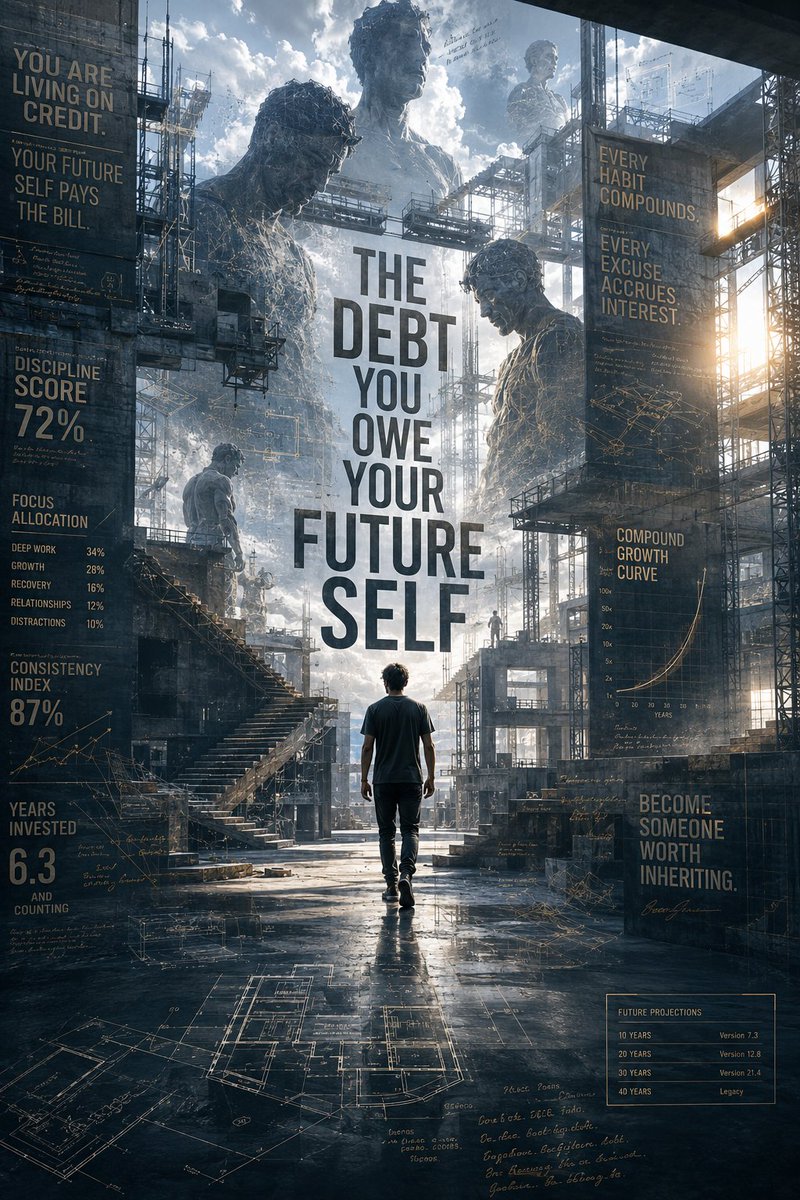
Full Prompt
Create an ultra-premium cinematic motivational campaign poster titled: {argument name="title" default="THE DEBT YOU OWE YOUR FUTURE SELF"} This is not a movie poster. This is not a fitness advertisement. This should feel like a luxury global campaign created by an elite creative agency for an entire generation struggling with discipline, distraction, and unrealized potential. At the center stands a {argument name="subject" default="young adult"} walking through a massive unfinished architectural structure. The environment is neither a city nor a construction site. Instead, it resembles the blueprint of a future life being physically built around them. Towering steel frameworks rise into the clouds. Floating architectural drawings drift through the air. Half-finished staircases lead nowhere. Uncompleted bridges extend into fog. Empty window frames reveal alternate versions of the future. The person is dressed simply. No luxury clothing. No obvious status symbols. Only focus. Only movement. THE VISUAL TWIST Surrounding the central figure are enormous translucent versions of themselves from different timelines. One version is stronger. One is wiser. One is exhausted from regret. One is successful. One never reached their potential. These alternate selves appear like giant architectural ghosts integrated into the environment itself. Some are built from light. Some are built from unfinished sketches. Some appear carved into concrete. Some emerge from clouds and dust. The viewer should feel that every decision creates a different future person. TYPOGRAPHY Massive typography integrated into the architecture: YOU ARE LIVING ON CREDIT. YOUR FUTURE SELF PAYS THE BILL. EVERY HABIT COMPOUNDS. EVERY EXCUSE ACCRUES INTEREST. BECOME SOMEONE WORTH INHERITING. Typography should feel physically embedded into walls, steel beams, blueprints, scaffolding, and unfinished structures. INFORMATION DESIGN Subtle premium infographic elements: Consistency Index Discipline Score Focus Allocation Years Invested Compound Growth Curves Tiny handwritten notes Habit tracking systems Future projections Architectural measurements Blueprint annotations Everything should feel intelligently designed rather than cluttered. COLOR PALETTE Deep graphite Concrete gray Blueprint blue Warm amber highlights Soft white architectural lighting Hints of gold representing earned progress STYLE Luxury campaign design Award-winning creative direction Architectural photography Editorial storytelling Museum exhibition poster Apple × Nike × A24 visual sophistication Photorealistic Extreme depth Atmospheric scale Premium typography integration 8K masterpiece The final image should feel like a visual representation of compound growth itself — something that makes people stop scrolling and stare for several seconds before understanding what they're looking at.