Case Media

Case Notes
This page keeps the media, full prompt, and original source together so you can inspect the result first and decide whether the prompt is worth copying, saving, or comparing.
Case Insights
To make this page easier to search, cite, and reuse later, the case is also broken down into practical guidance about usage, visual cues, and prompt structure.
Best Fit Scenarios
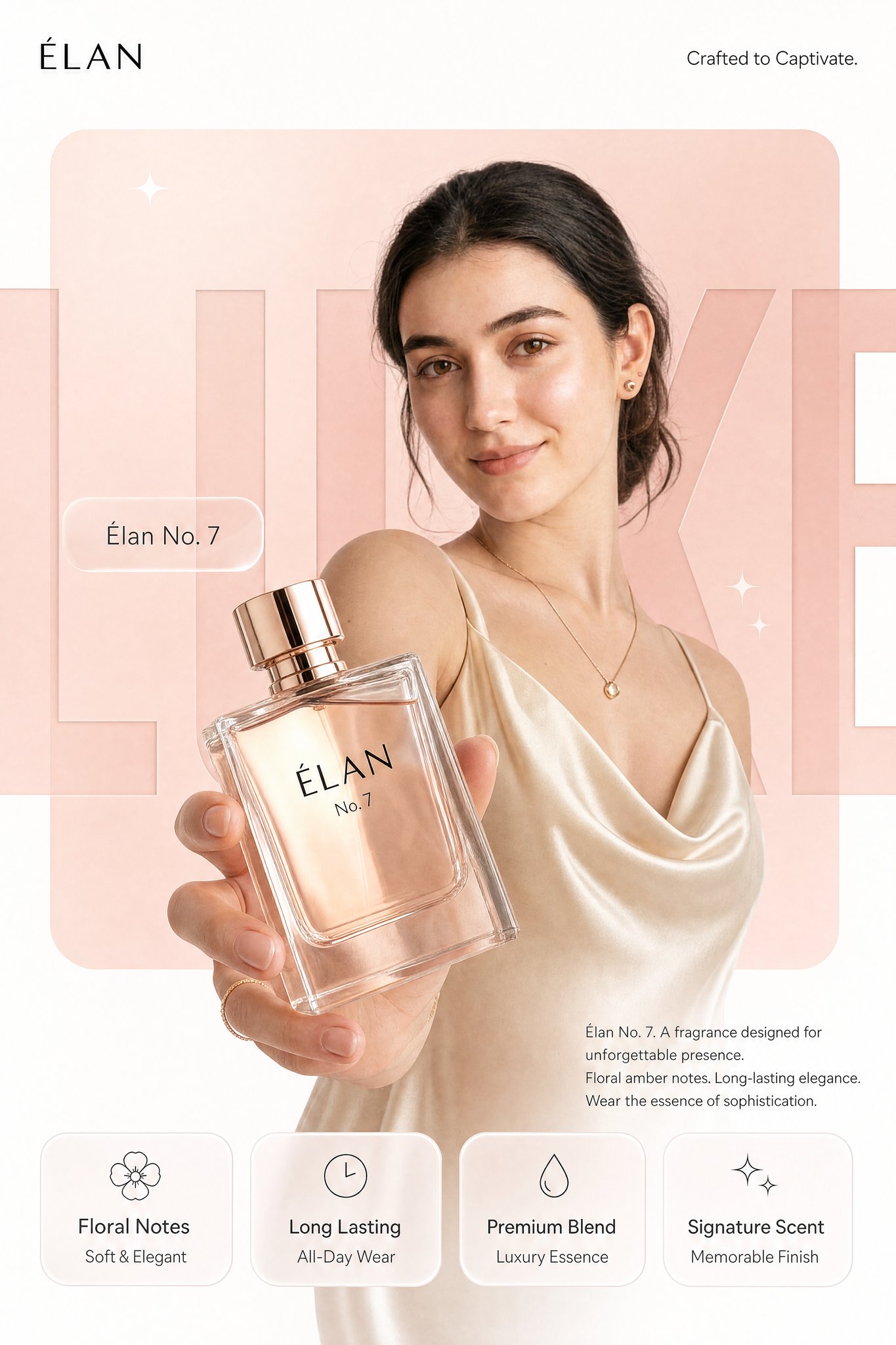
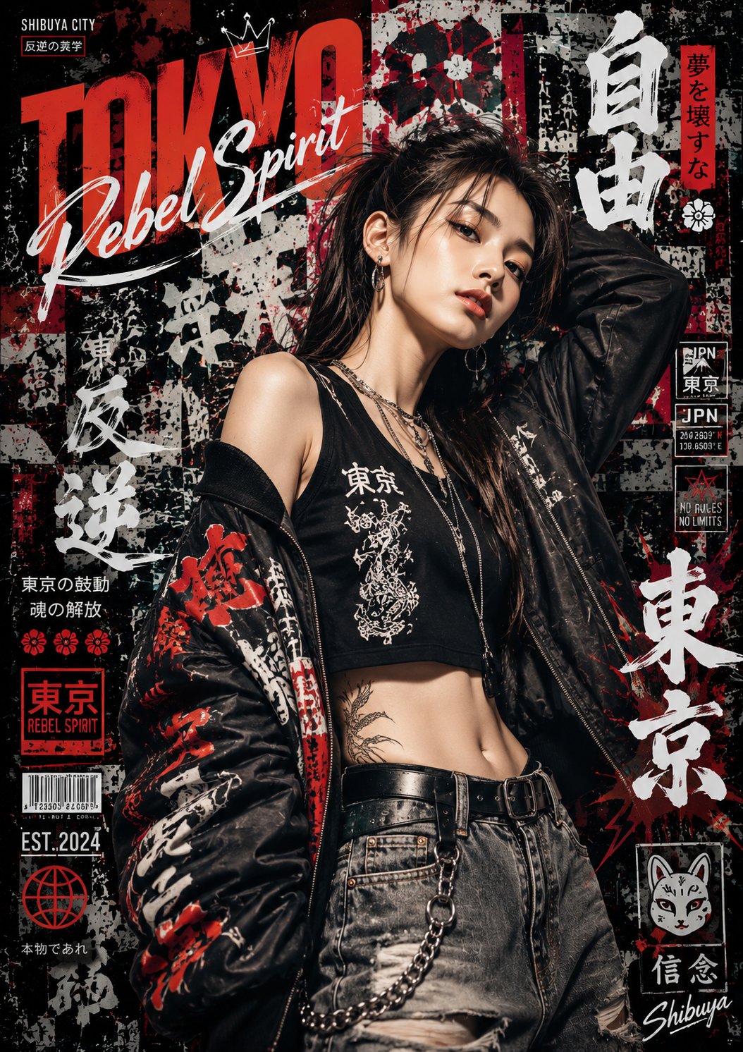
- Use this as a portrait & photography benchmark when you need a fast style baseline before rewriting your own prompt.
- It is especially helpful if your target overlaps with Neon, Portrait, Fashion and you want to judge the image result before tuning wording.
- Keep it as a control sample when you compare nearby prompt variants one variable at a time.
Visual Signals To Notice
- The clearest style signals here are Neon, Portrait, Fashion, so those should usually stay in your first rewrite.
- Focus on framing, light direction, pose, and the distance between subject and camera.
- This case keeps 2 media outputs, which makes it easier to check whether the style remains stable across multiple results.
How The Prompt Is Structured
- The prompt reads as a long, highly specified prompt, which is useful when you want to judge how much specificity this direction needs.
- Its keyword cluster is centered on Neon, Portrait, Fashion, so you can usually keep that cluster while swapping subject, camera, layout, or copy details.
- A practical rewrite path is: keep the outcome, keep the strongest style cues, then replace only the subject and environment blocks.
Good Follow-up Questions
- What changes first if you keep Neon, Portrait, Fashion but switch the subject matter?
- Which part of the result comes from section-level structure (Portrait & Photography) versus tag-level style cues?
- Which related cases in the same section give you a cleaner or more extreme variation of the same direction?
Full Prompt
Create an ultra-high-resolution minimalist line-art travel poster of [CITY DESTINATION], portraying the city as a stylish everyday urban scene rather than a tourist postcard.CORE COMPOSITION: Central composition features the city’s most iconic street, avenue, tram route, pedestrian district, or urban intersection Foreground includes commuters, cyclists, café visitors, tourists, students, business professionals, and pedestrians naturally interacting People should reflect the authentic local lifestyle and fashion culture of the city Background filled with realistic storefronts, cafés, restaurants, transportation signage, local businesses, bicycles, street furniture, and architectural details Major landmarks should appear subtly integrated into everyday city life, never oversized or exaggerated Include authentic local-language typography, transit signs, shop signage, menus, and culturally recognizable visual elements Large bold typography at the top center: [CITY NAME] Subtitle below: local language + country name STYLE: ultra-clean vector illustration Swiss modernist travel poster aesthetic minimalist monoline drawing mid-century editorial design architectural illustration Japanese-inspired graphic poster style precise geometric perspective extremely clean negative space premium luxury travel branding aesthetic LINE STYLE: monochrome line-art illustration only thin and highly precise linework minimal fill areas intricate architectural and street-detail density rhythmic layering of signs, buildings, windows, vehicles, and street objects visually dense yet highly organized composition COLOR SYSTEM — VERY IMPORTANT: use ONLY one main color + one background color Main color: deep muted maroon / burgundy inspired by vintage Japanese travel posters Background: warm cream / ivory paper tone monochrome silkscreen poster aesthetic no neon or rainbow palettes timeless premium atmosphere COMPOSITION: vertical 4:5 poster layout frontal street-level perspective natural pedestrian movement balanced visual rhythm and layering should feel like a premium city-brand campaign poster MOOD: calm but lively urban atmosphere editorial travel magazine cover aesthetic timeless city identity elegant and sophisticated minimal yet highly detailed TEXT QUALITY — EXTREMELY IMPORTANT: all typography must be readable and professionally aligned no distorted or broken letters authentic local signage style clean editorial typography hierarchy OUTPUT: vertical poster composition 8K ultra detailed print-ready ultra-sharp vector quality refined monochrome maroon aesthetic similar to vintage Japanese city posters