Case Media
Case Notes
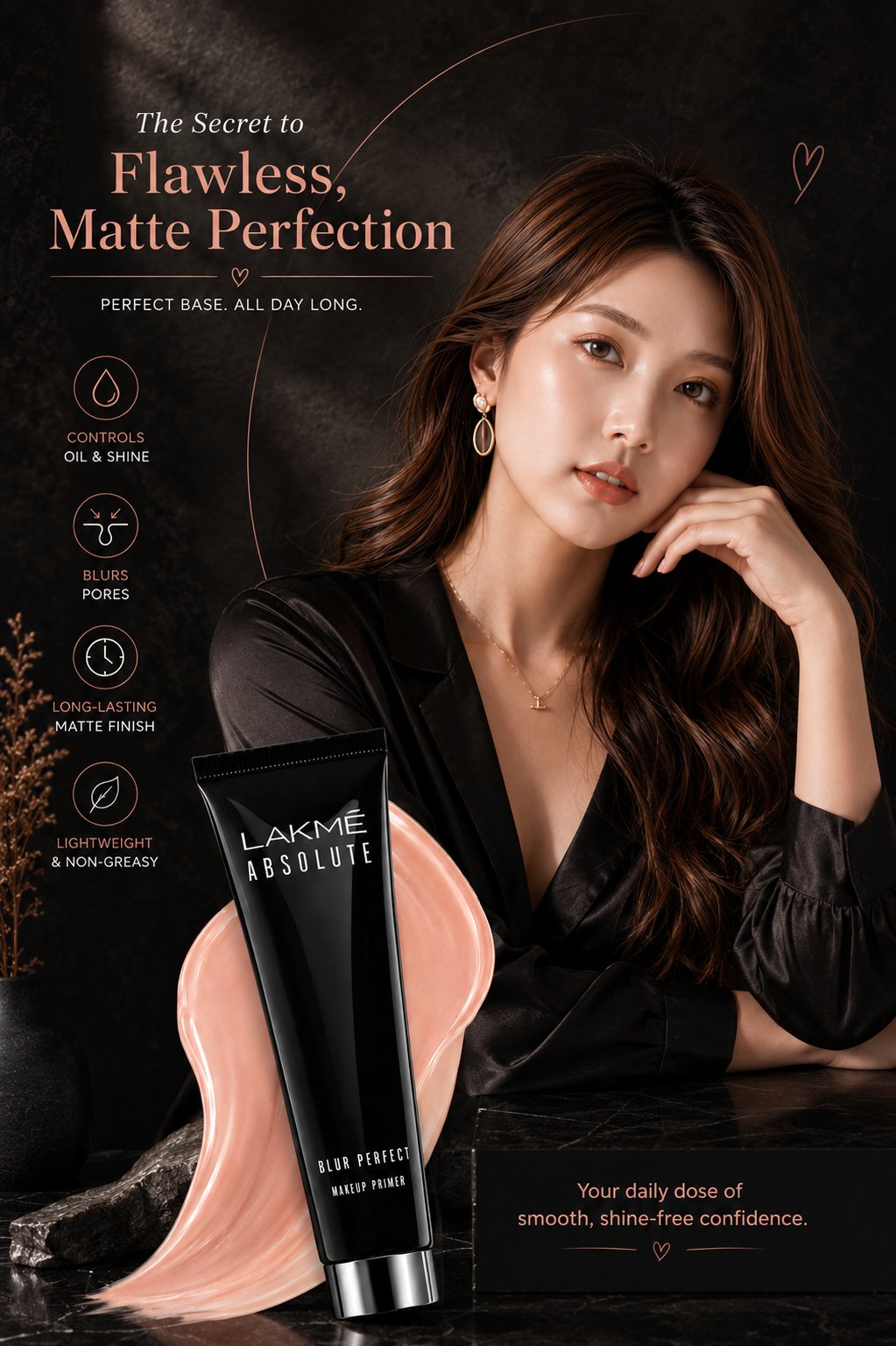
This page keeps the media, full prompt, and original source together so you can inspect the result first and decide whether the prompt is worth copying, saving, or comparing.
Case Insights
To make this page easier to search, cite, and reuse later, the case is also broken down into practical guidance about usage, visual cues, and prompt structure.
Best Fit Scenarios
- Use this as a portrait & photography benchmark when you need a fast style baseline before rewriting your own prompt.
- It is especially helpful if your target overlaps with Portrait, Cinematic, Fashion and you want to judge the image result before tuning wording.
- Keep it as a control sample when you compare nearby prompt variants one variable at a time.
Visual Signals To Notice
- The clearest style signals here are Portrait, Cinematic, Fashion, so those should usually stay in your first rewrite.
- Focus on framing, light direction, pose, and the distance between subject and camera.
- This case keeps one primary output, so the first image should be treated as the main visual reference.
How The Prompt Is Structured
- The prompt reads as a long, highly specified prompt, which is useful when you want to judge how much specificity this direction needs.
- Its keyword cluster is centered on Portrait, Cinematic, Fashion, so you can usually keep that cluster while swapping subject, camera, layout, or copy details.
- A practical rewrite path is: keep the outcome, keep the strongest style cues, then replace only the subject and environment blocks.
Good Follow-up Questions
- What changes first if you keep Portrait, Cinematic, Fashion but switch the subject matter?
- Which part of the result comes from section-level structure (Portrait & Photography) versus tag-level style cues?
- Which related cases in the same section give you a cleaner or more extreme variation of the same direction?
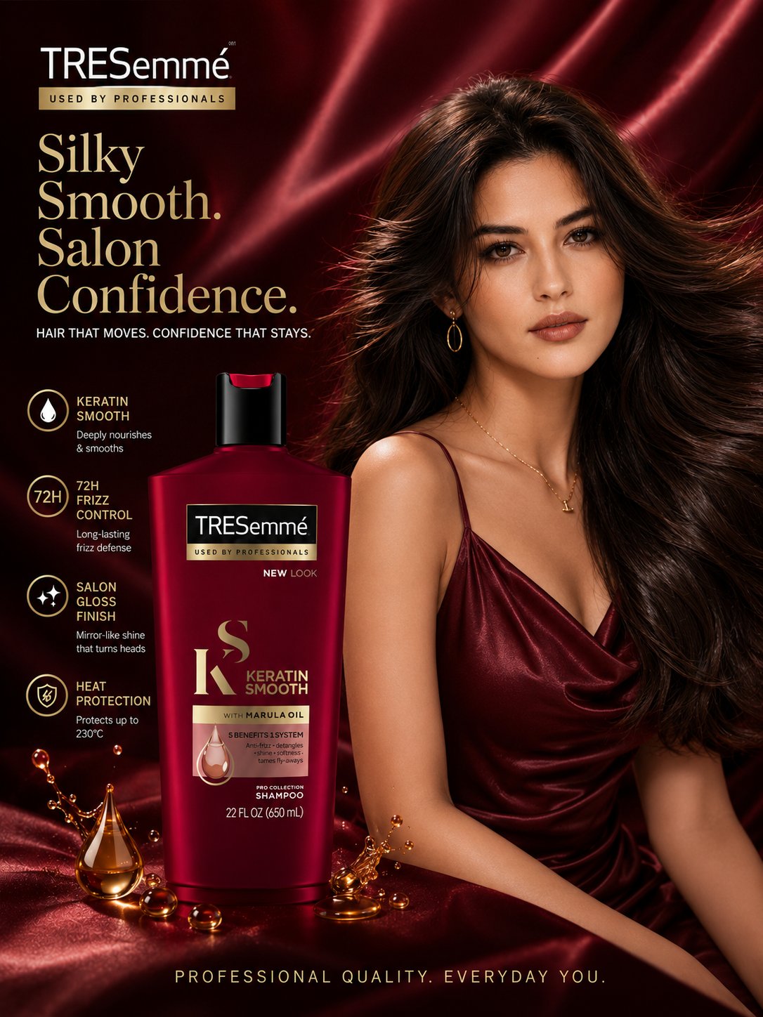
Full Prompt
Ultra-realistic luxury cosmetic advertisement poster for a matte makeup primer, vertical 4:5 format, premium beauty campaign aesthetic, dark moody black textured background with soft warm brown highlights, elegant cinematic studio lighting, beautiful Asian female model with flawless glowing matte skin, long wavy brown hair, natural glam makeup, wearing silky black satin outfit, relaxed elegant pose resting face on hand, high-end fashion magazine style. Foreground features a glossy black cosmetic tube standing upright with creamy nude-beige primer texture flowing behind it like liquid silk, reflective surface, dramatic luxury product lighting, black marble table surface with subtle reflections. Typography layout in elegant peach-nude serif fonts and minimal sans-serif fonts: “The Secret to Flawless, Matte Perfection” “Perfect Base. All Day Long.” Left side vertical feature icons with luxury minimal line-art icons and text: • Controls Oil & Shine • Blurs Pores • Long-Lasting Matte Finish • Lightweight & Non-Greasy Bottom-right elegant text: “Your daily dose of smooth, shine-free confidence.” Color palette: black, nude beige, warm brown, peach nude, soft bronze highlights. Style: luxury skincare ad, Vogue beauty campaign, premium cosmetic branding, ultra detailed skin texture, soft shadows, glossy reflections, aesthetic composition, clean typography spacing, editorial photography, photorealistic, high contrast, cinematic beauty lighting, 8k quality.