Case Media
Case Notes
This page keeps the media, full prompt, and original source together so you can inspect the result first and decide whether the prompt is worth copying, saving, or comparing.
Case Insights
To make this page easier to search, cite, and reuse later, the case is also broken down into practical guidance about usage, visual cues, and prompt structure.
Best Fit Scenarios
- Use this as a portrait & photography benchmark when you need a fast style baseline before rewriting your own prompt.
- It is especially helpful if your target overlaps with Portrait, Cinematic, Fashion and you want to judge the image result before tuning wording.
- Keep it as a control sample when you compare nearby prompt variants one variable at a time.
Visual Signals To Notice
- The clearest style signals here are Portrait, Cinematic, Fashion, so those should usually stay in your first rewrite.
- Focus on framing, light direction, pose, and the distance between subject and camera.
- This case keeps one primary output, so the first image should be treated as the main visual reference.
How The Prompt Is Structured
- The prompt reads as a long, highly specified prompt, which is useful when you want to judge how much specificity this direction needs.
- Its keyword cluster is centered on Portrait, Cinematic, Fashion, so you can usually keep that cluster while swapping subject, camera, layout, or copy details.
- A practical rewrite path is: keep the outcome, keep the strongest style cues, then replace only the subject and environment blocks.
Good Follow-up Questions
- What changes first if you keep Portrait, Cinematic, Fashion but switch the subject matter?
- Which part of the result comes from section-level structure (Portrait & Photography) versus tag-level style cues?
- Which related cases in the same section give you a cleaner or more extreme variation of the same direction?
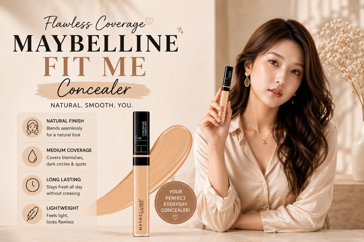
Full Prompt
Create a luxury horizontal 4K beauty advertisement poster for MAYBELLINE FIT ME Concealer. Use a soft warm beige and cream color palette with premium minimal aesthetic styling. Place an elegant East Asian female model on the right side with glowing smooth skin, long wavy dark brown hair, soft makeup, glossy lips, subtle gold earrings, and confident luxury fashion pose. Dress her in a silky champagne satin shirt with soft folds and natural lighting. She is holding the concealer product near her face naturally. Place a large realistic MAYBELLINE FIT ME Concealer product bottle vertically near the center with a creamy concealer texture swipe behind it. Background should be soft blurred luxury studio interior with beige tones, warm sunlight shadows, minimal flowers, marble surface, and high-end skincare campaign vibe. Typography should be clean and aesthetic: “MAYBELLINE” “FIT ME” “Concealer” “NATURAL. SMOOTH. YOU.” Add only 4 minimal feature sections with elegant icons: • Natural Finish • Medium Coverage • Long Lasting • Lightweight Keep layout very clean and premium. Remove all affiliate links, buttons, extra badges, unnecessary marketing text, and clutter. Focus on luxury beauty campaign aesthetic similar to Vogue cosmetic ads. Ultra realistic, cinematic lighting, soft shadows, glossy skin texture, luxury Korean beauty campaign style, sharp focus, premium composition, photorealistic, elegant typography, magazine-quality commercial design, 4K horizontal poster, high detail.