Case Media
Case Notes
This page keeps the media, full prompt, and original source together so you can inspect the result first and decide whether the prompt is worth copying, saving, or comparing.
Case Insights
To make this page easier to search, cite, and reuse later, the case is also broken down into practical guidance about usage, visual cues, and prompt structure.
Best Fit Scenarios
- Use this as a portrait & photography benchmark when you need a fast style baseline before rewriting your own prompt.
- It is especially helpful if your target overlaps with Portrait, Fashion, Poster and you want to judge the image result before tuning wording.
- Keep it as a control sample when you compare nearby prompt variants one variable at a time.
Visual Signals To Notice
- The clearest style signals here are Portrait, Fashion, Poster, so those should usually stay in your first rewrite.
- Focus on framing, light direction, pose, and the distance between subject and camera.
- This case keeps 2 media outputs, which makes it easier to check whether the style remains stable across multiple results.
How The Prompt Is Structured
- The prompt reads as a long, highly specified prompt, which is useful when you want to judge how much specificity this direction needs.
- Its keyword cluster is centered on Portrait, Fashion, Poster, so you can usually keep that cluster while swapping subject, camera, layout, or copy details.
- A practical rewrite path is: keep the outcome, keep the strongest style cues, then replace only the subject and environment blocks.
Good Follow-up Questions
- What changes first if you keep Portrait, Fashion, Poster but switch the subject matter?
- Which part of the result comes from section-level structure (Portrait & Photography) versus tag-level style cues?
- Which related cases in the same section give you a cleaner or more extreme variation of the same direction?
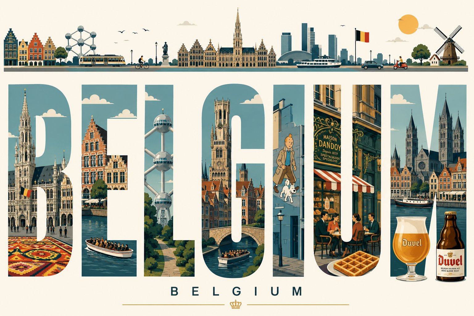
Full Prompt
Create an ultra-high-resolution Swiss modernist typography travel poster for BANGKOK THAILAND in a premium 16:9 layout. CORE CONCEPT: A massive bold condensed sans-serif word “BANGKOK” dominates the center composition. Each individual letter acts as a precise geometric window containing minimalist flat-vector illustrations of iconic Bangkok landmarks and authentic urban life scenes. INSIDE THE LETTERS INCLUDE: Grand Palace Wat Arun Wat Pho Chao Phraya River Tuk-tuks BTS Skytrain Long-tail boats Chinatown signage Rooftop bars Street food stalls Temple roofs Bangkok modern skyline The scenes inside each letter must transition seamlessly across the typography, creating one continuous panoramic urban narrative while preserving perfectly clean letter edges and flawless typography integrity. TOP PANORAMIC RIBBON: At the very top edge of the poster, create a thin elegant panoramic strip showing: Bangkok skyline silhouette BTS train River boats Birds Palm trees Cars and scooters Stylized tropical sun Minimal clouds STYLE & AESTHETIC: Swiss Graphic Design meets Mid-Century Modern travel poster aesthetics. Flat vector illustration only. Architectural infographic precision. 100% clean geometric shapes. No gradients. No photorealism. No textures. No grain. No AI distortion. No warped typography. VISUAL EXECUTION: Sharp vector edges Sophisticated negative space Balanced composition Minimalist architectural detailing Precise geometric shadows Museum-grade poster quality Editorial luxury aesthetic COLOR PALETTE: Muted premium Southeast Asian palette inspired by Bangkok: River teal Warm coral Tropical gold Ivory Slate blue Soft terracotta BACKGROUND: Soft ivory or premium warm white background. TYPOGRAPHY: Professional kerning and spacing. Perfectly legible text. Human-designed graphic identity feel. Large title: “BANGKOK” Small elegant subtitle underneath: “THAILAND” ATMOSPHERE: Intellectual, calm, avant-garde, collectible luxury travel poster found in a museum design store. OUTPUT: Ultra-detailed 8K vector-style rendering, ultra sharp print-ready quality, high-end editorial poster design.